The best Marvel logos for the Marvel Cinematic Universe movies successfully hail much-loved characters' arrivals on the big screen, often adding a cinematic sheen to designs that originated on the pages of comic books. With The Marvels finally reaching cinemas in 2023, we're recapping the best MCU logos so far.
It was a stroke of genius when Marvel decided to create its own movies, beginning in 2008 with the first Iron Man. In the 1980s and 1990s, movies based on Marvel comics were a mixed bag, to say the least. Long-forgotten turkeys like 1986’s Howard the Duck, 1990’s straight-to-video version of Captain America, and 1998’s Nick Fury: Agent of S.H.I.E.L.D (starring David Hasselhoff) show just how risky it was for Marvel to license its characters to third-party movie producers, who didn’t understand or respect the source material.
The ensuing volley of box-office beating blockbusters has been accompanied by some great MCU logo designs. Read on as we reveal our favourites from the series so far and look at why they work so well. Make sure you see our pick of the best comic logos for more. And see our logo design guide for advice on creating your own winning branding.
The best Marvel logos
01. The Iron Man logo (2008)

First on our list of the best Marvel logos, the Iron Man logo created by freelance creative director Fede Ponce boldly reflected the company’s new confidence in itself on the release of its first in-house movie in 2008. The design works effectively to unite past and present; both drawing on the original comic logo, and updating it with a gritty, photorealistic metallic texture. And that's not all. The designer later explained that he saw Iron Man’s story about “redemption, about being broken and re-born” and so the reflective nature of the logo was a sign of “sunlight and rebirth”.
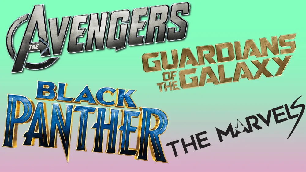
02. The Avengers logo (2012)

One of the big advantages of Marvel creating all its movies in-house was that it could bring multiple characters together in one movie (as it had done in its comics) without having to negotiate the rights with multiple producers. And in 2012, it made the most of this new freedom with the release of The Avengers, whose blockbuster success changed the course, not just of superhero movies but arguably the movie industry as a whole.
The MCU logo for this film (titled Avengers: Assemble in the UK) may have been new to many, but Marvel fans would have recognised it as essentially the same design as those used in the comics. Based on what was known internally as the 'Big A', with its forward-thrusting arrow, this design (shown below) was developed by Marvel letterer Gaspar Saladino, and debuted in print in 1972.

The movie logo developed the ‘A’ a stage further, placing it inside a ring to add extra dynamism, and italicising the word ‘The’ for further forward momentum. All this, plus a metallic texture, and extra sharpness to the end of the ‘G’ and two ‘E’s, combined to produce a pixel-perfect design that needed little updating across successive Avengers movies.
03. Guardians of the Galaxy logo (2014)

The Guardians of the Galaxy comics were the joker in the Marvel pack: fun, irreverent and sometimes quite ludicrous (but in a good way). So fans' hearts were in their mouths when a big screen outing was announced: could Marvel pull it off? Turned out they could: the film was a huge hit with comic lovers and mass audiences alike, not least thanks to its spectacular VFX.
The logo took the fundamental style of all Marvel movie logos to date and gave it a fun twist. The look of worn metal and slightly clunky style of lettering fitted this film about a bickering and chaotic group of space pirates beautifully.
04. Doctor Strange logo (2016)

While the early Marvel movie logos were quite samey, things started to open up in 2016 with this entrancing design for Doctor Strange. It took the underlying concept of reflective metal, and gave it a golden, magical and offbeat twist, which suited the fantasy theme of the film perfectly. Its thin and elegant lettering also subtly reflected how different Benedict Cumberbatch’s character would be from the usual meat-and-muscle brand of superhero.
05. Spider-Man: Homecoming logo (2017)

In the early days of the MCU, Marvel tried hard not to make its branding look too comic-like, lest they scared off the moviegoing mainstream. But by 2017, the tables had turned. Now, the ubiquity of large flatscreen TVs and streaming video meant that superhero movies were one of the few things that could tempt the public away from their sofas: Marvel was the cinema mainstream.
It’s fitting, then, that Spider-Man’s arrival in modern Marvel movies was accompanied by this very comic-esque logo. It does a great job of representing what was essentially a teen movie, with the spraypainted Spidey emblem in the ‘O’ of ‘Homecoming’ cheekily incorporating the superhero into the design.
06. Thor: Ragnarok logo (2017)

2017 was a sea-change year for Marvel movie logos, with Guardians of the Galaxy 2, Spider-Man: Homecoming and Thor: Ragnarok (above) all incorporating fun, retro and comicbook like elements into their designs.
With the cinematic version of Marvel now totally at ease with itself, this third in the Thor saga had its tongue firmly in cheek and was full of wry observations, ironic wit and self-parody. So while the logos for the first two Thor movies had been bold, earthy and masculine, this design instead drew on the lettering style of 1980s Marvel comics and TV cartoons to convey the change in atmosphere. In terms of colour, shape and style, it's a motley crew of graphic elements, but somehow they mesh perfectly… just like the movie itself.
07. Black Panther logo (2018)

In 2018 came another milestone in Marvel's modern movie story. The first Marvel film with a mainly black cast, Black Panther attracted critical acclaim across the board, and became the first superhero movie ever to be nominated for a Best Picture Oscar.
The logo's sleek lines and geometric preciseness gelled well with the spirit of advanced technology that permeates the film, and with the story centred around a mysterious and hidden African kingdom, it was suitably regal and majestic. It certainly wasn't staid, though: indeed, the 3D placing of the lettering, with the ‘P’ and ‘R’ shifted forward and the spike of the 'N' thrusting into the forefront, added a sense of movement and purpose that befitted the movie's dramatic and ultimately uplifting storyline.
08. Captain Marvel (2019) and The Marvels logo (2023)

We're putting these together as a joint entry since there's a nice relationship between the design for Captain Marvel and the 2023 sequel, the Marvels. While the modern Marvel movies have all promoted humanistic, progressive values, it wasn’t until 2019 that the MCU got its first female superhero. The origin movie set in the 1990s featured some impressive de-ageing digital technology, and Marvel pulled off a similar trick with the Captain Marvel logo.
The design employs retro lettering and a classic red and gold colour scheme to give the feel of a 20th-century superhero movie, while the explosive background instils it with the spirit of modern superhero cinema. Indeed, what's essentially a small patch of negative space is surprisingly effective: you almost want to shield your eyes from its brightness!

The Marvels logo for the 2023 sequel (initially expected for 2022) has added new symbolism with elements representing the other two characters appearing in the film – Kamala Khan's Ms. Marvel and Monica Rambeau. The Spectrum symbol on the 'A' is a nod to Monica Rambeau's superhero persona while the lightning-like 'S' at the end represents Ms. Marvel.

09. Avengers: Endgame logo (2019)

Given the success of the original Avengers movies, Marvel could have kept churning them out until Stark and Banner were trading blows in the old people’s home. But to its credit, it wound things up brilliantly with 2019’s Avengers: Endgame, managing to fit more superheroes into a single scene than you might have ever thought possible.
The logo took the familiar ‘Avengers’ wordmark from the previous three films, and gave it a slightly aged, weathered texture and more mature colour scheme to mark the passage of time and the sombre nature of the story. The ‘Endgame’ subtitle, meanwhile, was a little more muted than with ‘Age of Ultron’ or ‘Infinity War’, with an hint of sunset in the colour palette and wider letter spacing reflecting the bittersweet atmosphere of the saga's end.
10. Thor: Love and Thunder (2022)

Finally, our last entry in our list of the best MCU logos. The Avengers quadrilogy may have ended, but the Marvel movie universe powered on with the 2022 movie Thor: Love and Thunder. Wonderfully over-the-top and recalling the best of 1980s/90s Marvel cartoons in its bright and colourful pomp, the logo was a wonderfully fun taster for the film. For more inspiration, see our pick of the best Disney logos of all time.

