The best comic logos are different from other kinds of brand identities. They can vary significantly over even a relatively short space of time for new installations in each comic's respective franchises. They often get sketched by different artists, and also get revised outside of comics for TV and movie spin-offs and more.
But some of the best comic book logos classic logos are also timeless and benefit from core design fundamentals (see our guide to how to design a logo). Even some designs that are no longer used continue to inspire fans years later.
For more inspiration, see our picks of the best horror movie logos and the best band logos. In the meantime, here's our selection of the best comic logos.
9 of the best comic logos of all time
01. The Flash logo

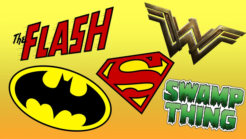
Like many of the best comic book logos, The Flash logo has seen many incarnations over the years and decades. But one of the early designs continues to make its influence felt and is probably The Flash logo that many will know and love.
Designed for The Flash's first series of his own in 1959 (he previously appeared with other characters in Flash Comics and Showcase), the logo design above is a simple idea wonderfully executed. Created by Ira Schnapp, drawing on influence from the Flash Comics series, it conveys the character's special power – super speed – with trailing movement lines and leaning letters.
The 'F' is emphasised over the other letters, and the speed lines actually break the borders of the letters. This design was used for an incredible 26 years up until 1985 and it was a major influence on the logo used through much of first decade of the 2000s.
02. The Superman logo

Created by Jerry Siegel and Joe Shuster in the 1930s, Superman is arguably today the world’s best known superhero. And his logo, aka the Superman Shield, can make a similar claim; this stylised red ‘S’, on a yellow diamond shield with a red border, has become recognisable the world over.
A simple version has been stitched into the Man of Steel’s costume from the word go, first seen in print in Action Comics #1 in 1938. Its design then varied in colour and shape over the years (you can see the various incarnations here) before settling in to the classic version created in 1977 (above), the year shooting began on the first Christopher Reeve Superman movie.

The Superman logo has also given a huge boost to DC Comics’ coffers, because in 1945, the company (then National Periodical Publications) succeeded in trademarking it.
This allowed it to keep control of Superman stories in perpetuity, rather than allowing them to become public domain after 75 years, as is normal for copyright. And that’s not to mention all the cash the design itself has generated from associated licensing and merchandise.
03. The Batman logo

Since 1939, Batman has rivalled Superman for the title of the world’s greatest superhero. Using brains, brawn and technology rather than physical superpowers, he represents a raw humanity that’s sometimes lacking in the comic-book universe.
The iconic character was created by artist Bob Kane and writer Bill Finger, and first appeared in Detective Comics #27. A Batman logo appeared soon after (shown above), which is believed to have been designed by artist Jerry Robinson.
Like most of the classic superheroes, the caped crusader has been reinvented and reimagined many times over the decades, across comics, TV shows, cartoons and movies. And the iconic Batman logo has similarly transformed into a number of guises; you can see the early designs here and its evolution over the decades here.

Despite all the different versions, though, the core of the design remains: a black silhouette of a bat; brooding, mysterious and suggestive of a darkness at the heart of the masked vigilante. DC Comics believes in it so much, they even took Spanish football club Valencia to court last year over what they considered to be a similar logo design.
04. The Spider-Man logo

Marvel Comics’ most popular superhero, Spider-Man was created by writer-editor Stan Lee and writer-artist Steve Ditko, and first appeared in the anthology comic book Amazing Fantasy #15 (Aug 1962) in the Silver Age of Comic Books.
The classic Spider-Man comic-book logo (shown above) appeared in May the following year. It was designed by Sol Brodsky and inked by letterer Artie Simek, and you can see some of the later versions here.

As Marvel's flagship character and company mascot, Spidey has gone on to feature in several animated and live-action television series, syndicated newspaper comic strips, and a series of blockbuster films. The logo for forthcoming 2017 film, Spider-Man: Homecoming, was released this April and as you can see above, it has a punchy, kid-friendly feel but still contains the essence and feel of the original.
05. The Wonder Woman logo

No offence to Buffy, Xena or Lara, but Wonder Woman was the original kick-ass heroine, and remains the biggest female superhero on the planet. Making her debut in All-Star Comics #8 in 1941, she got her own comic book six months later, and a long-running 1970s TV series cemented her fame around the world.
In the 1980s a redesign of Wonder Woman was spearheaded by DC Comics’ editor-in-chief Jenette Kahn. Part of the superheroine’s new look was a new logo (shown above), replacing the Eagle emblem she’d worn since the start. This fine piece of logo craftsmanship was created by none other than graphic design legend Milton Glaser, creator of the I Love NY logo.

Glaser’s clever design, combining the initials of her name with the essence of the original eagle emblem, has evolved over the years, but still retains its fundamental elements, and has become a licensing powerhouse for DC Comics. So much so that Whataburger (which has had a similar W-based logo since 1972) opened up a dialogue with DC Comics to “ensure that each party’s legal rights and interests are protected” ahead of the release of the Wonder Woman movie. You can see a detailed history of the development of Wonder Woman’s logo here.
06. The Marvel logo

Comics superpower Marvel was originally founded in 1939 under the name Timely Comics. In 1957, it renamed itself Marvel Comics and its logo featured the word written in clean comic-book lettering and surrounded by its biggest characters, including Thor, Captain America and The Hulk.
It’s been through quite a few changes over the years and you can see the main variants of the Marvel logo here. But the current design, in place since 2002, is still not a million miles away from the 1930s original; on close inspection, even the off-kilter kerning between the letters looks familiar.

Written in simple white text on a red background, in a clean and professional font, the modern-day logo was created to accompany the 2002 Spider-Man movie. And it’s proved so effective that’s it now appended to almost every Marvel property, whether in print or screen. (You can see it, for example, attached to the latest Spider-Man logo shown above.)
A great example of strength through simplicity, this minimalist design is instantly recognisable wherever it appears; a great asset in a market where the competition with DC (who have been less consistent with their logo) continues to rage.
07. Iron Man logo

A “cool exec with a heart of steel”, Iron Man was created by writer and editor Stan Lee and designed by artists Don Heck and Jack Kirby. Debuting in Tales of Suspense #39 in 1963, he’s a modern day knight in high tech armour; along with Batman, one of the few superheroes who doesn’t rely on physical superpowers.
There were a series of Iron Man comic book logos over the years, and you can see the main iterations here. While they vary hugely in style and colour, the central theme of solid, bold, metallic lettering was adhered to consistently. And the logo for the 2008 movie, created under the leadership of artist, director and VFX supervisor Fede Ponce, took that same aesthetic blueprint and brought it bang up to date (see below).

Since he’s hit the big screen, Iron Man has become Marvel’s biggest earner and the wisecracking favourite of a whole new generation of young fans. You can see the evolution of the Iron Man movie logos here.
08. 2000AD logo

British comic 2000 AD began in the late 1970s and hasn’t looked back since. It’s become a major launchpad for British artist talent, including Alan Moore, Mark Millar, Garth Ennis, Mick McMahon, Frank Quietly and Grant Morrison, not to mention giving the world the iconic anti-hero Judge Dredd.
2000AD has had a number of (fairly similar) logos over the years, and you can see them all in detail here. But it was this 1988 design for issue 555 (shown above) that pretty much broke the mould.

The current logo, which has appeared in one form or another since issue 1234 in 2001, is a little slicker but still follows the future-facing design of its predecessor. And the irony that the titular year is now the past rather than the future has done nothing to hinder its appeal.
09. Swamp Thing logo

Finally, the Swamp Thing logo is another of the best comic logos when it comes to conveying character. Created by Berni Wrightson, it leaves no doubt as to where this anthropomorphic environmental defender came from. The design has varied and been reworked over the years, but it retains a hand-drawn charm that captures the mood of the original stories with a slightly spooky but organic feel, with lovely cross-hatch shading inside the letterforms. This design was dropped towards the end of the 1970s but brought back in the early 1980s.
For more inspiration, see our pick of the best Marvel logos.

