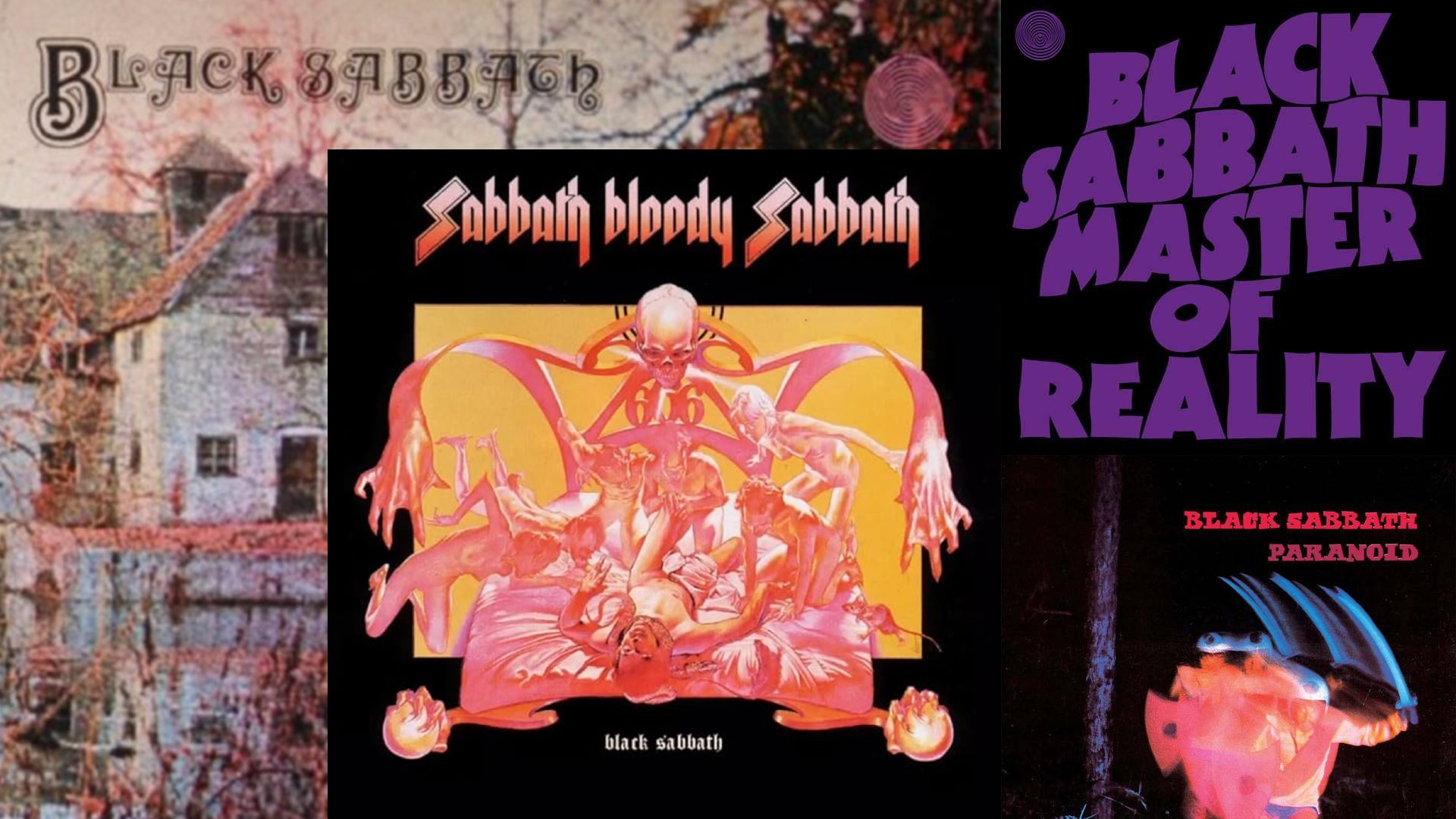
Ozzy Osbourne, the legendary singer of Black Sabbath, passed away on Tuesday night aged 76. It's an emotional end to an era that transformed not just how rock music sounded, but how it looked.
The band known to fans simply as "Sabbath" is best known for inventing the doom-laden sound of heavy metal by down-tuning their guitars. But their equally important contribution to rock's visual identity often goes unnoticed.
So let me make this crystal-clear: Sabbath's early releases featured some of the most important album art in rock history. It didn't just help sell records; it created a whole new aesthetic language... one that's defined the look of heavy rock and metal for generations since.
Article continues belowPower of the sleeve
A bit of context is useful here. In the early 1970s, there was no YouTube, no Spotify, no internet. Music videos hadn't really been invented yet, and seeing even mainstream pop bands on the TV was frightening rare. So record sleeves were generally the most important way (and often the only way) that artists communicated their visual identity to the world.
This made album art crucial, particularly for a band like Sabbath, who needs to visually convey just how different they were from the blues-rock and psychedelia dominating the rock landscape of the time.
In that light, their early album art established the template for the heavy metal imagery that persists today across the world today, from Kenya's Last Year's Tragedy to Indonesia's all-girl group Voice of Bracepot.
Debut artwork

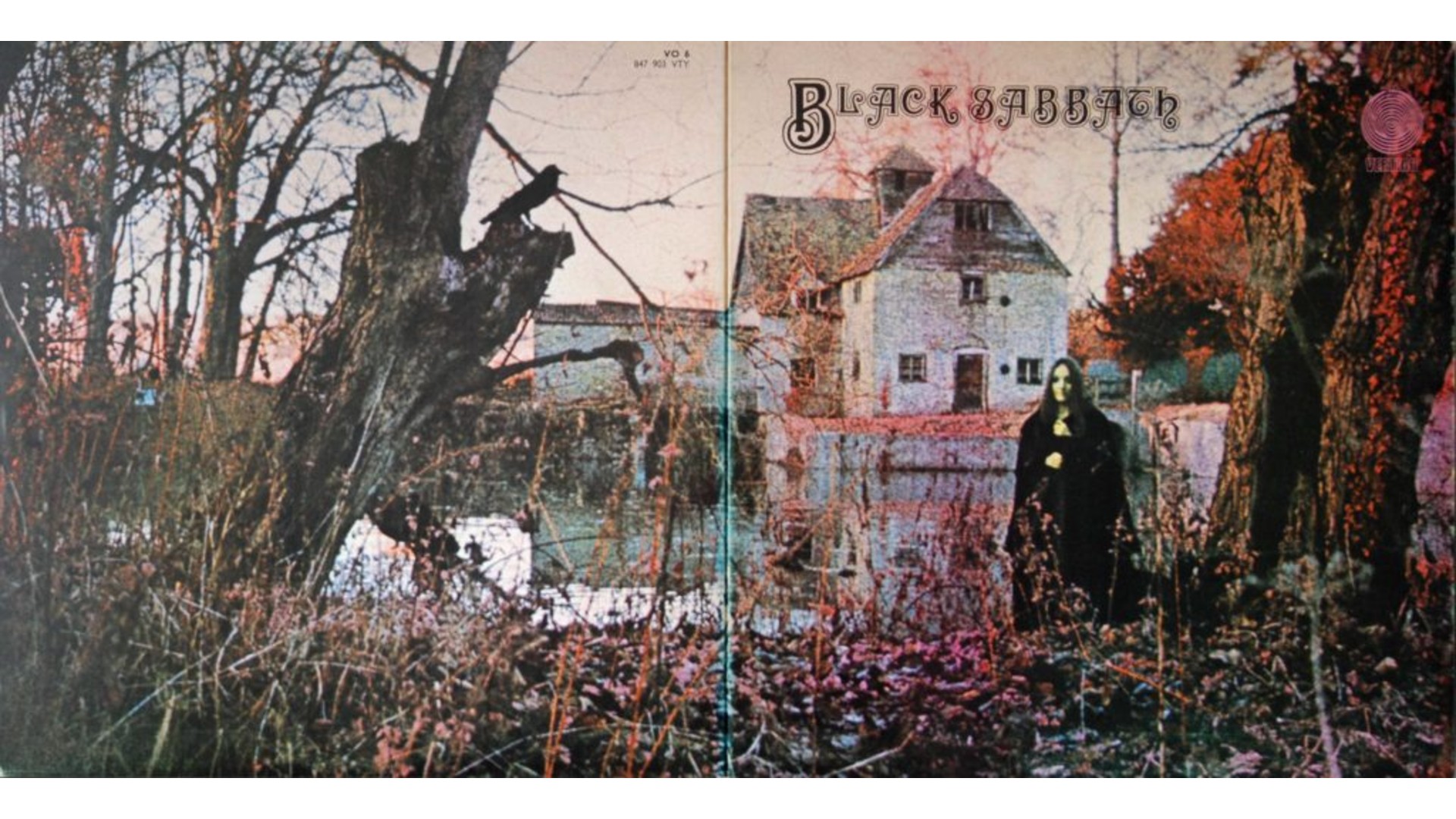
Shot at the 15th-century Mapledurham Watermill in Oxfordshire, the cover for the first, eponymous, Black Sabbath album in 1970 features a mysterious woman in black. Captured on infrared film, the image has a haunting, otherworldly quality. The gatefold, meanwhile, reveals an inverted cross containing cryptic poetry about death and supernatural dread.
Sign up to Creative Bloq's daily newsletter, which brings you the latest news and inspiration from the worlds of art, design and technology.
The effect was striking, and seriously hypnotic. As Iron Maiden singer Bruce Dickinson told Planet Rock in 2024: "You look at that picture, and I used to stare at it for hours thinking: 'What's going on there?'"
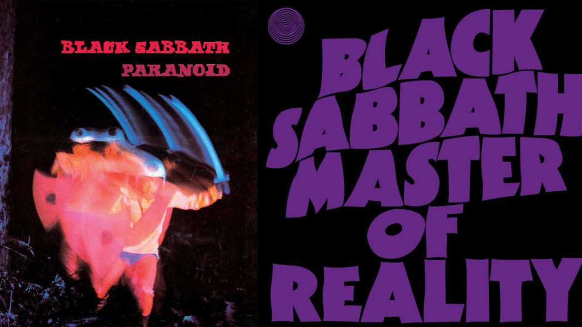
This sense of mystery and foreboding persisted throughout subsequent releases. Paranoid, Sabbath's second album that same year, featured a sword-wielding warrior in pink leotards; a scene that looks seriously weird to modern eyes. But crucially, it established heavy metal's fascination with medieval warfare imagery, which persists to this day.

In 1971 their third album, Master of Reality, switched things up again. Featuring huge, embossed letters on a black sleeve, this iconic artwork pioneered the gothic typography that would become synonymous with the genre.
Satanic imagery
The band's name and lyrics were pretty shocking to mainstram society in the predominantly Christian nations of Europe and North America. But that wasn't really a problem for the record companies. Controversy sells, after all, and Sabbath were shifting serious units around the world.
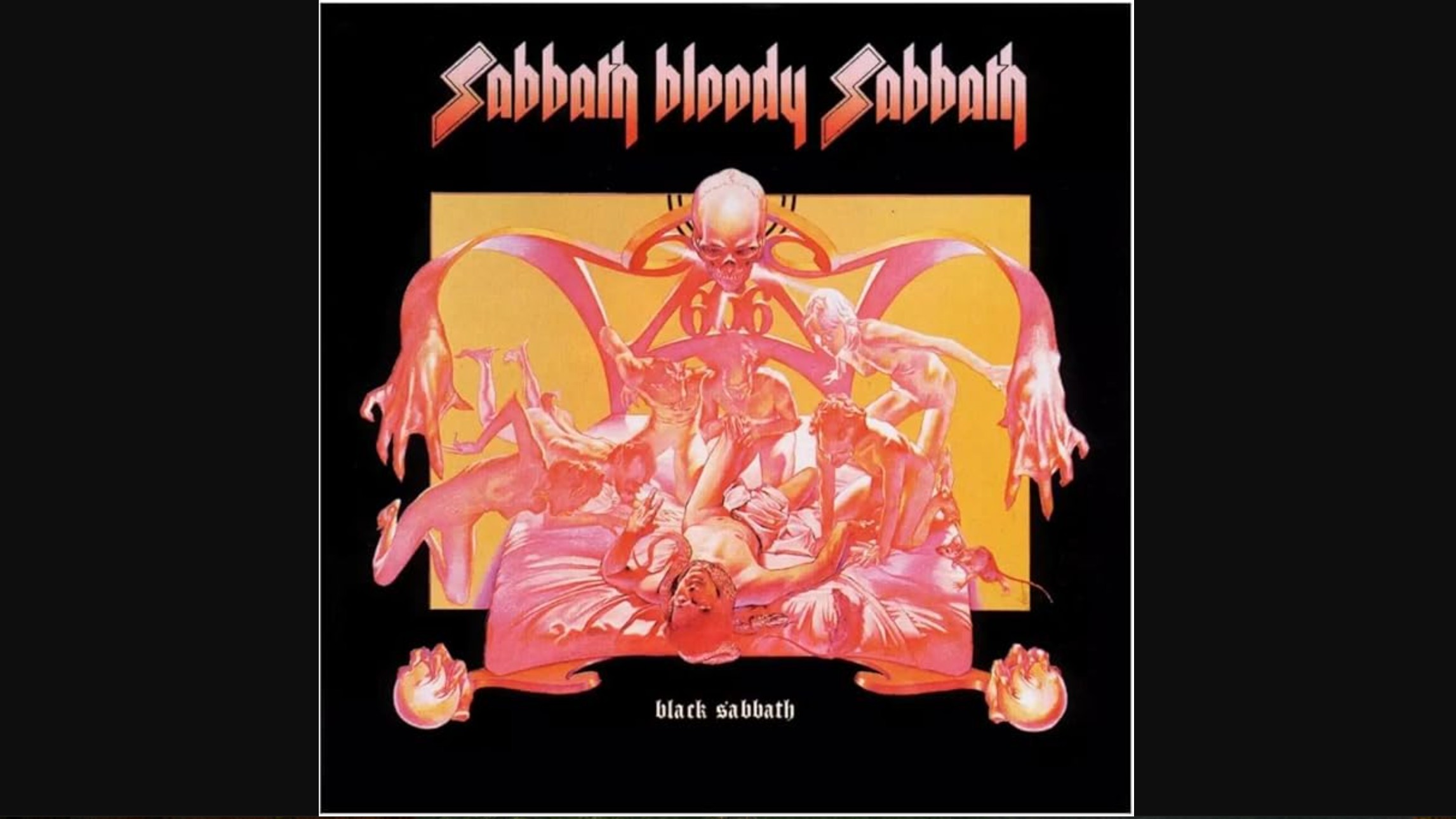
With 1973's Sabbath Bloody Sabbath, the band took this to the next level. Featuring artwork by Drew Struzan, who'd later gain fame illustrating posters for Star Wars and Indiana Jones, the cover's dual images—a man dying in torment surrounded by demons on the front, a peaceful death scene on the back—was heavy metal's first truly apocalyptic album art. It wouldn't, of course, be its last.

The cover's sophicticated and meticulous level of ghoulish detail established an approach that countless bands would adopt, while its conceptual focus on the duality of good versus evil also remains central to the genre today.
Lasting influence
Together, these visual innovations created a template that extended far beyond album covers, influencing everything from stage design to merch.
Elements such as gothic lettering, occult symbolism and apocalyptic themes were major influences on successive metal genres, including death metal, black metal, doom metal and sludge metal.
Today, as we mourn Ozzy's passing, we should remember that Black Sabbath's legacy extends far beyond their game-changing sound. They also established the principle that heavy music required equally heavy visuals, and proved that album art could be as transgressive as the music itself.

Tom May is an award-winning journalist specialising in art, design, photography and technology. He is the author of the books The 50 Greatest Designers (Arcturus) and Great TED Talks: Creativity (Pavilion). Tom was previously editor of Professional Photography magazine, associate editor at Creative Bloq, and deputy editor at net magazine.
You must confirm your public display name before commenting
Please logout and then login again, you will then be prompted to enter your display name.
