The Marvels gets an stunningly energetic new MCU logo
Symbolism puts the characters front and centre.
Sign up to Creative Bloq's daily newsletter, which brings you the latest news and inspiration from the worlds of art, design and technology.
You are now subscribed
Your newsletter sign-up was successful
Want to add more newsletters?
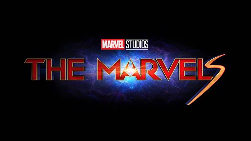
A new MCU logo has been released by Marvel/Disney, teasing the release of the upcoming sequel to Captain Marvel. Titled The Marvels, the film's logo had previously been presented with a colour palette more in line with the Captain Marvel logo tied to the first film.
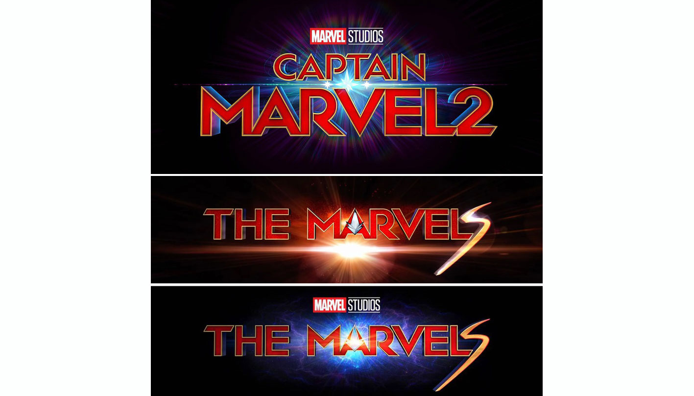
However, the revised version puts the hero's powers front and centre – with a new background colour and symbolic additions to the typography, earning it a place in our pick of the best Marvel logos. As the 31st film in the MCU, The Marvels will be a tie-in between Captain Marvel and Ms. Marvel – a TV show to be released on Disney+. This logo has echoes of both the logo attached to the first film and the TV show logo, and is also reminiscent of the Captain Marvel 2 logo that was presented during Disney Investor Day – proving its development has been a real journey.
If you don't yet have Disney Plus, find out how to get 15 per cent off a subscription.
Article continues below 
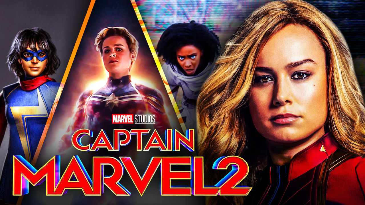
With reduced lens flare and a renewed blue colour palette transformed from fiery orange to a rich, cosmic blue, this logo focuses on Captain Marvel's powers – the ability to wrap herself in blue cosmic energy. But the logo also includes elements representing the other two characters appearing in the film – Kamala Khan's Ms. Marvel and Monica Rambeau (see the characters below).

The Spectrum symbol is a nod to Monica Rambeau's superhero persona, and has been integrated more fully into the letter A than in previous versions, and is now full of energy. The lightning-esque S at the end is there to represent Ms. Marvel and appears with less glare than before. Compare the three logo iterations below.

Marvel logos are always the source of much speculation, so we look forward to finding out how this design ties in with the plot and themes in reality. As we saw with the recent release of the Sonic 2 film logo, there could be some surprises ahead.
Read more:
Sign up to Creative Bloq's daily newsletter, which brings you the latest news and inspiration from the worlds of art, design and technology.

Georgia has worked on Creative Bloq since 2018, and has been the site's Editor since 2023. With a specialism in branding and design, Georgia is also Programme Director of CB's award scheme – the Brand Impact Awards. As well as immersing herself with the industry through attending events like Adobe Max and the D&AD Awards and steering the site's content streams, Georgia has an eye on new commercial opportunities and ensuring they reflect the needs and interests of creatives.
