There have been many Disney logos over years. As the animation company celebrates its 100th anniversary in October 2023 (it was founded as Disney Brothers Cartoon Studio on 16 October 1923), we're taking a look back at some of the best.
Disney has kept a tight grip on its corporate branding, and many know one Disney logo: the signature. But ta number of variations have cropped over the years, as the House of Mouse has extended from cinema to television and streaming, theme parks, retail and more. Below, we pick out the 10 best Disney logos, from ones you surely know to other hat you might not have seen before (for more inspiration, see our pick of the best entertainment logos).
The best Disney logos in 100 years
01. Signature logo

The core Disney logo, as the legend goes, is based on company founder Walt Disney’s signature. In fact, as many have pointed out, photos of Walt's original signature show it's nothing of the sort. What it does seem to be based on, though, is the founder's "official" signature, signed on his behalf by an employee thousands of times, to save Walt the bother.
Whatever the truth, this stylised cursive logo works beautifully in associating the brand with a warm, friendly and child-focused feeling. So much so, actors who play Mickey Mouse at Disney's theme parks are all taught to sign autographs using similar lettering. It’s an evolution of a logo that first appeared in 1939, and was later updated in the 1950s and 1970s, before this latest version appeared in 1985. Along with the classic logos of Coke, Nike and others, it's one of those logos we never want to see change.
02. Walt Disney Pictures logo (1985–2006)
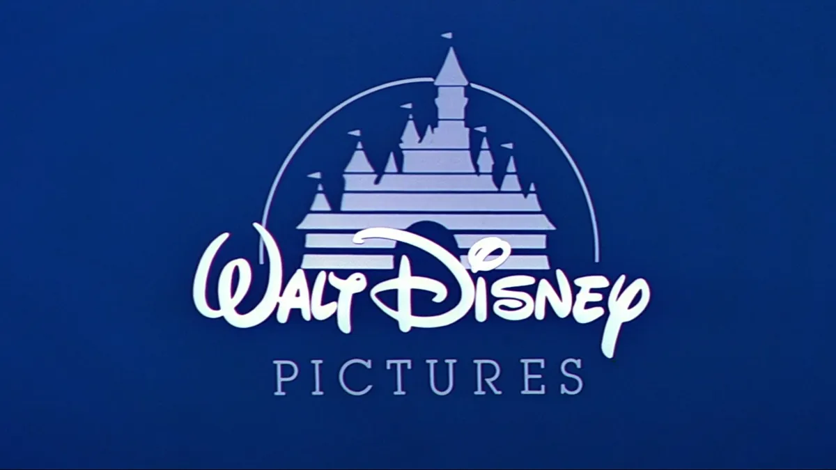
For decades, there wasn’t really a logo for Walt Disney Pictures: the studio's name just appeared at the start of the film, in whatever lettering suited the director. In 1985, though, the credits of fantasy animation The Black Cauldron introduced this classic logo design, which Disney continued to use over the next 21 years.
Bringing together Walt's signature with Cinderella's castle in a single, simple combination mark, the semi-circle recalls the elegant sweep of Tinkerbell's wand, while also representing the brand's global nature. Overall, this design performed a brilliant job of consolidating Disney's movie-making brand, in an era in which competitors like Don Bluth and Dreamworks were giving them a real run for their money.
03. Walt Disney Pictures logo (2006-2011)

The simple, flat nature of the Walt Disney Pictures logo served it well for two solid decades. But by the mid-2000s, it was sorely in need of an update, as new internet-savvy audiences were now expecting more colour, movement, definition and vibrancy in their media content. Replacing the simple castle graphic with a detailed, photorealistic CG scene, and giving a newly translucent, 3D look to the lettering allowed Disney to bring its branding firmly into the 21st century without throwing out the baby with the bathwater.
04. Disneyland logo

If you were wondering if all Disney logos have to incorporate the signature logo, then here's your answer. This wordmark for California's Disneyland resort, which opened in 1955, instead took inspiration from the kind of Gothic lettering associated with Grimm Fairy Tales. In all honesty, Disney's theme parks don’t have particularly thrilling rides or attractions, and trade more on the idea of being a fairytale wonderland 'where dreams come true', so this typographic choice was particularly well made.
05. Tokyo Disneyland logo

Although most elements of Disneyland theme parks worldwide are rigidly standardised, some variations are permitted to attract the local market. Thus the first resort to open outside the United States, Tokyo Disneyland, had a striking blue and gold logo that would have looked very strange anywhere outside of Japan. Within the south-east Asian nation, however, its space-age, geometric lettering made perfect sense. That design was updated in 1999 to the more streamlined, monochrome version shown above, which swapped Mickey ears for a castle emblem. As the castle in the actual park can be seen for miles around, whether you pass by on the train or motorway, it’s a particularly apt choice.
06. Tokyo Disney Sea logo

The citizens of Tokyo weren't content with just one Disney theme park, so in 2001 they got an extra one, right next to Tokyo Disneyland. As the name suggests, Disney Sea has a nautical exploration theme, and its logo emblem conveys this with beautiful simplicity, combining a minimal Mickey Mouse with waves formed subtly from negative space.
07. Disney Channel logo (1983)

First launched in 1983, The Disney Channel was a pay-TV service that featured a mixture of Disney classics and fresh programming. Originally marketed towards families, this imaginative logo conveyed everything the new channel was about, while staying eye-grabbingly minimal for the time. Another great use of negative space, the use of lines to represent a TV picture may seem strange to today’s youngsters. But in this pre-digital era, the low-definition PAL picture of broadcast television was made up of just 625 lines, so this graphic device would have made sense to viewers at the time.
09. Disney Channel logo (2014)

As both technologies and programming changed, the Disney Channel logo has undergone a lot of changes over the years. To our mind, it hit the sweet spot in 2014, at a point when the programming had become firmly focused on a pre-teen audience. Giving the classic signature logo a tweak by adding Mickey Mouse ears to the dot on the 'i', this fun and fresh logo is still in place today and leaves no doubt about who the target audience is.
09. Disney Tsum Tsum logo

First released in 2013, Disney Tsum Tsum is a range of stackable and stuffed toys based upon well-known Disney characters. Popular throughout south-east Asia and increasingly the USA, the name comes from the Japanese word 'tsumu' meaning 'to stack', and the brand has also expanded into mobile games. The Tsum Tsum versions of Disney characters are strikingly stylised and child-like, and the fun and funky Tsum Tsum lettering reflects this radical departure from Disney design norms. Meanwhile, to balance things out, the quotes tie it back to the more traditional style of the signature logo.
10. Disney Plus logo

Launched in 2020, with what couldn't have been better timing, Disney+ has been a great success. Providing Disney with a valuable revenue stream while cinemas and Disney theme parks were closed, it's now become an important platform for launching new content, such as the new live action Mulan movie. Although the Disney Plus logo might not seem like a great departure, the subtle curving of the '+' works quite brilliantly with the colour-gradiated curve, adding a sense of movement and dynamism that matches the fast-changing world of streaming video well. At the same time, it reduces down perfectly, and remains recognisable on even the smallest screens; a must-have requirement for any brand working in today’s multidevice world.
For more on Disney, see our guide to the 12 principles of animation).

