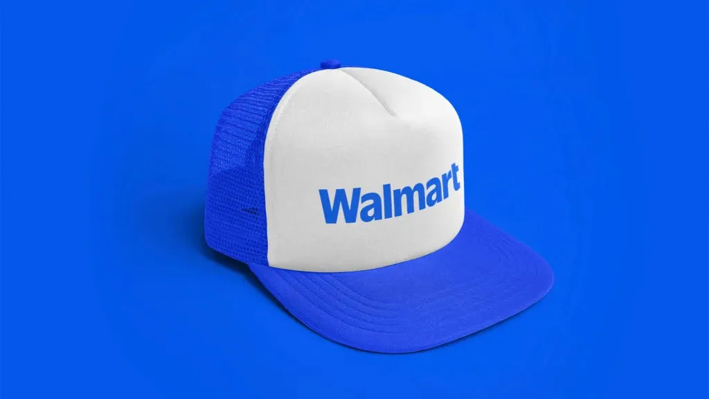
Without a doubt, the biggest design story of the week has been Walmart’s by-now infamous brand refresh. In partnership with well-regarded design house Jones Knowles Ritchie, the retailing behemoth unveiled its first major redesign in twenty years.
The brand’s essence is the same, but with a bolder and more rounded logo – clean and simply, just like all the best logos – as well as as a colour upgrade to blues and yellows that are deeper and more intense. The typography too has been updated, with a new font that is thicker and more impactful.
Yes, it’s an incredibly minor update to a company’s branding, and if that company were not the largest retailer on the planet, there is no way we’d be talking about it. But it is, and we are, and the reaction on social media has been swift, fierce, and pretty repetitive. You do not have to go far to find a million tweets, threads and posts along the lines of: ‘I can’t believe they paid for this’, ‘Some consulting firm fleeced them for $500M for this’, ‘They’re the same picture’, etc, etc.

I’ll admit that I did have a bit of a similar knee-jerk reaction at first. It’s easy to make fun, and the grandiose way that all these very minor changes were announced did feel a bit pompous. However, something that I think is quite interesting is that if you look past the noise and focus on what the design community is saying, the reaction has been very different – and overall very positive.
Many designers and branding experts across social media are pointing out that Walmart’s new look has been repeatedly and erroneously referred to as a ‘rebrand’ – which it isn’t.
Post by @bysnotleyView on Threads
Post by @hellomullerView on Threads
I think I'm the only person who thinks the new Walmart rebrand is solid.✅ Don't mess up the historical brand (hey Jaguar)✅ Slight tweaks to fit better into modern social✅ More pleasant to look at w/o being able to say why pic.twitter.com/980v86kmqwJanuary 13, 2025
It’s a brand refresh, and it’s a pretty good one. The colours do feel bolder and fresher, the font and logo do feel more impactful, but at the same time, there’s absolutely no danger of any consumers getting confused, or mistaking the assets for belonging to anything other than Walmart.
Post by @gregshumView on Threads
Post by @taylor.lorenView on Threads
Across the design press, too, the response has been enthusiastic. Our own editor Georgia Coggan wrote a glowing review of the refresh, describing it as ‘the truest definition of a glow up… a standout job in accentuating the best parts of the existing design to achieve the brand's aims.’
Elsewhere, Polly Hopkins of FutureBrand London argued in Design Week that changes in brand identity don’t need to be seismic when the business itself is not shifting its strategy or targeting a new audience. She invoked what has become a common counterpoint – the infamous, reviled, unasked-for Jaguar rebrand from late last year (which recent leaked letters have suggested even the designers weren’t happy with).
At Fast Company, Global Design Editor Mark Wilson was also impressed with Walmart and JKR’s efforts, particularly around colour choice, describing the new blue as having ‘the bright but pared-back vibe of IKEA… It seems to say, “Yes I’m here because I’m on a budget, but I do have taste.”’
Of course, all that doesn’t mean we can’t enjoy poking a little goodnatured fun at this minorest of minor refreshes. By far the best in this department has to be from Aldi USA, who took the opportunity to throw some good-humoured shade Walmart’s way on Instagram:

Even Walmart itself has got in on the meming action, posting a darkly portentous look at what could happen over the next century if the logo continues to thicken at its current rate…
The future is bright…and slightly more thick pic.twitter.com/sfBSkPd7s3January 16, 2025
And finally, with apologies for being this guy, I do think you have to admit that all this hullabaloo has caused millions of people to say, think and type the word ‘Walmart’ approximately 3.6 billion times over the past four days. And a retail giant like Walmart is never going to consider that to be a bad result, are they?