Ignore the hate, Walmart's bold new branding is the definition of a glow up
This is a refresh worth celebrating.

When a brand like Walmart refreshes its logo, the design world sits up and notices. It's one of the most recognisable logos on the planet thanks to the chain's dominance in retail – and the logo itself is an example of simplicity done exquisitely (as with many of the best logos). The brand has refreshed its identity for the first time in almost 20 years, and the result is the truest definition of a glow up.
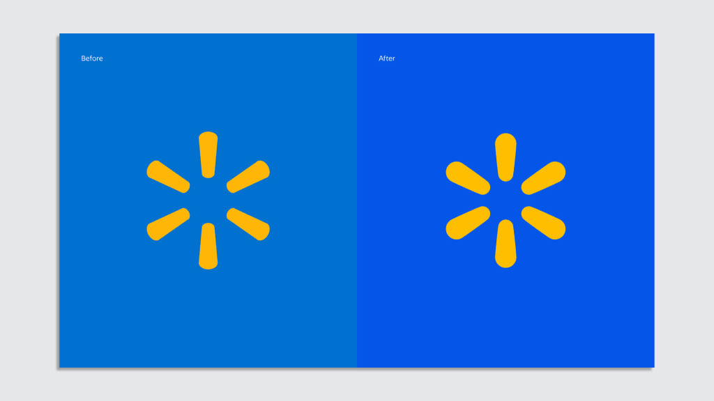
The iconic logo design has retained the same essence but the spark has been given a makeover in the form of bolder, thicker and more rounded shapes. Added to that, the whole identity has been treated to a colour upgrade. That means a brighter, warmer yellow and a deeper blue, known as 'True Blue' leading a range of new blues. And there's even a new typeface.
While parts of the internet are bemused over the 'subtle' changes, as a huge brand Walmart had no reason to change its logo completely – and the design team have done a standout job in accentuating the best parts of the existing design to achieve the brand's aims. It's these design evolutions that cement a brand identity in the mind of a consumer, and this version brings Walmart bang up to date.

Walmart teamed up with Jones Knowles Ritchie to create this stunning new design (that's the agency behind that sumptuous Burger King rebrand we awarded our favourite of the last decade, FYI). So what inspired the first major redesign for Walmart in almost 20 years?
According to a statement from CMO William White, the new look aims to cement the brand as a "an inspirational, digital retailer", while celebrating the brand's heritage.
"While the look and feel of our brand is more modern, our refreshed brand identity reflects Walmart’s enduring commitment to both [founder] Sam’s principles and serving our customers however they need us," he says.
A post shared by William White (@williamawhite)
A photo posted by on
As the Instagram video above shows, the new typeface is one element that draws on the brand's roots. The new sans-serif, that follows the spark in being thicker and rounder, was inspired by a hat worn by the founder in a photo from 1980. The typeface on the hat was Antique Olive, and the JKR team worked to make it bolder to suit a new era for Walmart – replacing the version of Myriad Pro that's been in action since 2008.
Sign up to Creative Bloq's daily newsletter, which brings you the latest news and inspiration from the worlds of art, design and technology.
The logo and wordmark are to be separated, which is a smart move for digital, and the new, thicker design on both will allow them to carry more weight when standing alone on screen.

Seeing the two versions next to each other proves the success of the project. When paired with the new iteration, the old (on the left) looks faded and a bit dingy – something I certainly never thought before the new one was created. The new logo design looks equally as meant-to-be, leaving the old version paling in comparison to those luscious new shapes. That thought of "wow, why hasn't it always been like that?" is symbolic of a job well done, and especially brilliant when the new design is a tweak rather than a total overhaul.
If you love awesome rebrands, see our pick of the best rebrands by decade.

Georgia has worked on Creative Bloq since 2018, and has been the site's Editor since 2023. With a specialism in branding and design, Georgia is also Programme Director of CB's award scheme – the Brand Impact Awards. As well as immersing herself with the industry through attending events like Adobe Max and the D&AD Awards and steering the site's content streams, Georgia has an eye on new commercial opportunities and ensuring they reflect the needs and interests of creatives.

