"Serious identity issues": HBO's new Max rebrand is raising eyebrows

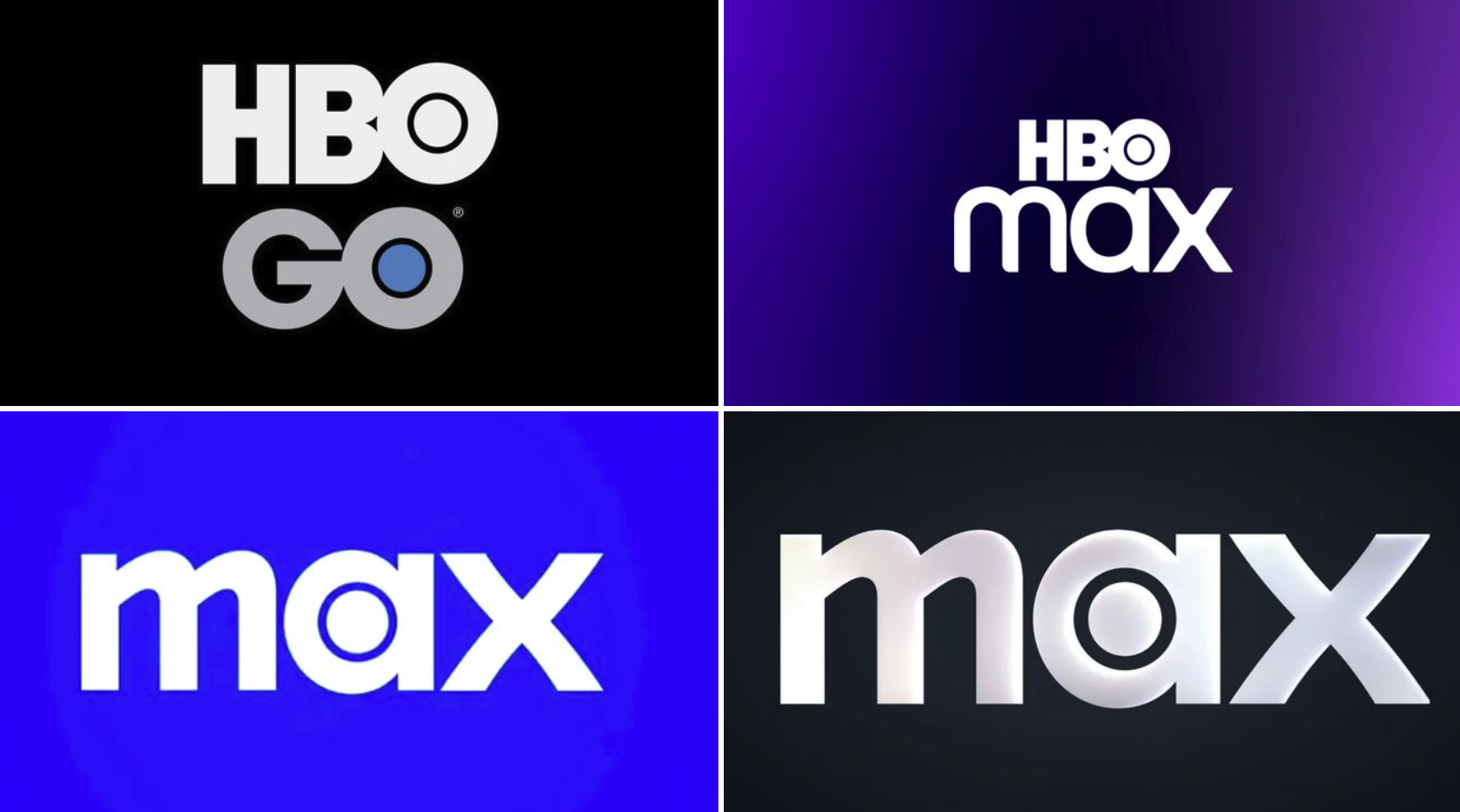
Ah, HBO Max. Sorry, I mean just Max. Warner Bros Discovery's streaming platform did away with its association with HBO back in 2023, prompting all manner of confusion. Viewers mourned the loss of the prestige that the HBO name carries, and mocked the need for a new 'The one to watch for HBO' strapline in the absence of the network's name. And now, somehow, Max has managed to make things even more confusing.
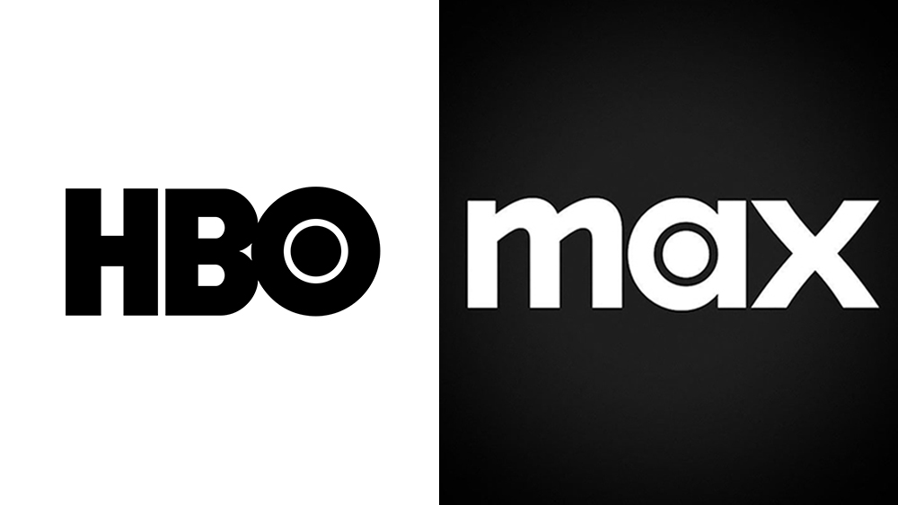
Max has launched a new monochrome colour palette, with white text and a black background replacing the previous striking blue. And as many have pointed out, it suddenly looks a lot more like the also monochrome HBO logo. The first rule of the best logos is that they could never be mistaken for something else. Guys, do you want to be associated with HBO or not?

As spotted by Variety, the new visual identity was dropped quietly this week, without a press release or any fanfare at all from Max itself. But the brand's comments on its previous rebrand, which included the shift from purple to blue, might shed light on the decision. "There’s different types of blue, and if you put us in juxtaposition to Disney or Paramount or Prime, they look different,” CMO Patrizio Spagnoletto said in 2023. “With our blue and the way that the logo is designed, what we were going for is a combination of premium but accessible... Consumers will tell us if we got it right, and we think we did. But there’s enough room in the world of blue to still differentiate ourselves."
Article continues belowWell, judging by the fade to black, it seems consumers might have told Max it didn't get it right. But in launching new branding that's much closer in style to that of HBO's isn't going down particularly well either.
At some point this year they're going to "rebrand" it as "HBO Max" and act like it was an original thought. https://t.co/OjKe5crFIZMarch 30, 2025
The idea WBD had this incredibly valuable and premium and imprinted-on-the-consciousness brand, and decided to completely junk it, is going to go down as one of the absolute dumbest corporate moves of all time. https://t.co/31oMSowtA7March 30, 2025
Tonight my wife asked which app White Lotus is on. I said "Max" and she said "what's Max?" They really knocked this whole thing out of the park. 10/10 marketing. https://t.co/z4rKNF2AQKMarch 31, 2025
Indeed, it's hard to deny the sense of a brand trying wriggle out of a mess of its own making. If Max continues to correct course with each subsequent refresh, it won't be long until it adds HBO back into the name. Hey, maybe it'll even get rid of the Max.
Sign up to Creative Bloq's daily newsletter, which brings you the latest news and inspiration from the worlds of art, design and technology.

Daniel John is Design Editor at Creative Bloq. He reports on the worlds of design, branding and lifestyle tech, and has covered several industry events including Milan Design Week, OFFF Barcelona and Adobe Max in Los Angeles. He has interviewed leaders and designers at brands including Apple, Microsoft and Adobe. Daniel's debut book of short stories and poems was published in 2018, and his comedy newsletter is a Substack Bestseller.
You must confirm your public display name before commenting
Please logout and then login again, you will then be prompted to enter your display name.
