How to achieve expressive life drawing an an iPad
Artist Rick Graham shows us how he captures a live figure session using an iPad app that replicates real paint.
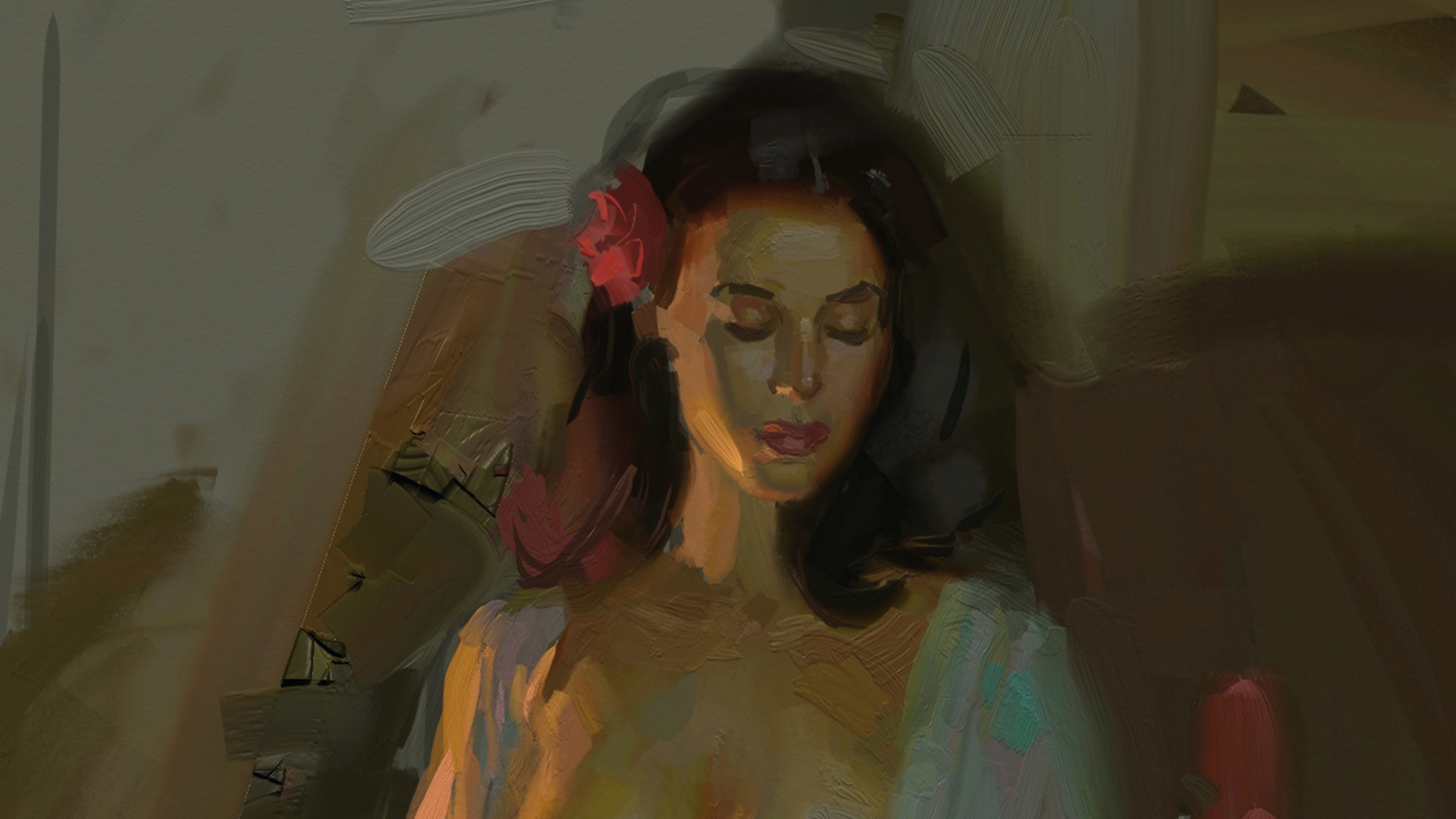
I’ve long admired the expressive brushwork of painters like John Singer Sargent, Joaquín Sorolla, Frans Hals and Anders Zorn. Their alla prima technique – wet-into-wet painting – emphasises bold, abstract strokes that feel fresh and unlaboured. It’s a style I continue to pursue in my own work, using oils, slow-drying acrylics, and even in an app on an iPad.
Yep, an iPad. Figure drawing on an Apple tablet is as viable as on any of the best drawing tablets. For me, digital painting doesn’t replace the studio – it extends it. For artists rooted in traditional methods, it’s a way to keep creating wherever inspiration strikes.
It's a portable paint box, ideal for capturing quick studies in places where setting up paints would be impractical. Whether it’s a fleeting sunset, a crowded pub or a study in a museum, where it lets me work up close without the fuss of materials.
ArtRage has been my go-to app for digital painting for years as it stands out for its ability to replicate the viscosity and texture of real paint, from delicate glazes to thick impasto. The latest version, ArtRage Vitae, has a place in our pick of the best digital art software and offers an incredibly natural experience when paired with an Apple Pencil.
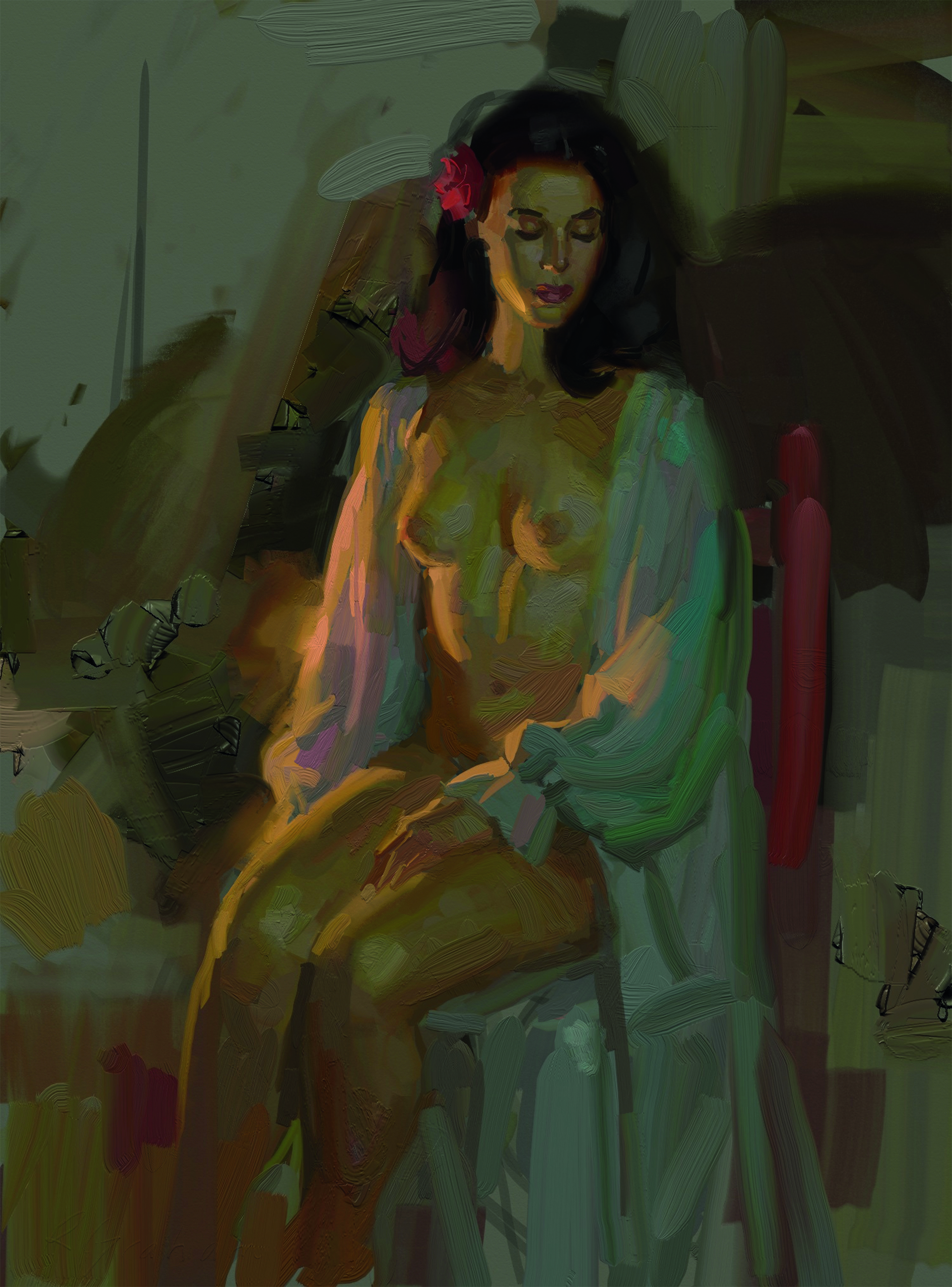
Today’s iPad apps have expanded what’s possible. Procreate, Infinite Painter and Rebel offer powerful tools for artists of all styles, but for painters who favour traditional methods, ArtRage remains uniquely tactile and intuitive. Below, I'll show you how I use it with an example of a piece from an iPad figure drawing session.
01. Mounting the iPad
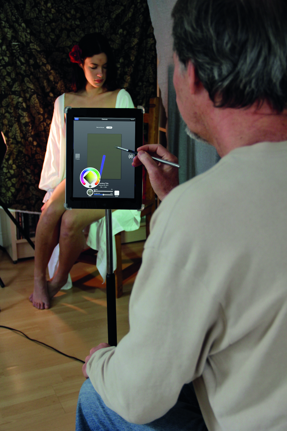
Whenever I can, I prefer to mount my iPad on an easel for hands free use. Pictured is the GigEasy iPad Mount with 360 degree rotation, allowing a horizontal or vertical orientation. It also leaves the dock connector exposed so you can charge or connect the iPad. However, most portable easels work well and are less expensive.
02. Selecting the surface to paint on
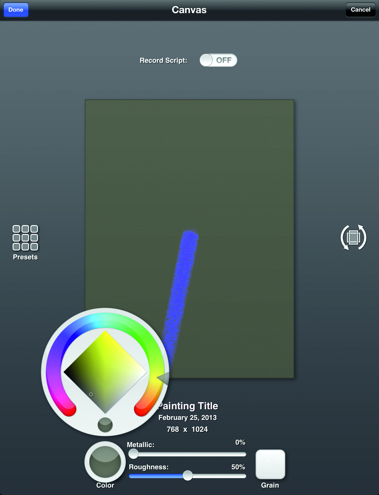
Once I’ve selected ‘New Painting’ in the gallery page, several options for painting surfaces will appear. Tapping Color brings up the Color menu and allows me to select any colour I wish as a base tone for my canvas. Finally, Tapping Grain allows me to pick from a selection of canvas textures. For this painting I’m choosing Fine Canvas with vertical rather than horizontal orientation (middle right icon). So now I’m ready to start painting. Clicking on the canvas will take me into the program.
03. Beginning to paint
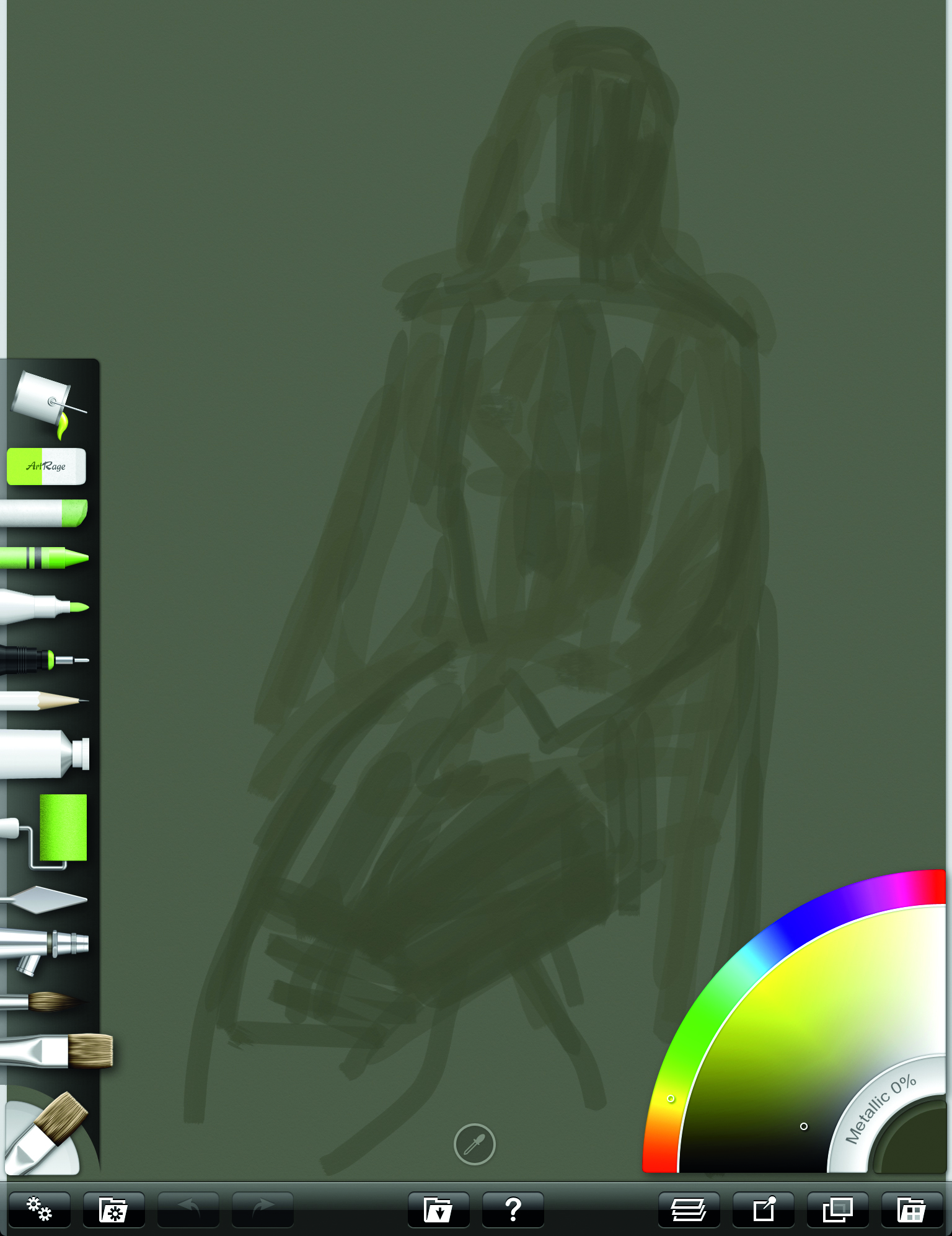
On the left side is a list of tool options called a Tool Pod. Being the oil painter that I am, I choose the Oil Brush tool and begin to do a loose block in of the figure. This is a very rough indication of the size and placement of the figure without concern for detail. At this stage I use a broad sized brush. Brush sizes can easily be changed with a three-finger slide up and down the screen.
04. Starting to refine the drawing
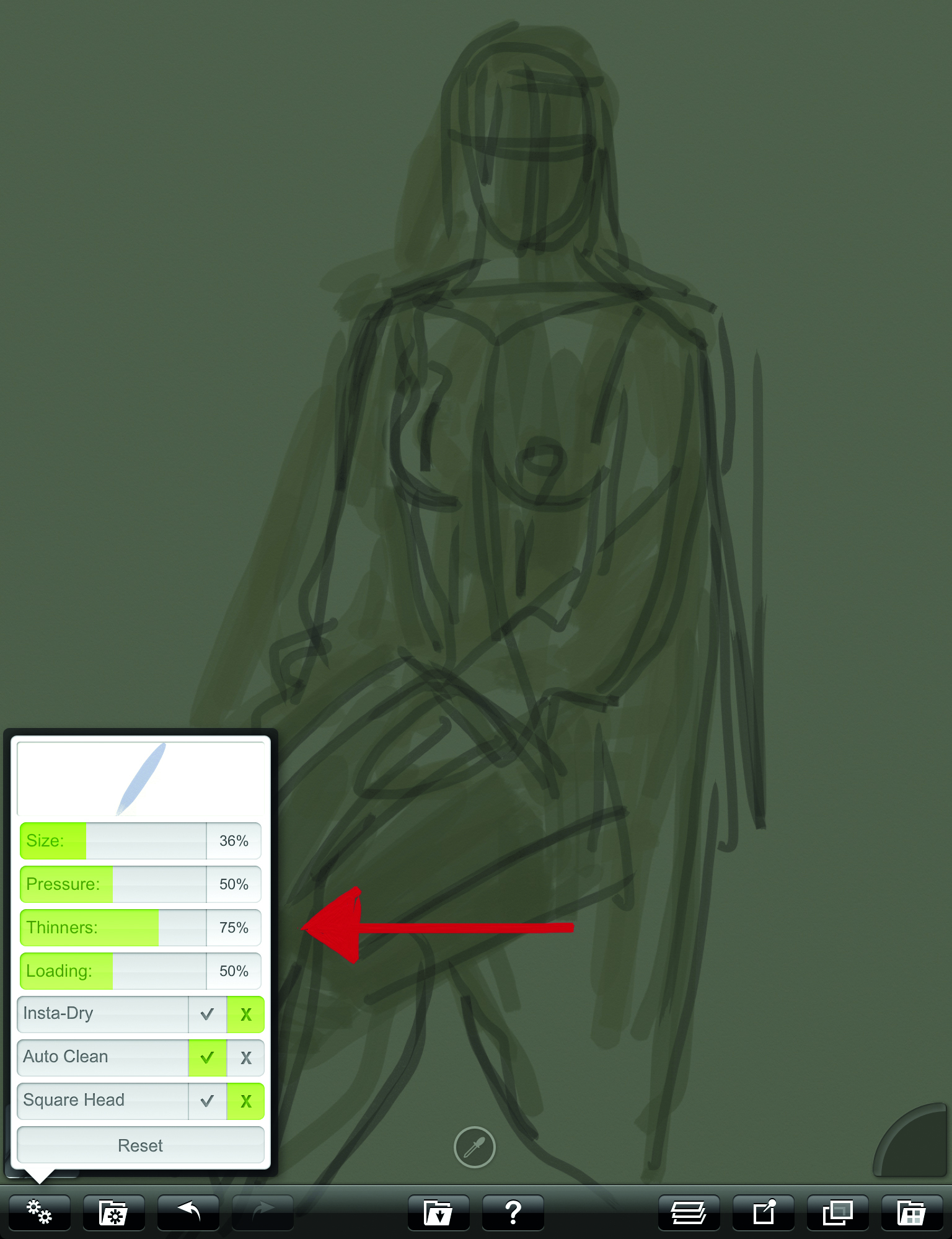
With a smaller brush and a slightly darker colour, I make a second pass over the loose sketch to start refining the shapes. Each of the tools contains a menu of options. From the Oil Brush tool menu, I’m choosing to keep my paints thinned down at this stage. It’s similar to my studio painting process where I thin down oils using mineral spirits during the early block-in stage.
05: A further refined pencil sketch
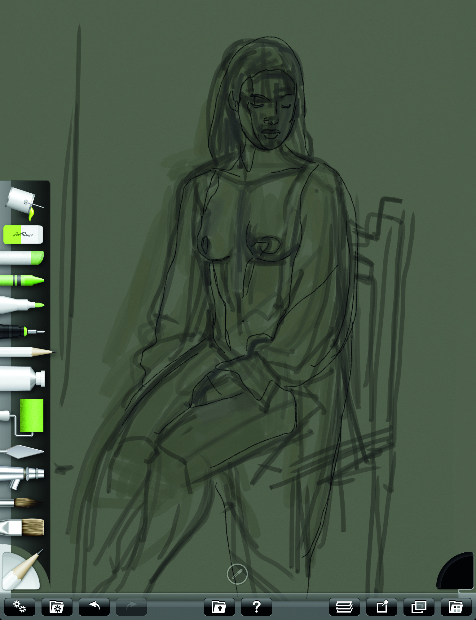
I’ll now make a third pass over the drawing with an even more refined line using the Pencil tool. (Notice the selected tool appears in the lower left pod). I make this pencil sketch on a separate layer so that when I’m ready to apply colour I can do so under this layer, preserving the line. This way I can paint loose and free without fear of losing the drawing. It’s a great digital advantage I only wish I could do with real oils!
06: Adding colour
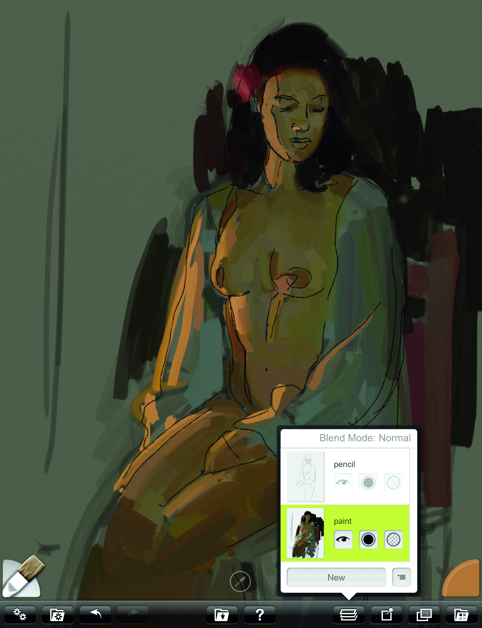
As you can see in the Layer menu, a loose block-in of colour is being applied under the pencil sketch. My first task is to set the stage for my value relationships by painting in darkest darks and lightest lights first. This allows me to better gauge the middle tones which can be tricky without these value comparisons.
07: Less thinner
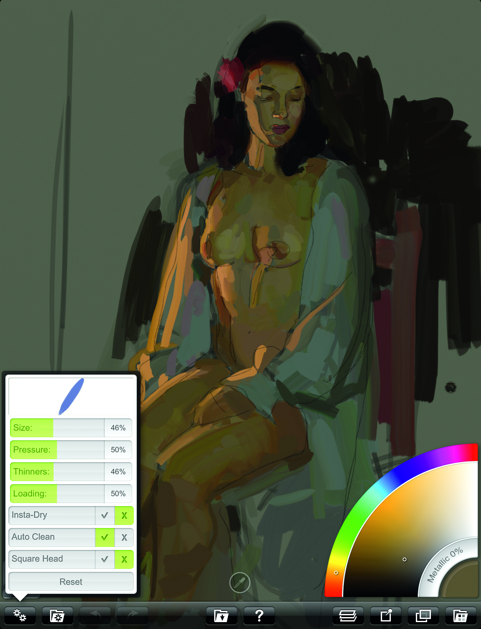
I gradually reduce the amount of thinner and apply thicker paint. Like the ‘fat over lean’ oil painting advice, this makes wet in wet painting easier and adds variety to the paint strokes. I reduce the opacity of the pencil layer so the paint is more dominant. I can bring this back if I need to revisit the drawing.
08: Colour picking
As more colours are applied to the painting I find less need to create new ones from the Color Pod and instead, pick them off the painting using the Sample Toggle located bottom middle. When this icon is tapped, the Sample Toggle image will appear in the Tool Pod. This lets you know you are ready to select a colour from the canvas to use for your next stroke.
09: Zoom in, zoom out
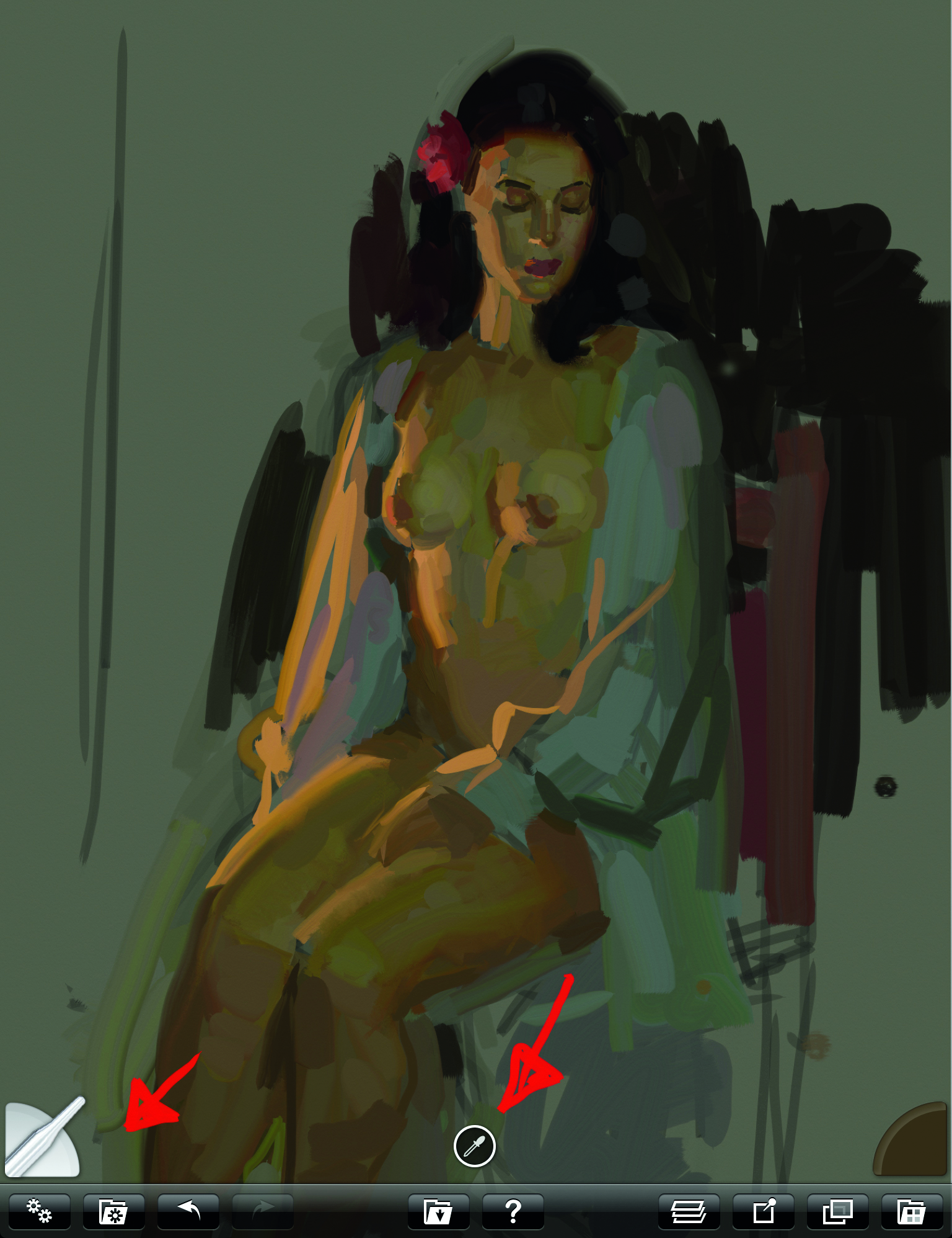
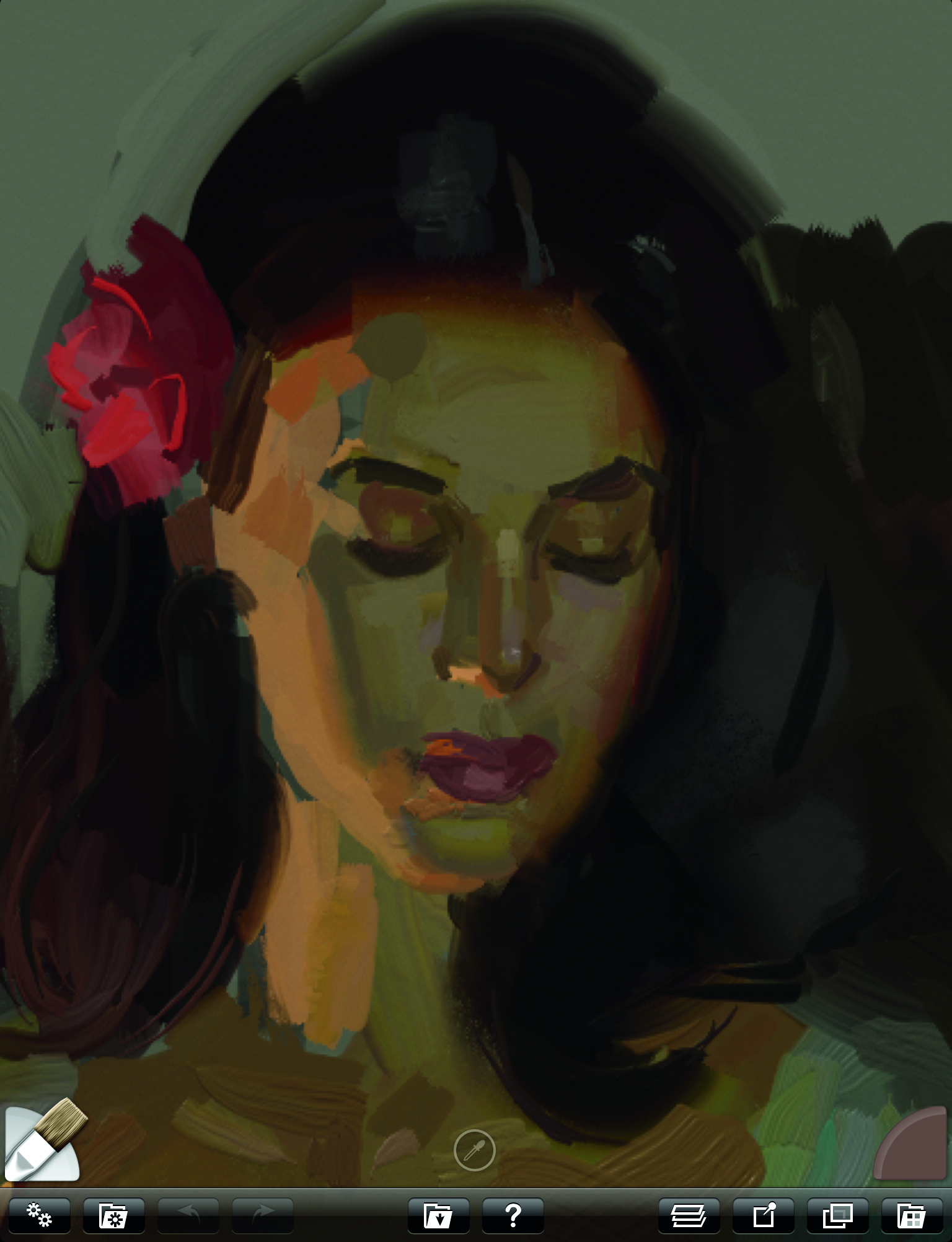
Two fingers dragged apart bring the head close up for some refinement work. I try to retain the freshness of the alla prima brushwork by avoiding too much detail or smoothing out too many strokes. A single tap of two fingers takes the image back to original size so I can see how my refinements fit with the whole painting.
10: Using the paint tube and pallet knife
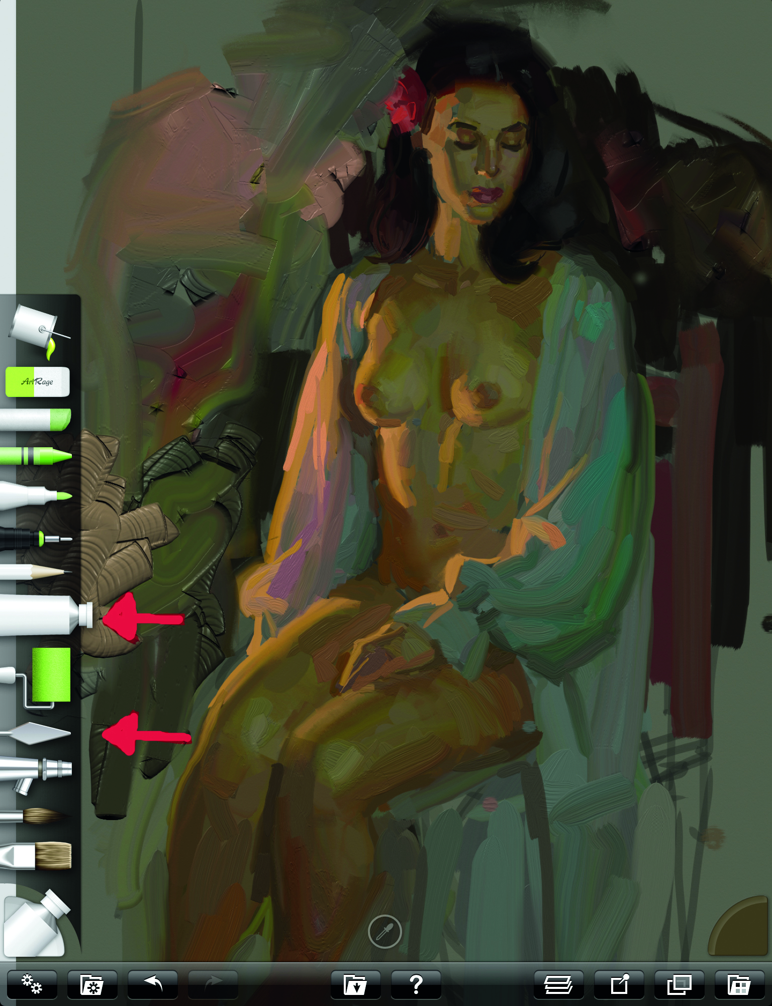
I now start tossing in some abstract I now start tossing in some abstract background colour. The Paint Tube tool is a fun way to squirt down thick paint which can then be blended and smeared with the Pallet Knife. The Pallet Knife contains a number of menu options, my favourite being Hard Out Smudge and Just Blend Colour. The Paint Roller, located just below the Paint Tube, is another pleasing way to apply and spread colour.
11: Glazing
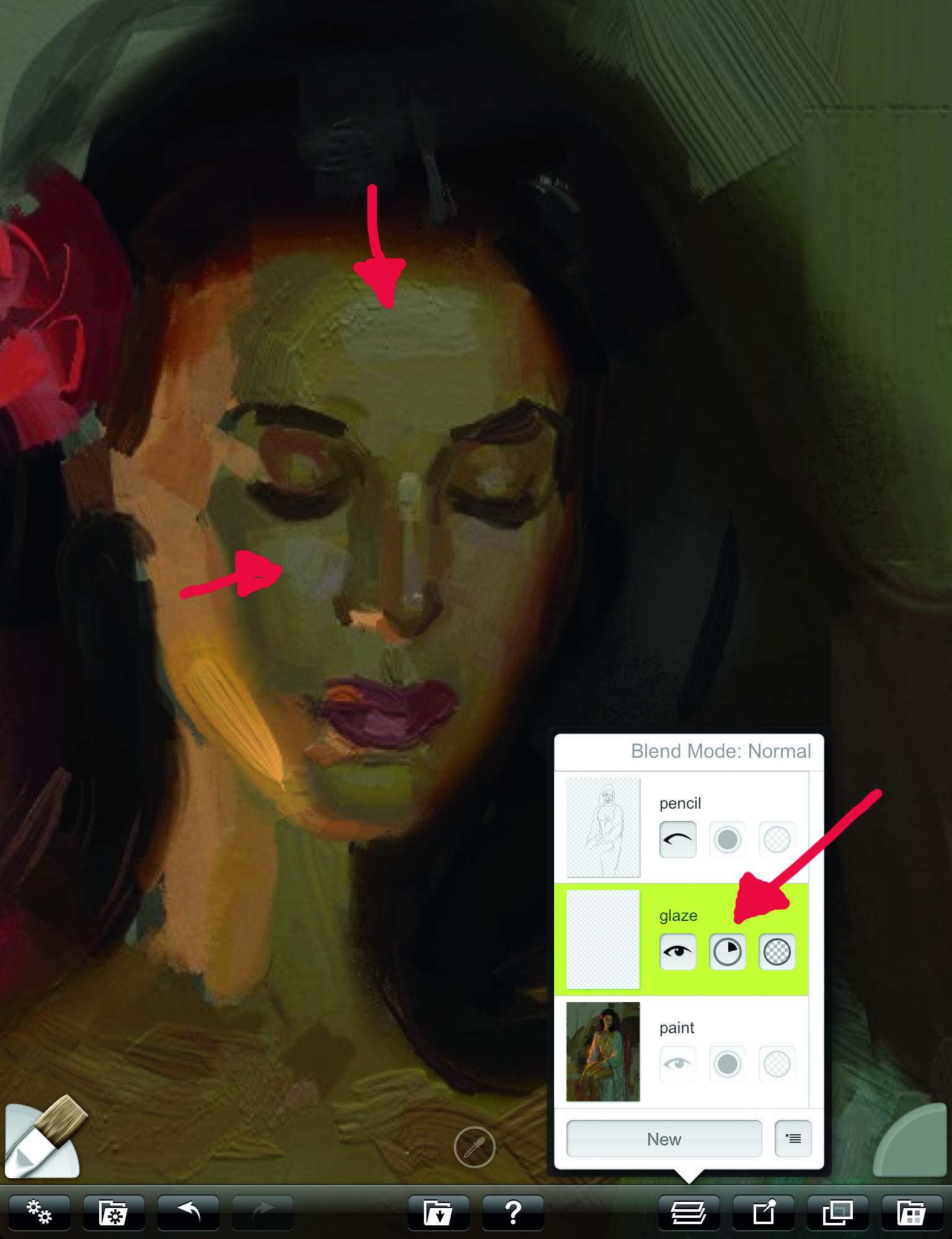
I'm now going to apply a thin glaze (transparent wash) on the face where I want to slightly lighten and cool the forehead and cheek. I do this by creating a new layer where I can adjust the transparency by spinning the circle you see next to the red arrow in the Layer Menu. This allows me more control over the amount of transparency I’m giving to the glaze.
12: Final touches
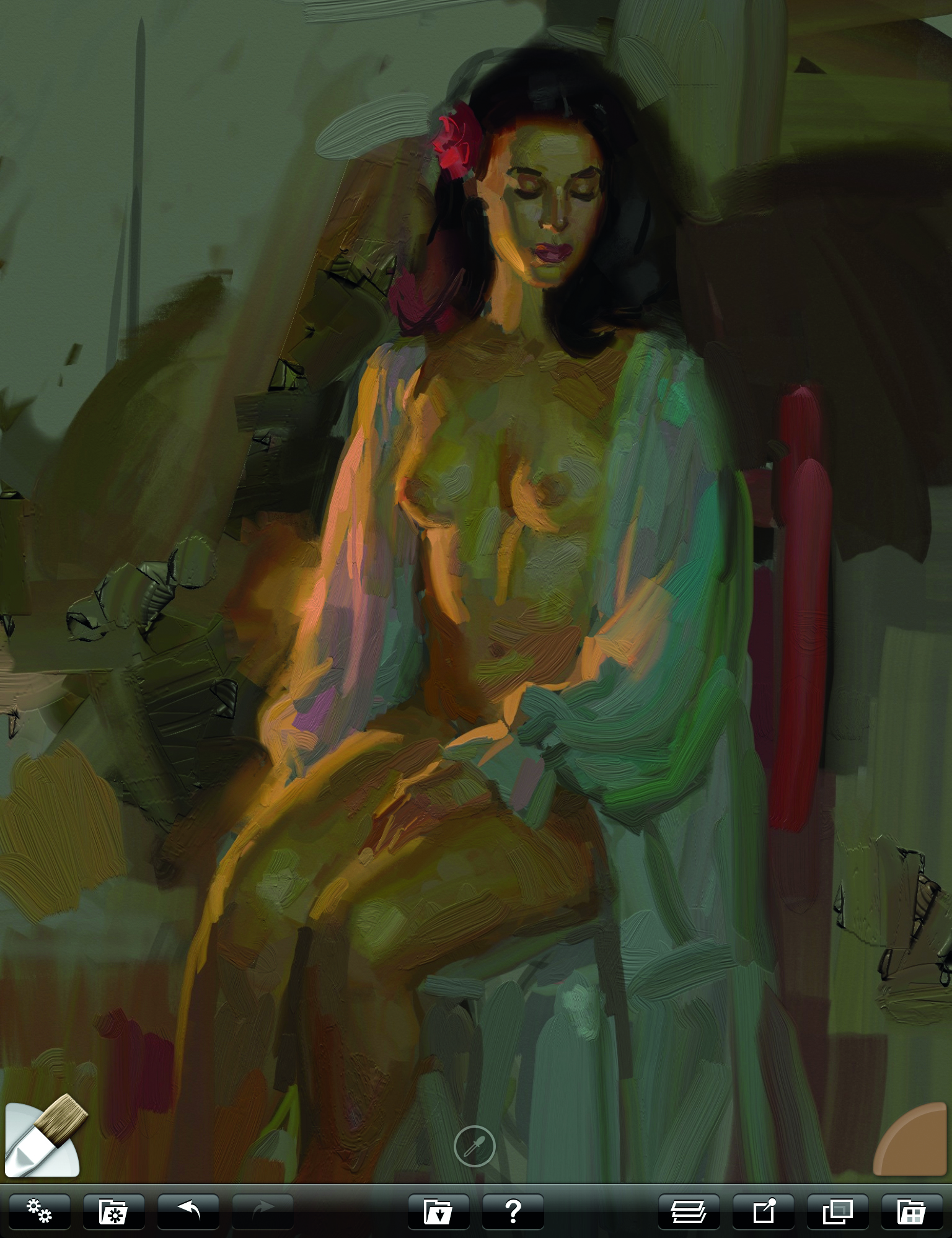
The Oil Brush thinner is set quite low now as I apply mostly thick paint to finish up. A variety of thick and thin paint, along with a good mix of hard and soft edges, will add interest to the painting. I can add some atmosphere to the light on her right sleeve by smearing some of its colour into the background. The session on the iPad is finished and I now have a colour study which I can use in my studio as reference for an oil painting.
For more tips, see our piece on digital plein air painting. And if you're not sure which iPad to use, see our guide to the best iPad for art.
Do you have any tips for figure drawing on an iPad? Share your advice in the comments below.
Sign up to Creative Bloq's daily newsletter, which brings you the latest news and inspiration from the worlds of art, design and technology.
Rick Graham is a professional illustrator, animator and art teacher, who has a permanent exhibition at Springville Art Museum. www.rickgrahamart.com
You must confirm your public display name before commenting
Please logout and then login again, you will then be prompted to enter your display name.
