Mobile website design: Why is it important and what is the process?
Hereford College of Arts lecturer and students reveal what makes great mobile design.
With smartphones now arguably the world's most coveted commodity, it's not hard to see how online search on a mobile device has risen dramatically in recent years. However, when you compare the user experience on desktop and mobile, it's often the latter that comes out somewhat lacking.
As web and UX designers, now more than ever, it's crucial to deliver websites and content that cater to an audience's needs, no matter what device they may be using (for more advice see our mobile website design tips).
If you’re working toward bettering your mobile UX, stay tuned, as Innes Jones, BA (Hons) Graphic & Media Design Course Leader at Hereford College of Arts (HCA), walks through the process of mobile website design, using two standout student examples to demonstrate.
"Designing for screen features highly as part of the BA (Hons) Graphic & Media Design course at HCA," Jones explains. "Students learn UI design through workshops led by industry active tutors and technical demonstrators. Working with a combination of Adobe Photoshop, Adobe Illustrator, Adobe After Effects and Adobe XD students produce functioning, responsive prototypes for mobile sites, these sites are then published through the Creative Cloud and can be viewed on authorised mobiles.
"The following examples show elements of two, second-year student creative journeys, which build on the knowledge, gained from previous projects and workshops in the students first year."
Macha - Alix McGreggor

"Alix decided to use her favourite health food ‘Macha’ as the subject to promote and develop" says Jones. "Students were not tasked to rebrand their chosen product, but Alix was keen to do so."
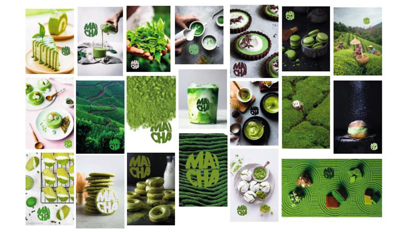
"Alix created a mood board using Photoshop to define a UI visual style for the screens and test the new identity in context," Jones explains.
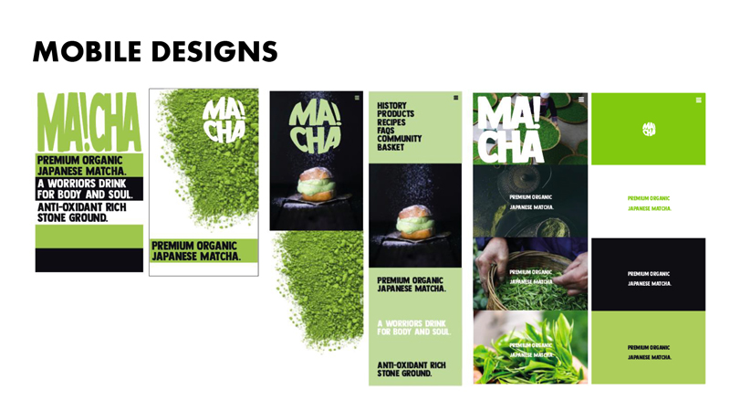
"These images are quick drafts created by Alix of mobile website designs," Jones says. "She has looked into some text-led designs, minimalist design, and image-led designs, and, after discussion with tutors, opted for the latter."
"I respond to photography more than anything, so I knew this was the approach I wanted for my website'," McGreggor adds.
"Our students learn about a wide range of small screen UI design principles during the course," Jones explains. "Alix was focusing on making information easy to find, making buttons large enough to work with different finger and thumb sizes, using fonts with good legibility and at appropriate sizes for clarity and keeping designs simple."
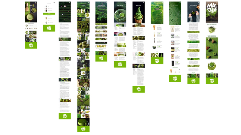
"These are all the UI designs for the pages," Jones says. "Adobe XD creates a map of how all the pages look, so continuity can be achieved. Alix tried to avoid too much scrolling and included the Macha logo as a footer on each page. Images were selected from the mood board and added appropriately."
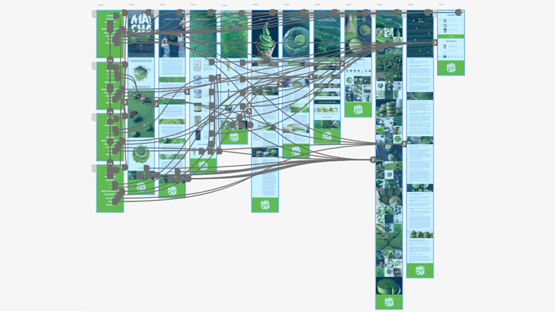
"This image shows the prototype view of Alix's website, revealing the connections and transitions through the site," says Jones. "This looks very complicated but actually, in practice, Adobe XD makes this easy by allowing the user to drag links across the screen to the pages they wish to link to. When all the links are visible, the designer can see which elements link to which pages.
"On the left, you can see the lime green pages, these are the navigation menu which pops out from the side when you select the hamburger icon. Alix wanted to make the whole page the menu to keep it clean, fresh and minimalistic, as otherwise the site is quite busy."
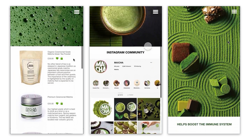
"Here are three example screengrabs of Alix's final mobile site promoting Macha," says Jones. "Students went on to make a larger desktop version of each site, making their designs truly responsive."
Binge Me - Mia Booth
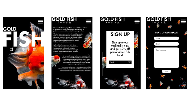
"Mia created the pages above during two digital workshops, one focusing on UI design and another working with technical aspects of prototype building," says Jones. "This set of designs were a trial run for Mia's chosen project.

"Mia wanted to create a site named 'Binge Me' focusing on the best of entertainment for a young adult age group," Jones explains. "The site has a particular focus on animated films, so Mia spent much time sampling images from cartoons and animations to create a graphic style that provided continuity through shape, colour and typography."
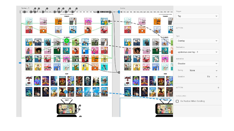
"This grab shows not only the high number of films featured within the site but also the mini TV player, which Mia created to showcase choices," Jones adds. "Adobe XD helps designers by creating a visual map of links that means multiple pages and links can be employed."
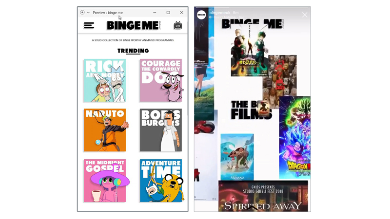
"Above are two screen grabs from Mia’s completed mobile site," says Jones. The first image has a Hamburger menu and a link to the mini TV, which showcases the films on offer. The right image is a screengrab from an animated Instagram story that promotes Mia's mobile site.
"Hopefully these examples have provided you with some inspiration for how to design or revamp your mobile website," Jones says. "Just remember to keep things simple when designing your website. Include only what is necessary while giving your page a welcoming feel. A mobile website is a necessity in this day and age."
If you want to find out more about the mobile design process as part of the BA (Hons) Graphic & Media Design course at Hereford College of Arts, or if you have a passion for graphic design and are contemplating the next step in your journey, join HCA for its virtual open day on Saturday 7 November at 10:00 (GMT). Here you can speak directly to Innes Jones about the course, plus talk to HCA graduates about their student experiences. Alternatively, you can find out more, by contacting Innes Jones on social media @graphicdesignhereford.
Sign up to Creative Bloq's daily newsletter, which brings you the latest news and inspiration from the worlds of art, design and technology.

The Creative Bloq team is made up of a group of art and design enthusiasts, and has changed and evolved since Creative Bloq began back in 2012. The current website team consists of eight full-time members of staff: Editor Georgia Coggan, Deputy Editor Rosie Hilder, Ecommerce Editor Beren Neale, Senior News Editor Daniel Piper, Editor, Digital Art and 3D Ian Dean, Tech Reviews Editor Erlingur Einarsson, Ecommerce Writer Beth Nicholls and Staff Writer Natalie Fear, as well as a roster of freelancers from around the world. The ImagineFX magazine team also pitch in, ensuring that content from leading digital art publication ImagineFX is represented on Creative Bloq.
