10 things they probably didn’t teach you about print in design school
Leaders in print for designers Route 1 Print reveals the essential things to consider when approaching print-based work.

In this ever-expanding digital world, it can be easy to forget the power of print design. But print is most definitely not dead and, done properly, can produce work that is extra special.
However, the ‘getting it right’ bit is vital to this outcome – and that’s where leading print and design company Route 1 Print can help. As experts in their field, the Route 1 team has put together this helpful list of pointers for creatives to consider when preparing artwork for print:
01. Dealing with ‘the blues’
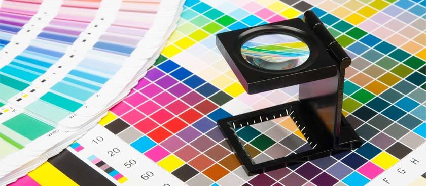
Being accurate with colour percentages is vital to get good quality prints. If you’re finding your blues are being printed with too much purple, increase your cyan value to 30 per cent more than the Magenta to avoid this happening.
02. Avoid banding
Banding is a universal annoyance for many a designer. Prevent headaches with banding by avoiding gradients with small ranges. Instead, add blur or soft noise effects and don’t use KPEG compression.
03. Does your artwork need overprinting?
Always check with your printer whether your artwork requires overprinting, the feature that stops the mixing of colour when printed on top of one another. Overprinting also stops colours knocking out other and ensures no parts of your design are unwantedly overlapped – it’s a technique that can lead very interesting visual effects within a design.
04. Correct font sizing

It may seem like an obvious one, but you’d be surprised by how many designers get caught out by using the wrong sized font when printing. Fonts should be no smaller than 6pt to be visible when printed, and if the font you’re using contains very fine lines, make sure to add thicker strokes to aid visibility.
05. Font formatting
Just as important as font size is font formatting. By converting your text to outlined, not only will you avoid blurring, but the text will also keep its shape, even with large format items.
06. Rich black
To get the actual colour black when printing, you must create what is often referred to as ‘rich black as solid black areas aren’t dark enough and print as more of a grey. To do so, create a specific colour including cyan, using the following values: C30 K100.
07. Dots per inch (dpi)
Dots per inch or dpi refers to the output resolution of a printer – a value that it is imperative to get right in order to achieve the correct print quality. For full-scale printing you should use an image resolution between 300-400 pixels per inch. However never go above 400dpi for greyscale.
08. Optimum quality images
This may seem like a no-brainer, but make sure to always choose vector illustrations or original digital images for optimum image quality in print. Web images or printed documents will no doubt be lower resolution, quality images and will therefore have an impact on the final printed product.
09. Always check the preview
Print preview is there for a very good reason, so make sure you take full advantage of it. Check for any unwanted spot colours by displaying the preview (Advanced > Print Production) in your PDF to save a lot of time, hassle, and potentially money later on.
10. Beware of folded items
Printing folded items need extra care and attention. Be wary of heavy ink coverage, especially. If a dense area of colour is along a crease, cracking can be caused by the volume of ink being absorbed by the stock. Use lighter colours over folds for a smooth finish.
Printing power
If you think you’re still in need of a little help when it comes to the art of print design, never fear, Route 1 Print are here to help. As the UK’s fastest growing trade printer, Route 1 Print has everything you need make the process as simple and stress free as possible.
Whether you’re working as a freelancer or in a digital studio that outsources print, the team act as your silent print partner, offering a range of printed products, from business cards to exhibition banners to print resellers through an easy-to-use website. And with over 30 years experience in the industry, no hidden fees, presses no older than three-years-old, and 99.6 per cent of all jobs dispatched on time, you’re definitely in good hands. For further information on products and services, visit the Route 1 Print website.
50 Must-Read Tips From Designers, To Designers

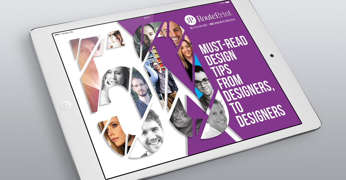
As well as providing services and top advice on all things print, the Route 1 team has also been busy collating expert tips and tricks on all things design in a new eBook ‘50 must-read design tips for designers from designers’.
Packed full of useful advice to help you become the best creative you can be, the must-have design resource includes new ways to develop your creative skills and ideas, how to strengthen your own design identity and improve client relationships, reveals the fonts the experts never use and much more!
You’ll also find super-helpful practical techniques and advice on new ways to look at the design process from influential graphic designers such as Jacob Cass and Brent Galloway. So what are you waiting for? Download your copy of this free ebook today.
Sign up to Creative Bloq's daily newsletter, which brings you the latest news and inspiration from the worlds of art, design and technology.

The Creative Bloq team is made up of a group of art and design enthusiasts, and has changed and evolved since Creative Bloq began back in 2012. The current website team consists of eight full-time members of staff: Editor Georgia Coggan, Deputy Editor Rosie Hilder, Ecommerce Editor Beren Neale, Senior News Editor Daniel Piper, Editor, Digital Art and 3D Ian Dean, Tech Reviews Editor Erlingur Einarsson, Ecommerce Writer Beth Nicholls and Staff Writer Natalie Fear, as well as a roster of freelancers from around the world. The ImagineFX magazine team also pitch in, ensuring that content from leading digital art publication ImagineFX is represented on Creative Bloq.
