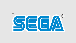
Twitter was buzzing with theories over the weekend after Japanese developer, Yuichiro Kitao, pointed out that video games company Sega uses a different version of its famous text-based logo in Japan. And what's more, it appears that nobody really knows for sure why Sega has two versions of its logo.
So how does its logo look different? Simple: the Japanese version uses a lighter blue, while the logo for other territories is darker. Cue rampant speculation as to whether this decision is motivated by colour theory.
In his tweet, Kitao posts an image comparing the two different logos. The Japanese one appears first, followed by the darker alternative.
For a passing thought about logo colours, this status appears to have captured Twitter's imagination. Hundreds of users have given it a like and have commented with their thoughts on why Sega has two logos.
Sega of America’s director of production, Sam Mullen, even got in on the action by confirming that, yes, the video games developer does in fact operate two logos, each with a different colour.
But the important question is why does Sega have two different coloured logos? Sadly, we don't know for sure. Mullen has his theories, including the idea that it's the result of a printing mix-up, or that the Japanese colour could be seen as more kid friendly.
Either way, it's a curious detail that adds to the Sega brand. And considering that Sega's startup sound ranks alongside the best audio logos, it looks like the company knows how to use its branding to excite interest.
Related articles:


