"It's more important than ever": Deftones designer Frank Maddocks on the enduring power of the album cover
Here's why iconic album art still matters
The turn of the millennium saw the landscape of heavy music dominated by a particular album art aesthetic: jagged typography, graffiti-style emblems and distressed image filters. Some worked, some didn’t, but the arrival of Sacramento alt-rockers Deftones’ third LP, White Pony, with its silver sheen and quiet silhouette offered a stark and disarmingly clean alternative with not a gothic band logo in sight. For Frank Maddocks, then a young designer finding his footing at Warner Records, it was a statement of intent that would define a career.
Having already established himself as a freelance creative, in 1999 Maddocks was invited by Warner’s Creative Director Melanie Nissen to join the team on a permanent basis. He soon caught wind that one of his favourite bands was finalising a follow-up to their 1997 album ‘Around The Fur’. Deftones happened to be signed to sister label Maverick Records and Maddocks wanted in.

“I had to raise my hand for that one because it would have never happened,” he states. “Being at Warner Brothers, I wouldn’t have got a Maverick project, but we bent the rules because I wanted to do it so badly. Luckily, I got it and flew up to Sausalito to meet with the band and hear the record. The rest is history.”
Released in 2000, White Pony’s sleek minimalism stood apart from the era’s visual clutter in much the same way that Deftones distanced themselves from the ‘nu-metal’ tag they were often lumped in with. Two decades on, Maddocks’ and Deftones’ relationship continues, spanning every record since, including their long-awaited tenth LP, Private Music.
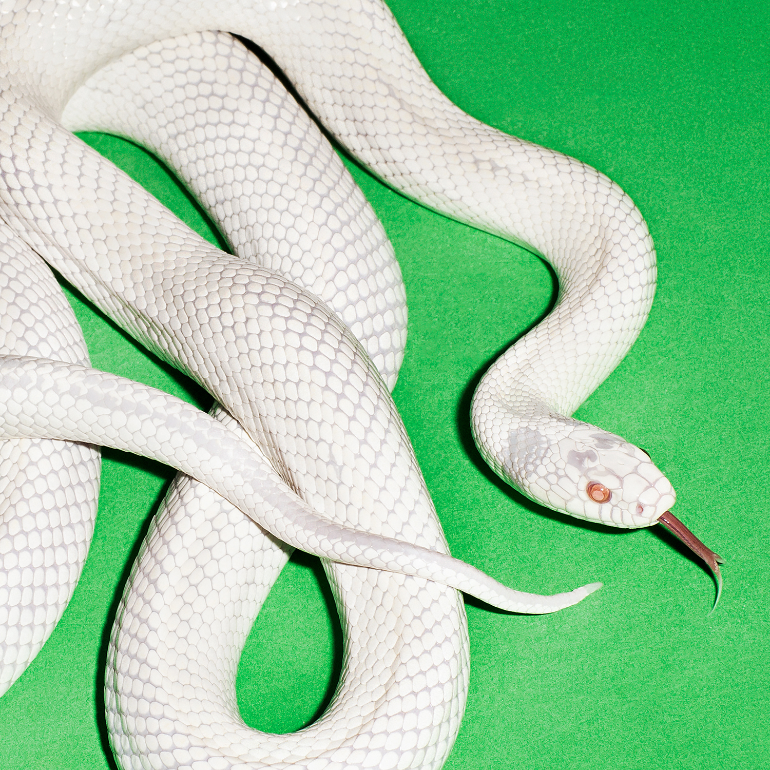
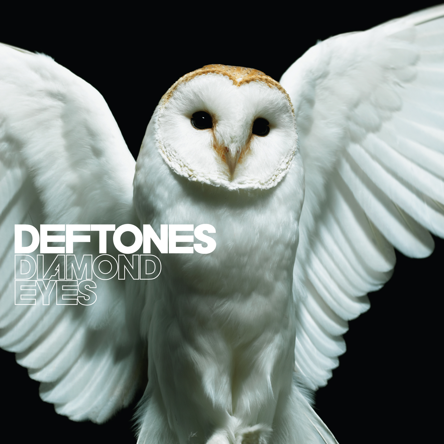
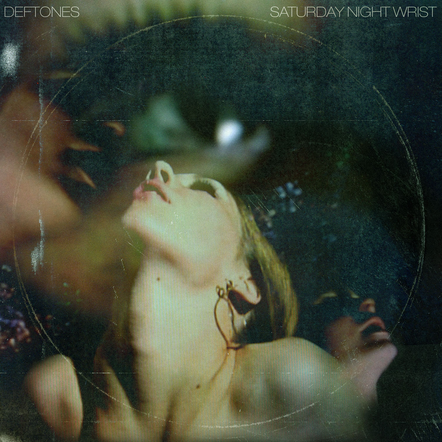
The collaboration has fostered something of a creative short-hand between Maddocks and Deftones’ frontman, Chino Moreno. From the iconic skull that adorns their self-titled fourth LP to the sex tape-inspired aesthetics of 2006’s Saturday Night Wrist and a selection of repurposed wildlife photography across Diamond Eyes, Gore and now Private Music, the duo often find their visions aligning unexpectedly.

“Oddly enough, throughout this whole process, sometimes our brains just click and we’re thinking about the next thing at the same time,” he states. “I’ll show him something and he’s like, ‘That’s crazy - I was thinking about that.’ Or he’ll send a round of references, and I’ll be like, ‘Dude, I was totally thinking about doing something like that’. There’s a nice cadence there.”

That shorthand extends beyond Deftones too. Now VP of Creative at Warner Records, Maddocks has overseen artwork for various acts, including Linkin Park, where his longstanding partnership with Mike Shinoda echoes the intuitive back-and-forth he shares with Moreno, as well as some of the world’s biggest pop acts.
Sign up to Creative Bloq's daily newsletter, which brings you the latest news and inspiration from the worlds of art, design and technology.
Maddocks’ arrival at Warner coincided with a particularly fruitful period for album artwork. His credits would go on to include Linkin Park’s debut LP Hybrid Theory, also released in 2000, but it wasn’t long before he was being tapped for work in other genres. Projects for Alanis Morissette and Madonna offered up new challenges and required a unique balance of artist representation and creative edge.
“I didn’t know any better when I was doing those things,” Maddocks states coyly. “I didn’t have any preconceived notions of what it was supposed to look like and I just entered into those things doing what I wanted to do, especially with that Alanis Morissette cover. That was just me just doing what I do.”

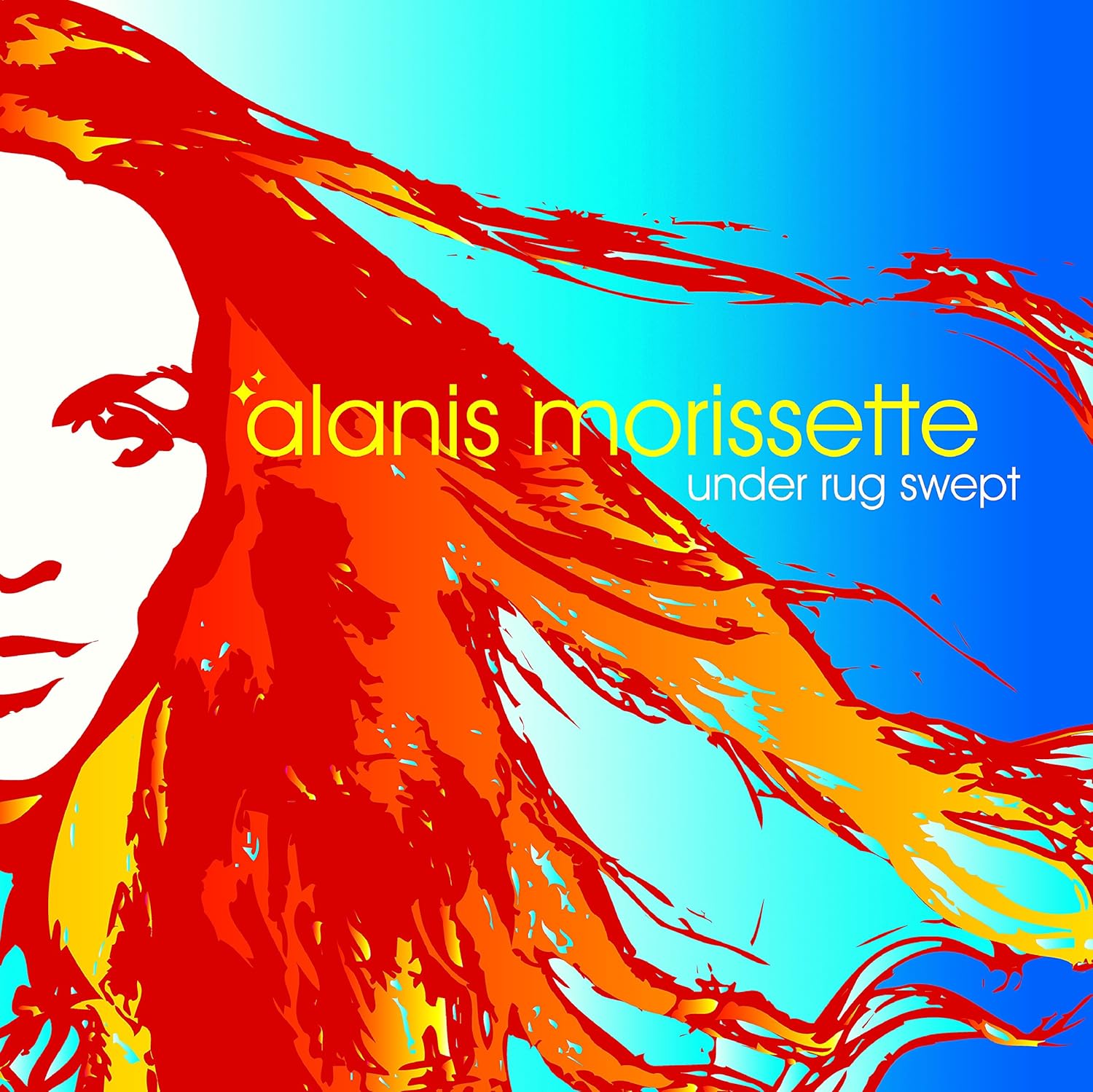
That instinctive approach resulted in some of his most striking pop work, including the vivid, Warhol-esque treatment of Morissette’s fifth studio album, Under Rug Swept.
“I got handed this beautiful photo shoot, and then what did I do? I beat the shit out of the photos with these crazy filters and made it this colourful pop art. I think everybody at the time was like, ‘Holy fuck. We never thought it could be this.’ And I was like, ‘I don’t think it can’t be this - I don’t know what else it can be.’”
Arguably, the effect was more than cosmetic.
“Friends of mine have that poster in their house,” he laughs. “They don't even know the music. They just like the image… And the people at the label freaked out, but I think it brought new life into the project. I just didn’t know any better.”
For Maddocks, the album sleeve has always been more than a mere accompaniment to the music. While its purpose, function and visibility may have shifted across formats, from 12-inch vinyl, to battered, well-loved CD jewel cases and compressed JPEG thumbnails, it remains an integral part of an album’s identity.
“I was asked for many years, ‘What are you gonna do now CDs are not popular?’”, he muses. “I never worried or changed what I was doing based on how the media was going to be seen… That image on your phone is more important than ever. People used to always say, ‘Oh, it’s just so small now.’ But what are we all doing? Everyone is on their phone. So now, more than ever, that image has become, to me, where everything shines.”
While the ongoing vinyl revival has restored some of the tactility and scale that designers may have once taken for granted, the modern album cover still serves multiple masters: artwork, merchandise and even projection across mainstage backdrops.

“It’s kind of a big ask to come up with one image that can lend itself to all of these other things,” he reflects. “Sometimes you can make an amazing album cover that is a great piece of art that maybe doesn’t really relate to a billboard, or merch or something. The great thing to do is to come up with something that can check off all those boxes. Indeed, that "one image" can feel increasingly elusive in today's world of countless alternate album covers.
For all the weight of expectation, magnified by the instant-feedback loop of social media, Maddocks remains committed to balancing utility and purpose with artistry and creative expression.
“You have to know that, yes, you are creating a tool - a marketable asset for the band, the artist and the company,” he muses. “But at the same time, try to do something artistic that is true to yourself and true to the artist. You’ve gotta just put the blinders on a little bit, stay the course and do what’s right.
It’s a sentiment that underpins a body of work spanning rock, pop and everything between: sleeves that have become shorthand for entire genres. For Maddocks, the medium endures because of the music.
“Everybody needs great imaging and that has never gone away,” he states. “If there’s music, they’re gonna need art.”
Paul Weedon is a UK-based freelance writer and journalist. He's been writing about music, design and popular culture for well over a decade and is always interested in exploring the various ways that those worlds often intersect. If there’s design involved and a music angle of some description, chances are he’s probably interested in talking about it.
You must confirm your public display name before commenting
Please logout and then login again, you will then be prompted to enter your display name.


