Creative industries are more competitive than ever, and the course you choose to study on could make or break your professional career. If you want to develop a fulfilling career as a designer, you'll need to have a solid foundation – with a course taught by industry professionals who are experienced and, crucially, practising in the design industry.
Hereford College of Arts (HCA) runs a BA (Hons) Graphic and Media Design course, on which students are consistently supported and challenged to find their own unique graphic voice by the industry professionals that teach them. This means that when they graduate, they're fully ready to successfully gain employment in multidisciplinary design agencies. Whether graduates find their own pathway in editorial design, advertising, branding or digital design, the well-developed links HCA has with media industries and external employers will have given them the professional experience needed to start their career with a bang.
What could you achieve?
To show aspiring designers what it's possible to achieve while studying at HCA, course leader Innes Jones has curated this list of his favourite design pieces created by students on the course. These designs showcase the standard of design at HCA, standards so high they've led students to win awards in national design competitions, including D&AD & YCN. The smaller group sizes contribute to the success of the graduates, as well as the relaxed learning environment with plenty of individual workspaces (a reassuring feature amidst Covid-19).
The quality of these pieces explain why final year students of HCA have exhibited at high profile graduate showcase exhibitions in London such as New Designers and D&AD New Blood. But they also show the passion and commitment of the students themselves. Honing this level of skill means these students have taken full advantage of all the course has to offer. From the world class external speaker programme, to the opportunity to win commissioned work with live outcomes from project partners like SuperDry clothing, MASH Cinema and Hay Festival, amongst many others, there is a lot to soak up at HCA.
If you're inspired by the work created at HCA and want to kickstart your graphic design career with a top-level qualification, apply now for entry in Autumn 2020. Read on to discover Jones' top 10 designs.
01. Jessie Dixon

"Jess conceived, designed and produced this set of three thematically connected classic book covers all relating to the theme of dystopian futures," Jones explains. "They include 'The Handmaid's Tale', '1984' and 'Brave New World'. The designs combine original illustration with digital type and composition and create a set when viewed together."
"This design is in my top ten because it links the themes together so creatively and its sparseness reflects the darker content of the books perfectly."
02. Andy Carter

Entering Jones' top ten for "its neutral clarity and legibility designed to be useful for tourists across the world", the Nexus Bike app and campaign was created for a D&AD national competition project, challenging students to produce a campaign and prototype app for a street rental bike service.
Carter "created a Swiss-inspired design with clean, minimal lines and bright text and imagery set against a calm black background," says Jones. Interestingly, the app was created as a working prototype using Adobe XD.
03. Joshua Brettel

Created for an internal project challenging students to design a campaign to reduce plastic waste, Brettel utilised his research into plastic toys being a major contributor to the problem. Hence, this Toy Story themed project was born. Finished designs were created in a range of formats, using photomontage.
Jones includes this project because it's "an original concept which has been subtly executed. "The decision to use black and white images with the toy bank highlighted in colour was very effective as was the positioning of the characters with the relevant text," Jones explains.
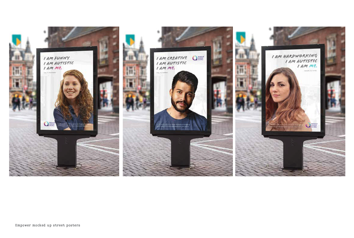
For this internal project, named 'Empower', students created a campaign to raise awareness of an issue they felt passionately about. Cookson used young faces with carefully written copy to communicate a positive message about autism, as part of her aim to normalise autism through a range of creative formats.
Jones chose this design "because of its impact, well-considered copy and fresh aesthetic," he says, going on to praise Cookson for her approach to the project. She "conducted much research into successful campaigns and applied knowledge learned with successful results."
05. Gemma Goode

Chosen for "its humour and beautiful execution of both hand-drawn and digital typography", this is a personal piece created for a brief based on themes that interest the students. Goode's work is focused on the breakdown of relationships, but she also wanted to improve her typographic skills.
06. Joe Stayte

Jones describes this piece, which was created as part of the Final Major project, as a "clever and comical infographic". The project was sparked by the word 'measure', and Stayte's interest in minimal design and information graphics came to the fore. It's the "cheeky humour, attention to detail in the information and the clear, sophisticated composition" that won this design a place in Jones' top 10.
07. Emma Ryan

"This double-page spread was created for the cookbook project," Jones explains. For this project, introduced and supported by celebrated UK design Professor Phil Cleaver, students were challenged to create "original graphic and conceptual interpretations of what a cookbook could be". Ryan wanted to be playful with the typography and imagery, which she created in HCA's Photo studios, supported by HCA technicians.
The "creative use of type and image" made Jones choose this spread for this list. "The dripping beans form an interesting pattern for the type to respond to," he says.
08. Jodie Sweeney

Part of a branding project, in which students were given notional start-up businesses to create a brand for, Sweeney branded Camino – a Latin American restaurant. She produced this design, alongside some "standout" promotional work, using a combination of digitally manipulated type and montage.
"This design is in my top 10 for its typographic strength, the vibrancy of colour and playful combination of type and image," says Jones. "The design really captured the spicy food and sub-tropical setting of the restaurant."
09. Thomas Davis

Another piece created for the Final Major Project, Davis' piece aimed to promote the success of British aerospace, particularly Concorde – the supersonic aircraft. Davis' interest in Swiss design, minimal composition and pattern influenced this piece, which he created using Adobe Illustrator.
Jones loves how Davis "brought all his favourite graphic elements together in an eye-catching way." The design "cleverly manages to capture the essence of high-speed travel [and] the design was also sold successfully on t-shirts," making it a worthy entry in the top 10.
10. Ed Humphries

Designed for a live brief set by a start-up chocolate company, which needed to be artisan packaging centred around where the cocoa originated from, Humphries based his patterns on relief lines found on ordnance survey maps. These patterns were taken from the location of the production facilities for the company – where the cocoa is sourced.
"This design is in my top ten because it answered the brief very well and also created packaging which is eye-catching and differentiates the flavours available," Jones explains.
If you have a passion for graphic design, you're contemplating the next step in your journey and want to find out more, contact Innes Jones on social media @graphicdesignhereford.

