Sans Serif typeface gives a whole new look to Google
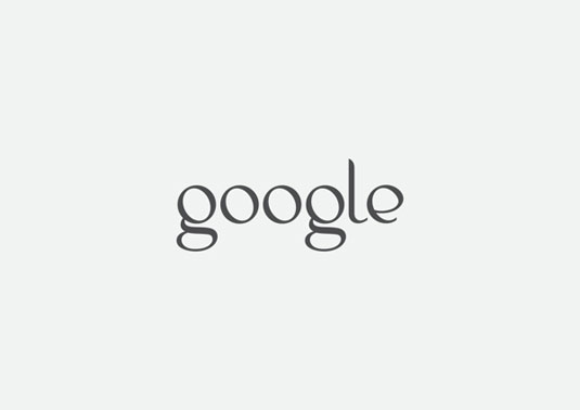
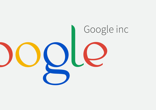
This proposed Sans Serif font for the Google logo makes it a world away from what we all know.
Sign up to Creative Bloq's daily newsletter, which brings you the latest news and inspiration from the worlds of art, design and technology.
You are now subscribed
Your newsletter sign-up was successful
Want to add more newsletters?
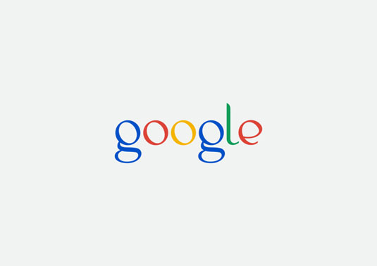
Google is clearly one of the top brands in the entire world, with its logo design one of the most recognisable and iconic throughout the globe. Using simple typography and a handful of primary colours, their simple approach worked wonders.
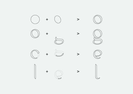
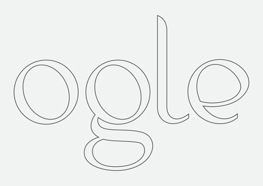
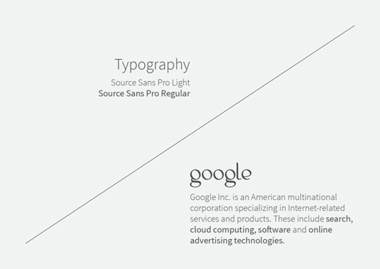
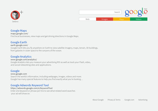
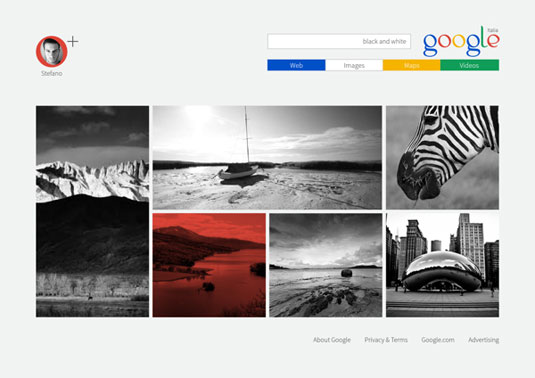
However, Italian designer Stefano Parrone has come up with a proposed redesign that whilst staying true to Google's trademark colours, makes it look a world away from what we all know. Using a Source Sans Pro Regular font, the logo has had a complete overhaul.
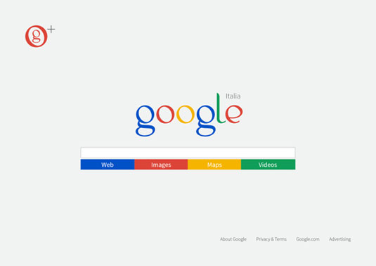
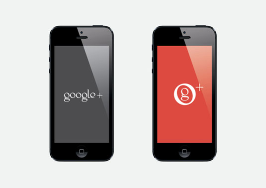
Showcasing the way in which the new logo could be used for Google+, Parrone also redesigned the classic Google web page. Whilst we don't think Google will be changing their logo any time soon, this redesign gives us an insight into what could be.
Article continues below 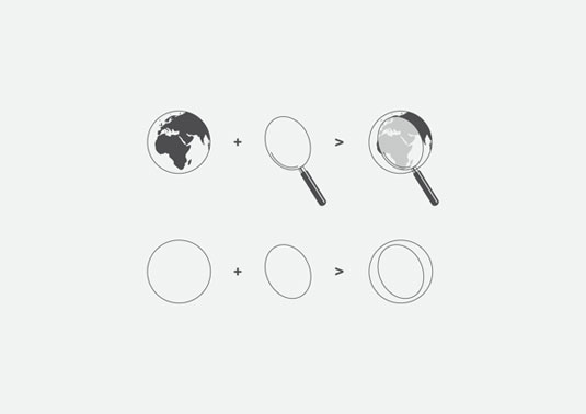

[via Design Taxi]
Like this? Read these!
- Free tattoo fonts for designers
- Create a perfect mood board with these pro tips
- The ultimate guide to designing the best logos
What do you think of this Google redesign? Let us know in the comments box below!
Sign up to Creative Bloq's daily newsletter, which brings you the latest news and inspiration from the worlds of art, design and technology.

The Creative Bloq team is made up of a group of art and design enthusiasts, and has changed and evolved since Creative Bloq began back in 2012. The current website team consists of eight full-time members of staff: Editor Georgia Coggan, Deputy Editor Rosie Hilder, Ecommerce Editor Beren Neale, Senior News Editor Daniel Piper, Editor, Digital Art and 3D Ian Dean, Tech Reviews Editor Erlingur Einarsson, Ecommerce Writer Beth Nicholls and Staff Writer Natalie Fear, as well as a roster of freelancers from around the world. The ImagineFX magazine team also pitch in, ensuring that content from leading digital art publication ImagineFX is represented on Creative Bloq.
