The biggest myth about typography is that it’s fussy and fastidious but, strangely, no one ever levels that criticism at engineering or architecture. If you cut corners in those industries then buildings fall over; if you cut corners with your typography then your design falls over, albeit a little less dramatically.
When it comes to laying out type, what I really like to see is a combination of scale, balance and tension. Strong layouts are born from large headlines contrasting with much smaller body copy and an even distribution of white space. Careful font selection, structure and rhythm are also vital.
Most mistakes that designers make are down to carelessness and lack of attention to detail. Lines that are too long, leading that is too tight, hyphenated text, bad line breaks; all these things, if not corrected, really detract from a layout, no matter how good it might first appear.
To improve your type skills, take your time and don’t rely on InDesign to tidy up after you. Overhang your punctuation, account for invisible characters when setting centred text and, where necessary, space lines individually to make a nice ragged edge. Think about how much text you’re dealing with and how easy it is to read.
The ‘rules’ of typography are all worth obeying at first. There’s a reason why you’re not meant to set more than 12 or 13 words on a line and there’s a reason why one grid layout works better than another. Jan Tschichold’s The New Typography should be on every designer’s reading list before they get out into the industry. The more you learn about what works and why it works, the fewer decisions you’ll have to make – it becomes second nature and then, when you have an idea that requires stepping outside of this framework, you’ll have a very good reason for doing so.
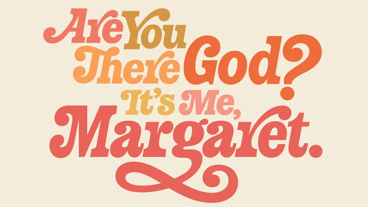
Neither legibility nor readability should be confused with communication. Just because you can read something perfectly doesn’t mean to say that it communicates an idea. I think you can take more from a piece of text than just the meaning; type can convey a mood, an emotion, a sound or a memory.
For more info on type terms, check out the What is Typography post on our sister site Creative Bloq.