What were the biggest graphic design trends of 2017, and what graphic design trends will be big in 2018? As 2018 takes off, we asked leading designers and studio heads to reflect on 2017, to identify the biggest movements of the moment and forecast what will be big this year.
Just as when we brought you the biggest illustration trends, this isn’t about following the creative herd: it’s about taking stock of where the design industry is right now.
Whether you use these trends to be inspired or move steadfastly in the opposite direction, the information here can help inform your design choices in 2018. Read on for our predictions of the biggest graphic design trends of 2018…
01. The 'Little Big Idea'
“The design theme of 2017 was big impact, but paradoxically the best work achieved it by really sweating the small stuff,” says Chris Moody, creative director at Wolff Olins. “The things I have found the most striking are the consommés – those jobs that focus on something singular and use it to create something with clarity, distinctiveness and beauty: the ‘Little Big Idea’.
“2017 was about simple ideas, executed with intelligence and insight to create real, radical impact. W+K’s work on the Dutch women's football team was a tiny logo tweak that managed to question heritage, patriarchy and even what a logo stands for. The Moonpig rebrand did more with the kerning of an ‘o’ than a thousand animated cartoon characters ever could.
“If 2018 is going to be as chaotic, channel-hopping and crazy as 2017 was, elegant logic will be the only way to cut through.”
02. Braver colours
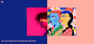
“2017 has been a riot of colour, with graphic designers making big, bold choices,” says Shaun Bowen, creative partner at B&B studio. “Perhaps in an effort to inspire positivity after a difficult year in 2016, we’ve seen an influx of bright colours, often with flat graphics and only one or two colours used at any one time,” he adds.
Get the Creative Bloq Newsletter
Daily design news, reviews, how-tos and more, as picked by the editors.
“More and more brands are also using their core packaging hue as the backing colour in posters and supporting graphics.
Max Ottignon, co-founder at London branding agency Ragged Edge, tells a similar story. “We’ve noticed our clients getting braver,” he says. “Fluoro colours and clashing tones have moved away from edgy startups into the mainstream. eBay’s new identity has colour right at its heart, using it as a way to communicate both its breadth and inclusive personality.”
Mireia Lopez, creative director at DARE, concurs. “We’re seeing the use of vibrant colours in juxtaposition with bold imagery,” she says. “This can be seen as a response to minimalism and material design, from using white spaces and clean layouts to unexpected colour combinations and distinct varied typographical styles – and is across all areas of branding as well as digital.
“The new Dropbox brand direction, for example, is doing this with its creative use of images, and corporate identities such as NatWest are shifting to a fresh and modern feel, using the potential of brighter colours to increase higher conversion rates. In my field, digital, this development is probably due the fact that sites can load faster and screens on phones are bigger, so it’s easier to play with images.”
“Using bright colours helps content stand out from meme-filled social media,” notes Nathan Sandhu, founder and creative director of Jazzbones Creative.
03. Brutalism is back
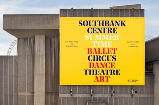
“Although it’s been around for a while, Brutalism is one of the graphic design trends I’ve seen really kick off in 2017,” says Lopez. “The Southbank Centre’s rebrand by North is an obvious example. The simple branding and typeface used have been inspired by and go really well with Southbank Centre’s brutalist architecture.
“We’ve also definitely seen web design being influenced by the principles of the movement,” she adds. “Balenciaga’s over-functional, anti-aesthetic site is the most impressive manifestation of this in my view.’
Our article Are brutalist sites the web's punk rock moment? explores this trend in web design terms in depth.
04. Hyper brand distillation
“Throughout 2017, design has been getting simpler, yet richer,” says Ottignon. “In a world where user experience is king, complex brand systems get in the way of the content. Function overrides superfluous design details, and every brand asset needs to earn its place.”
So brands are striving to streamline their core assets, but looking to pack more meaning and distinctiveness into each element, he argues. Often this starts with the name.
"Naming briefs are increasingly becoming ‘How can we distill as much meaning into as few letters as possible? Bulb remains a great example of this, communicating product, purpose and tone in a mere four letters. Or Nested, a proptech startup whose name delivers on both a functional and emotional level."
Naturally, it also means means scalable, digital first symbols packed with meaning – think YouTube or F1, where an entire brand can be distilled into an app tile or a profile picture.
“There’s also a noticeable trend towards bespoke typefaces, such as IBM’s Plex and BBC's Reith – not to mention Camden Market and Giraffe,” adds Ottignon. “This allows a brand to show up distinctively wherever it appears, without introducing anything that isn’t strictly functional.”
05. Modern still life

The use of high-end, styled and modern-looking still life was everywhere in 2017. Giacomo Cesana, creative director at CBA Italy, describes the look as: “Contemporary, geometrical and a bit abstract.
"Works that use flat colours with simple objects and shapes were trendy in 2017, especially in fashion and the luxury market. Tiffany’s Christmas campaign, created in collaboration with art photographer Roe Ethridge, is a good example of this trend in action.”
06. Generative identities hit the mainstream
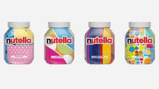
“We are seeing more brand identities making use of generative software graphics,” says Cesana. “What used to be seen as an avant-garde craft is now most definitely in the mainstream, as Nutella’s algorithm jars and the Hello Robot catalogue at the Vitra Design Museum demonstrate.”
07. Flat graphics in packaging
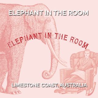
Packaging design has made a move towards simplicity in 2017, says Rowena Curlewis, CEO of Denomination, a drinks design agency in Sydney and London. “Simplicity through the use of flat graphics can be seen across all packaging categories, including wine,” she explains.
“This does not necessarily mean minimalism but instead a stripping back of layers, detailing, text and tone to hone in on the core information and graphics. These are then treated in a simple, deconstructed manner.
“For example, the wine brand Elephant in the Room, Fourth Wave’s latest success story, has taken the Australian wine market by storm with its single colour label design. Featuring just the core information and intriguing illustrations, the contrast of its simplicity with the complexity of its competitors’ designs has ensured both distinctiveness and strong shelf standout.”
08. 3D modelling in typography
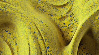
“3D modelling is the new frontier of graphic design,” says Cesana. “This has especially been seen in type design, but also in pattern generation.”
Sandhu also points to a potential future trend: “One-colour 3D design is growing in popularity. There has been more and more product marketing that uses the same bold background colour as the featured product itself: the product leaps off the screen thanks to the volume created by the 3D techniques.”
For examples of the 3D trend, check out the work of Locus and David McLeod, whose work for Dolby is shown above.
09. Geometric type breaks the Helvetica cycle
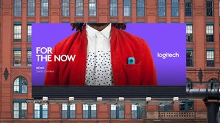
“The use of geometry in both graphic design and type design has grown in 2017,” says Lee Fasciani, founder and director of Territory Projects, a sister company to Territory Studio specialising in brand and digital.
“The use of Helvetica used to happen in cycles – largely driven by the lack of alternatives (notwithstanding Akzidenz Grotesk) – but now it seems the wealth of well-crafted geometric sans serifs available make designers think differently about choosing the trusted typographic statesman."
"Google Fonts and the ability it gives designers to easily incorporate digital fonts into web pages is one of the reasons for this, bringing typographic consistency to branded collateral across all channels. Geometric sans serif fonts also have the ability to be relatively ageless, like most geometric design."
“There is a bold clarity and honesty to such fonts that have now been used by many large corporations to communicate the simplicity and openness that their brand team requires,” he concluded. “Examples of the trend can be seen in the use of LL Brown by Airbnb, Natwest and Thameslink, and LL Circular by Spotify and Eurosport.”
10. Hand-drawn elements continue
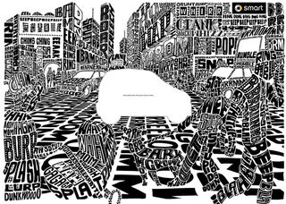
“Hand-drawn images have been particularly big in 2017,” adds Sandhu. And that’s not surprising. “The personal touch that they provide to branding and marketing is undeniable,” he stresses. “In a world ever-more dominated by screens, there is just something appealing about the hand-drawn that resonates with many.”
Similarly, Dan Bramham, senior designer at Greenwich Design, points to the recent rise of black and white hand lettering over the last 12 months. “I particularly like the work of Oli Frape and Vic Lee,” he says. “It's fantastic to see something a bit less polished, and that really stood out for me in 2017.” And he sees it as part of a wider trend.
“It goes hand in hand with the movement away from the very technical and a return to an artisan approach, which we're seeing across everything from food to the resurgence of handicrafts, and the search for a more balanced way of life.
"Similarly, there's been a move away from polished photography to more gritty, real-world photographs. I think this all stems from the Millennial generation looking for design that has a bit more integrity, and the manifestation of physical art in graphic design has really struck a chord."
Simon Wright, managing director at Greenwich Design, makes a similar point" "One of the things we've noticed in 2017 is the desire to be more personal through design – a nod to a previous era,” he says. “Clients sending a beautifully designed postcard or a hand-written letter for example; a return to old-fashioned methods of communication as a means to stand out.”
Liked this? Read these:

