Are brutalist sites the web's punk rock moment?
They're the web's uncompromising trend, but are brutalist sites mere punk exuberance, or a sign that web design is maturing?
This post was originally published in 2017.
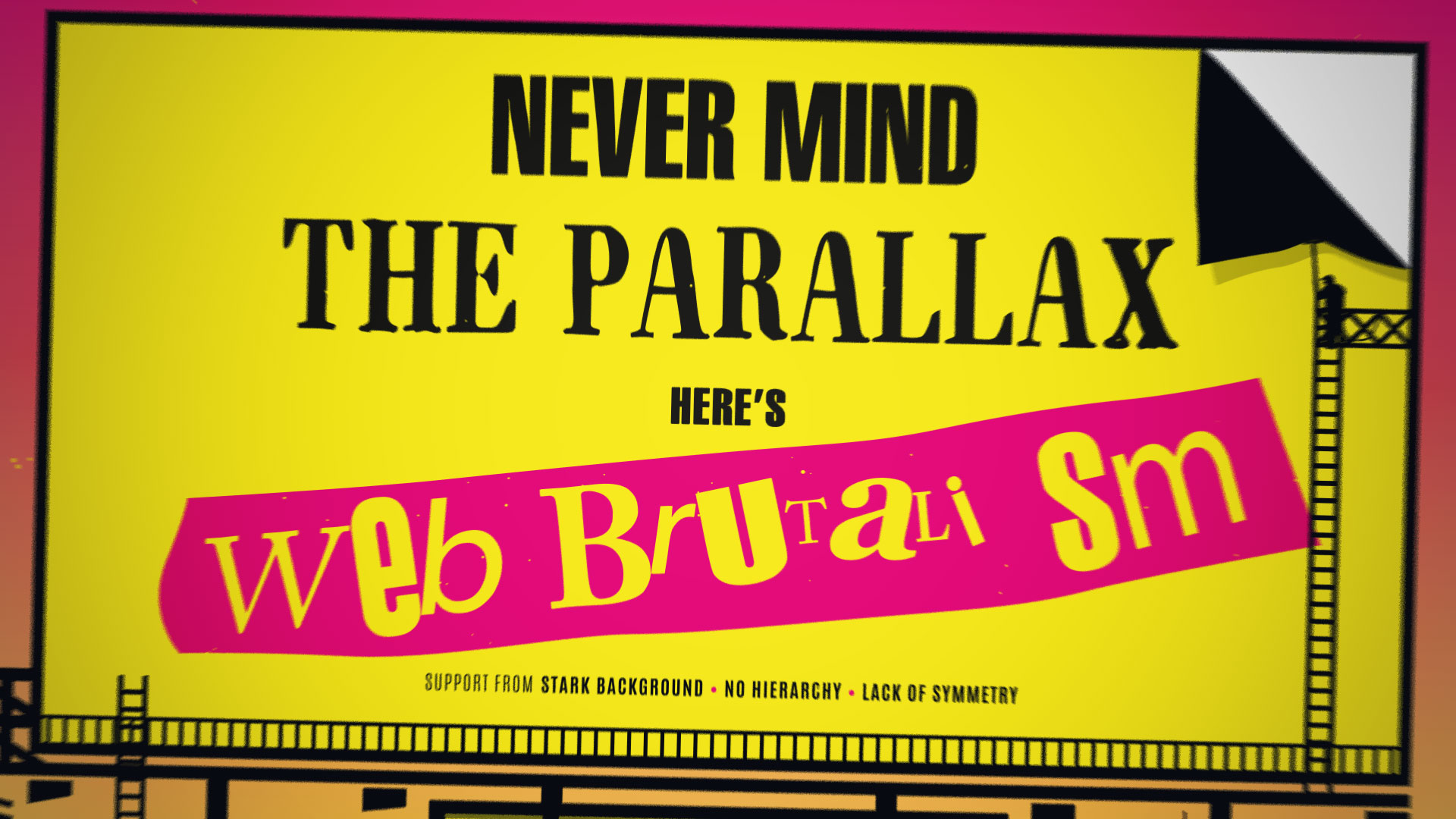
Named after the brutalist architecture movement from the mid-to-late 20th century, web brutalism gleefully ignores all the website layout and design best practices established over the past 20 years. Instead, it is throwing out work that's inventive, exciting and challenging – even confrontational. Brutalist websites range from the wilfully chaotic to the obstinately minimal, but they're united by a rejection of mainstream web trends.
There comes a time in every creative movement when some of its practitioners decide to push back against the accepted way of doing things and start breaking the rules, usually to the outrage of the establishment.
Article continues belowThe origins of web brutalism
Brutalist architecture is unconcerned about looking attractive, and it's this – as well as the idea that brutalism was conceived as a reaction to the more frivolous architecture of the 1930s and '40s – that led Pascal Deville, co-founder and creative director of Freundliche Grüsse to co-opt the term.
"I've had a high interest in digital design and the web design community since the early days of the web, " he tells us. "In the last couple of years I noticed a trend toward streamlined, almost neutralised interfaces that completely missed any sense of brand attributes or characteristics regarding the content or purpose they serve."
Deville also noticed designers starting to experiment with a kind of web design anti-trend: a rough and back-to-basics approach on how websites could work outside a perfect UX world, and it's this aspect that reminded him of the original brutalists.

Since then Deville has been curating Brutalistwebsites.com, where he gathers sites that fit in with his ideas of web brutalism and interviews their creators. "It serves as an inspirational platform for young designers," he says, "I want to give back to the community."
Sign up to Creative Bloq's daily newsletter, which brings you the latest news and inspiration from the worlds of art, design and technology.
Defining features of web brutalism
A trawl through Brutalistwebsites.com will quickly demonstrate that it covers a broad range of styles and aesthetics; nevertheless there are a few commonalities.
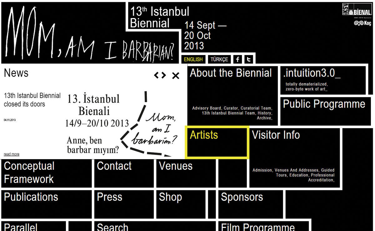
Interactive designer Bruno Landowski, who in 2013 worked on an early example of a brutalist site for the 13th Istanbul Biennial, sums up the brutalist approach like this: "It uses big fonts, solid-colour backgrounds, geometric shapes and raw features… It doesn't care about the general public."
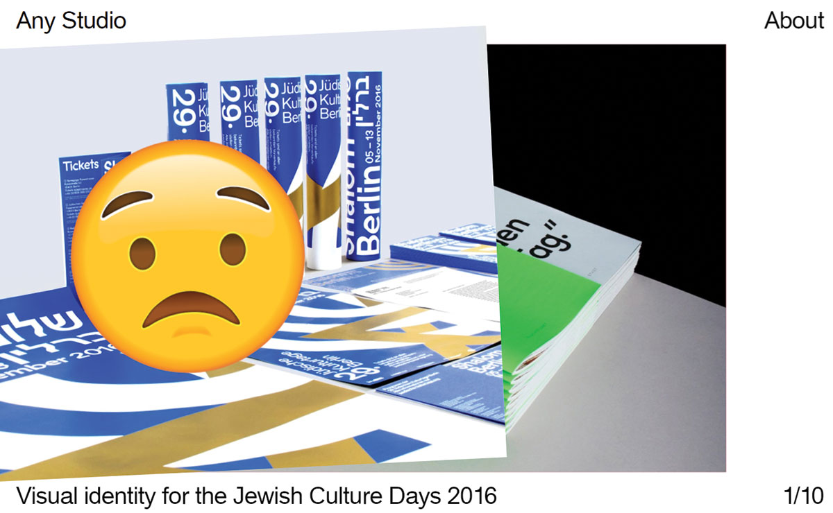
Jakob Kornelli from Any Studio in Berlin, which boasts a gloriously brutalist website full of emojis, also points out the movement's use of bold and somewhat radical typography. "But even more than that," he tells us, "we believe that a brutalist website pushes the boundaries of its medium, especially in terms of interaction. Even though web design has been around for some time now, the interactive and aesthetic possibilities of it are seldom used to their full potential."
French multidisciplinary designer Pierre Butin has made a name for himself with his Brutalist Redesigns project, in which he reworked popular apps such as Tinder, Google Maps and even Candy Crush to striking effect. He has his own theories on brutalism: "Some seem to define it as a crude approach, whilst others tends to embrace this loose definition," he says.
"This got me wondering: is brutalism in digital design more about Swiss minimalism or just raw coding? For this reason, I tried out different styles that could be deemed as brutalist. I used system fonts, basic web colours, a simple colour scheme and stuck to the original UX of the app. My objective was to start a conversation about what's coming UI-wise and how it should be done."
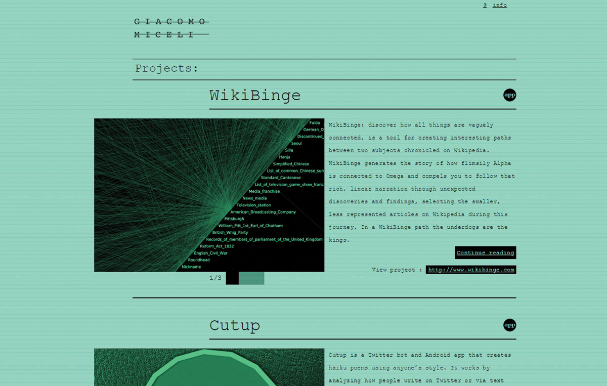
For Giacomo Miceli, whose monochrome portfolio site is a masterpiece in Courier, it's about simplification, and there's nothing new about it. "Just look at the homepage of Google, " he observes. "17 years ago, AltaVista was a thing and its homepage was cluttered with useless stuff. Google came in with a website that did one thing, did it really well, and was unconcerned with looking pretty. Google definitely gives more attention to the eye these days, but the core remained the same."
It's Detroit-based designer Kikko Paradela who sums web brutalism up most succinctly, though: "Typographic. Content-driven. Straightforward."
How to build brutalist sites
Perhaps a great part of brutalism's appeal is that you can neatly sidestep all the initial preparation that traditionally comes with building a site, and simply get on with it. Many creators of brutalist sites take a distinct pride in the fact that they do virtually all of their design and development work in that venerable Windows mainstay, Notepad.
Landowski quickly summarises his brutalist process: "Rock–paper–scissors to make choices, a pen to sketch them, Photoshop CC and Illustrator CC to specify them, and a text editor to make them alive." Although, he points out, this isn't an approach that would work for everyone; he comes from a graphic design background which, he says, makes him more sensitive to user experience.
Kornelli agrees, noting that much of Any Studio's work focuses on strong typography, clear messages and the occasional unexpected twist to keep things interesting. "The website we recently designed for the film production company Very Film shows this approach," he tells us, "with its bold and crisp black-and-white typography combined with only one distinctive interaction that is reminiscent of a curtain closing and opening."
And in Paradela's case, both his site and his practice are influenced by where he lives and works. He explains that his site is, "a reflection of my design approach and thinking. I've always aligned myself with the anti-mainstream or 'anti-Jesus' aesthetic because it challenges conventional and convenient truths including my own. This approach is also pertinent to the current social and political environment of Detroit, which is where I live and base my practice."
The benefits of brutalism
Paradela's philosophy resonates with many of the reasons that designers have given us for building websites that go so strongly against the grain of modern web design. So what are the benefits to this concept?
Daan Lucas feels that there's an honesty to brutalism that's perhaps missing from more polished, corporate offerings. "I think brutalism intends to show the core and deduct it from distraction," he says.
"I like that. I think it's also the right thing to do these days. People know when they are bullshitted. In our work we always try to make a real connection with people. Make them wonder, invite them to play. If you bullshit people they will walk away and be annoyed."
You can see brutalism's playfulness on sites such as Bong's homepage, featuring a giant Newton's cradle and links to the agency's work scrolling around the edge. It might go against the rules, but it's a different and exciting experience for users, and Any Studio is keen to mine the possibilities of this approach to web design.
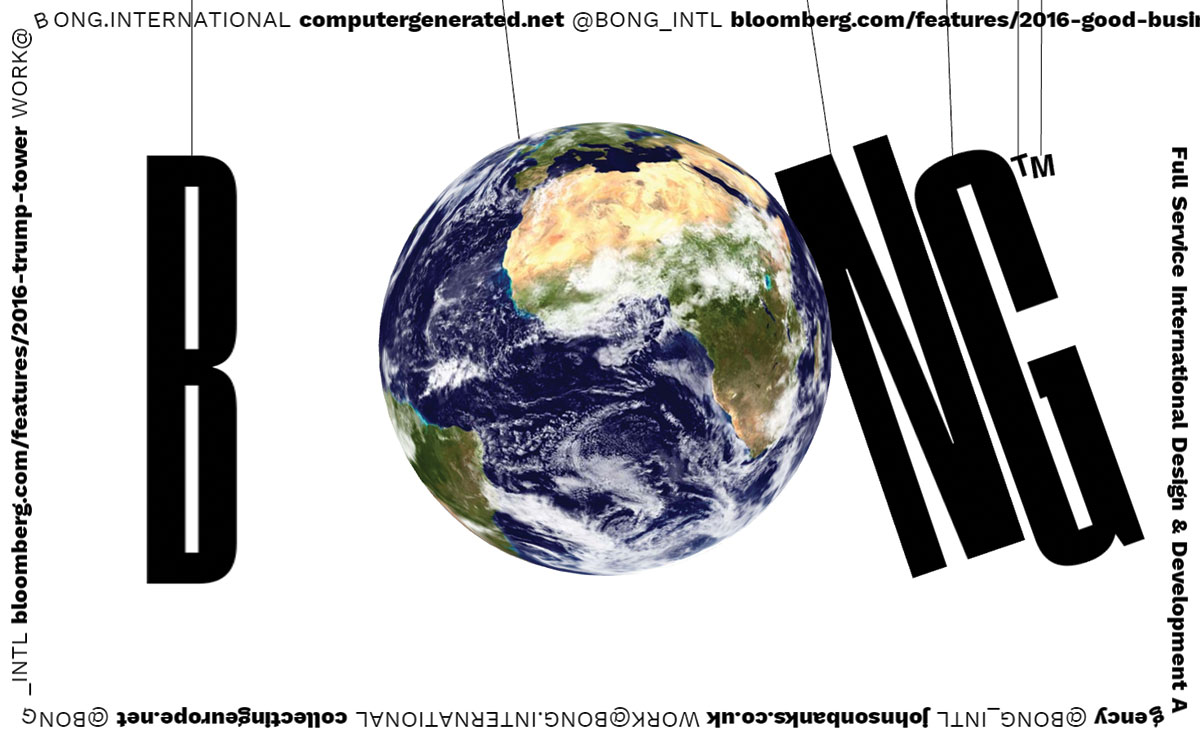
"Not playing by a certain set of rules or applying different ones – like classic Swiss modernist graphic design rules – has the advantage that the results tend to be more unique and therefore more captivating for the user, " says Kornelli.
"Also the influx of avant-garde graphic design opens the field to tons of new and striking aesthetic possibilities, which in return generate more interesting experiences for users and clients."
More than punk rock?
So maybe this is more than just a punk rock moment. While there's a degree of that – Kornelli points out that there's been a glut in recent years of boring UX-driven web design, creating an environment of functional but bland website clones, and in many ways brutalism is a 'fuck you' reaction to that environment – designers see brutalism as a way of driving web design forward and actually increasing usability.
Butin explains: "Straightforward brutalist elements might improve the overall experience users have of an app. UX experts like Luke Wroblewsky show again and again that, for example, the word 'Menu' in an interface generates more engagement than the hamburger icon (as goes the saying, 'obvious always wins'). For this reason, I do not think that brutalism in digital design is incompatible with a UX-driven approach."
And looking through the pantheon of brutalist sites, it's hard not to draw comparisons with the world of graphic design. You can see clear parallels between brutalist sites and the work of designers such as David Carson, Stefan Sagmeister and more recently Richard Turley, who used audacious and provocative design to turn stuffy old Bloomberg Businessweek into one of the most talked-about magazines.
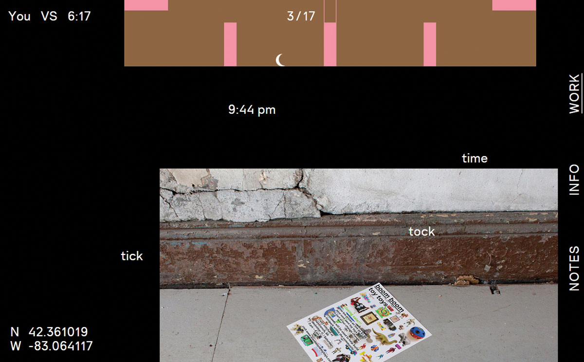
Kornelli agrees that there's definitely a graphic design influence, and Any Studio welcomes this development. "Until recently web design was, for some reason, kind of detached from the long and great tradition of graphic design," he tells us.
"Graphic designers treated web design as an unknown medium and didn't really know what to do with it. Now there is a new generation of designers emerging that feel at home in both worlds. Web design is becoming fully integrated into the vocabulary of contemporary graphic designers."
This matters, because graphic design is a mature discipline that for many years has been addressing and solving the issues that web brutalists are now taking on. "This is the space where we usually operate," says Paradela. "We deconstruct and understand visual language so we can have it at our disposal to communicate effectively. We are self critical with what's going around us."
Where's the brutalism trend going?
Like brutalism, graphic design often goes to provocative extremes, but always in the name of clear communication. While graphic designers tend to go all-out for their portfolios, the work that they produce in the day job is generally a lot less full-on; and this is how the brutalist approach will leave its influence on web design in general.
"I found that a fair amount of brutalist websites are small scale; designers' portfolios or personal projects," observes Butin. "Yet, an increasing number of designers work on (popular) mobile apps. It would then not be surprising if they transferred this taste for brutalism/minimalism to the products they design."
Kornelli believes that brutalism is about to establish its relevance and will probably stay for a while, giving designers increasing rein to create a beautiful, communicative web. "Thanks to the evolution of interfaces and software, designers will soon be empowered to create top-notch websites without handing sketches off to a developer – the developers will provide the appropriate tools beforehand instead."
This article originally appeared in a 2017 issue of net, the magazine for professional web designers and developers. Subscribe to net here.
Related articles:
Jim McCauley is a writer, performer and cat-wrangler who started writing professionally way back in 1995 on PC Format magazine, and has been covering technology-related subjects ever since, whether it's hardware, software or videogames. A chance call in 2005 led to Jim taking charge of Computer Arts' website and developing an interest in the world of graphic design, and eventually led to a move over to the freshly-launched Creative Bloq in 2012. Jim now works as a freelance writer for sites including Creative Bloq, T3 and PetsRadar, specialising in design, technology, wellness and cats, while doing the occasional pantomime and street performance in Bath and designing posters for a local drama group on the side.
