Yes, YouTube has a new UI. Yes, it's terrible
"This is almost impressively bad."

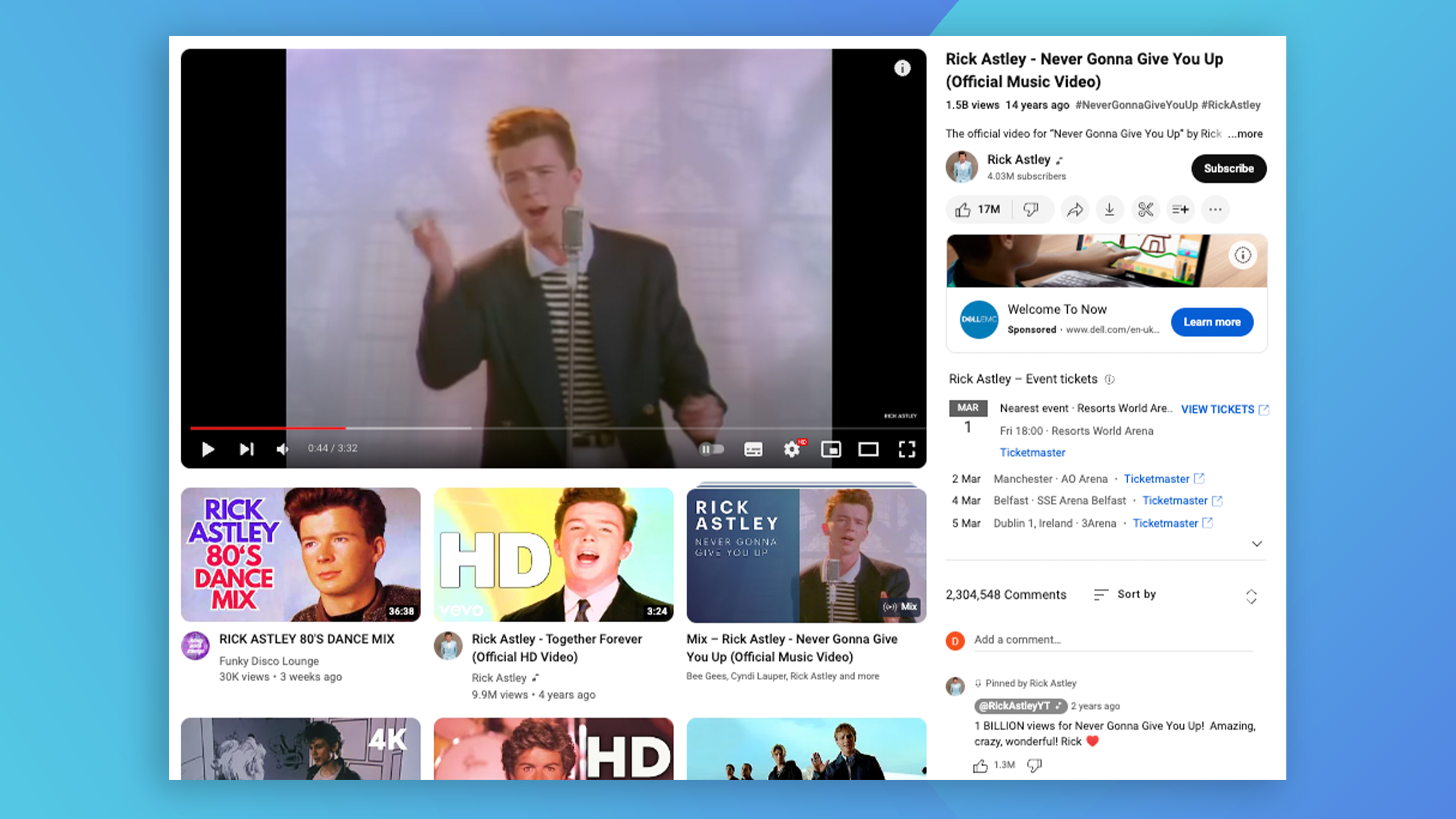
If you've spent any time on YouTube over the last few days, you might have noticed that things look a little different. On desktop, it seems comments and video suggests have swapped places – an ostensibly simple change that, judging by the response online, is having a profound effect. And not in a good way.
Where once video thumbnails appeared in a single, uniform column to the right of the video, they now sit in an enormous grid underneath the video. And when even a single YouTube thumbnail can be a bit full-on, an endlessly scrollable table of them can only be described as a sensory overload.
wtf is this new @YouTube video layout? 💀someone needs to fire the UI/UX team. 🥴 pic.twitter.com/VxTo4GBlRpFebruary 22, 2024
Just got hit with Youtube's new UI on Desktop and this is almost impressively bad. Like good god pic.twitter.com/SwKphN7VuFFebruary 23, 2024
Whoever choose and approve this new youtube ui needs to be fired! pic.twitter.com/vSnqAWovSTFebruary 27, 2024
"Oh my god, how are they finding new ways to make the website worse," one Redditor comments, while another adds, "On the one hand, I'm glad I didn't just mess up my computer somehow without knowing, but on the other hand I hate this change, it's absolutely terrible, and oh my god I can't wait till someone makes a plugin that can change it back."
Now, normally I'd try to include an opposing view for balance, but I genuinely can't find a positive comment about this after a whole 10 (ten!) minutes of searching. So there we have it, the new YouTube UI is not super popular. Whether it'll revert back remains to be seen, but in the meantime, if you think you can do better, check out the best web design tools available now.
Sign up to Creative Bloq's daily newsletter, which brings you the latest news and inspiration from the worlds of art, design and technology.

Daniel John is Design Editor at Creative Bloq. He reports on the worlds of design, branding and lifestyle tech, and has covered several industry events including Milan Design Week, OFFF Barcelona and Adobe Max in Los Angeles. He has interviewed leaders and designers at brands including Apple, Microsoft and Adobe. Daniel's debut book of short stories and poems was published in 2018, and his comedy newsletter is a Substack Bestseller.

