IBM ditches $1m annual Helvetica bill with new font
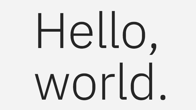
IBM Plex is a fresh font that blends man and machine – and it's free.

US technology company IBM is responsible for creating three of the most recognisable letters in the world. Well, that's according to Mike Abbink, IBM's executive creative director of brand experience and design – and the man behind the company's bespoke new free font, IBM Plex.
Designed by Paul Rand in 1956, the IBM logo – which sees the company's initials broken into eight distinct bars – remains one of the world’s most distinctive pieces of branding today. Earlier this month, the firm added another milestone to its design heritage by launching its first-ever “bespoke” font in beta.
IBM Plex will be used across everything from the company’s software, websites and signage to PowerPoint presentations and marketing initiatives. It’ll be available in 110 languages, in both serif and sans serif versions, and boasts eight weights. Interestingly, it's also available for anyone to download and use for free.
Article continues below"When I came to IBM, it was a big discussion: Why does IBM not have a bespoke typeface? Why are we still clinging to Helvetica?" says Abbink. To better reflect who it is and how it communicates, IBM briefed Abbink to create a relevant font that taps into the story of the company.
Money matters
IBM is big on good design, of course. Last year it partnered with AIGA to put 100,000 members of staff through design training.
But there’s another side to the story, as Quartz reports.
Until recently, IBM was paying Monotype over a million dollars each year to license Neue Helvetica. That cost didn’t stretch far enough to provide each of IBM’s 380,000-plus employees with access to Neue Helvetica, so the firm needed a custom font that it could distribute as it wished.
Sign up to Creative Bloq's daily newsletter, which brings you the latest news and inspiration from the worlds of art, design and technology.
The only thing surprising about this is they didn't have someone cut their own version sooner.November 10, 2017
Imagine howany machines IBM have and how many they need full font licences for. It's going to be 10,000s that will add upNovember 10, 2017
New Helvetica?
Abbink and his team worked on the project for two years. Looking back to the IBM of the '50s and '60s, Abbink was captured by how the company tapped into the zeitgeist of modernism with a theme of man meeting machine.
This collision of worlds was carried over into IBM Plex, a highly engineered font that’s loaded with idiosyncratic human touches. Watch the team behind IBM Plex explain its development in the video below.
One of our favourite touches is how the font is designed to include eight weights in a nice callback to the IBM logo.
On the video, the team says it hopes IBM Plex will become the 'new Helvetica'. It’s a bold ambition, but with the font free to download for everyone from individuals to businesses, if Abbink hits a design home run on a par with the famous IBM logo, perhaps we'll be seeing a lot more of IBM Plex in the future.
Related articles:

Dom Carter is a freelance writer who specialises in art and design. Formerly a staff writer for Creative Bloq, his work has also appeared on Creative Boom and in the pages of ImagineFX, Computer Arts, 3D World, and .net. He has been a D&AD New Blood judge, and has a particular interest in picture books.
