BBC starts rolling out new digital-friendly font
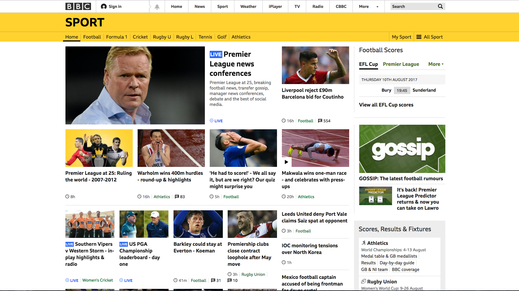
Clear new font has started launching on the BBC Sport website.

Sign up to Creative Bloq's daily newsletter, which brings you the latest news and inspiration from the worlds of art, design and technology.
You are now subscribed
Your newsletter sign-up was successful
Want to add more newsletters?
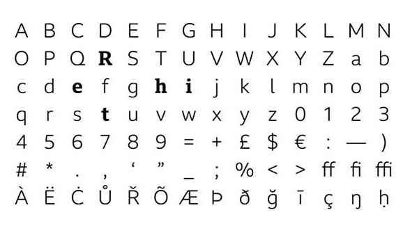
Earlier this week the BBC introduced a new digital-friendly font on its sports website. The font was launched to coincide with the start of the new football season and is eventually expected to be used right across the BBC.
This update is the first time the BBC Sport brand guidelines have been given a polish in seven years. In that time the way that its audiences have consumed content has changed, so this new font is a timely overhaul that should help the BBC engage with online readers.
In a nice little nod to the past, the new font, called BBC Reith, takes its name from the BBC's founder Lord Reith. And with licence fee payers constantly aware of how their money is being spent, it's a relief to hear that the new font should save the BBC money in the long run as they won't have to pay for other fonts.
Article continues below 
"The existing fonts that the BBC uses were developed last century and work well in print – but they’re not always clear enough when they appear in small, digital, spaces, and we’re all reading and watching far more on screens and mobiles these days," says Colin Burns, chief design officer at the BBC.
"So the new font – which we’ll gradually roll out, starting with sport today – will be easier to read and clearer, especially on small devices," he adds.
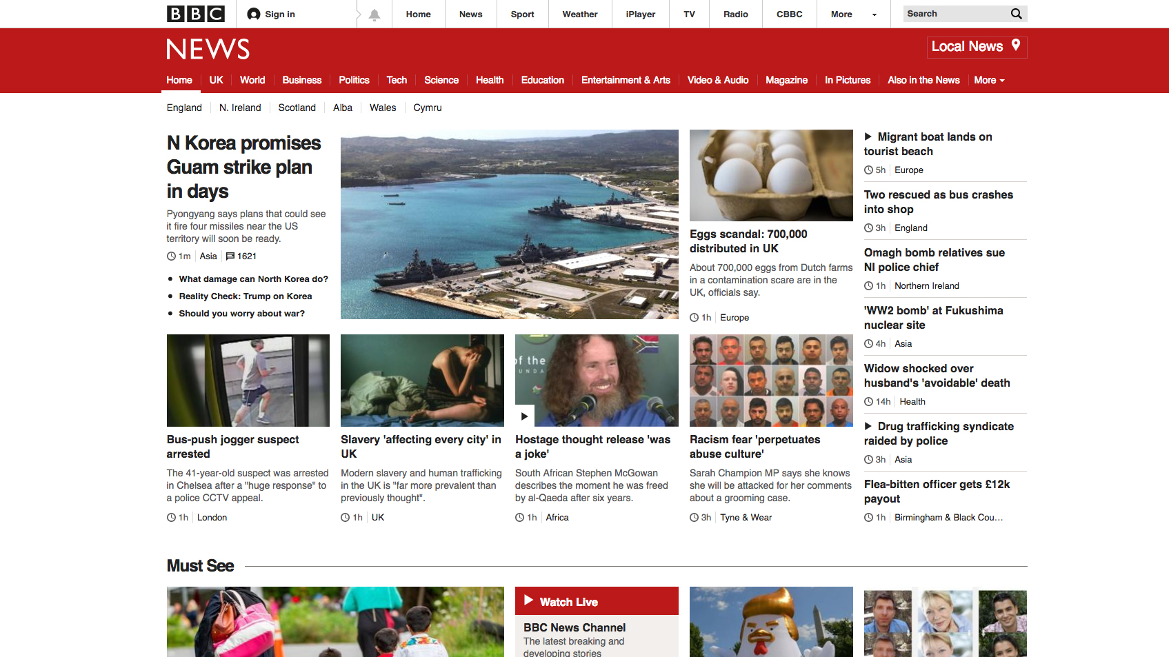
It is expected that the font will one day be used right across the BBC, but thankfully the broadcaster's distinctive block logo won't be changing.


Related articles:
Sign up to Creative Bloq's daily newsletter, which brings you the latest news and inspiration from the worlds of art, design and technology.

Dom Carter is a freelance writer who specialises in art and design. Formerly a staff writer for Creative Bloq, his work has also appeared on Creative Boom and in the pages of ImagineFX, Computer Arts, 3D World, and .net. He has been a D&AD New Blood judge, and has a particular interest in picture books.
