Designers react to the new BBC Three logo
Ahead of its move to online platforms, BBC Three reveals its striking new logo.
Sign up to Creative Bloq's daily newsletter, which brings you the latest news and inspiration from the worlds of art, design and technology.
You are now subscribed
Your newsletter sign-up was successful
Want to add more newsletters?

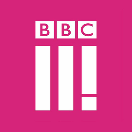
No sooner have we celebrated (or otherwise) the biggest logo designs of 2015 than a major rebrand drops in 2016. Home to new comedy, pioneering documentaries and seemingly infinite repeats of Family Guy, BBC Three has kicked off 2016 by revealing a striking new logo. Yet despite keeping the Beeb's iconic block encased letters, this eye-catching logo has been quick to attract criticism.
Unveiled ahead of the channel's move to online platforms, the new logo echoes the essence of BBC Three. Niki Carr, the head of marketing at BBC Three, explains that "the new icon represents BBC Three's three pillars, make me think, make me laugh and give me a voice. That is what new BBC Three is all about."
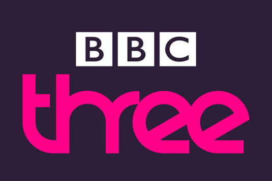
The bold new design is the third in the channel's history since it launched way back in 2003. While the first logo had a soothing blue background, a hot pink colour scheme was adopted in 2008 and has been carried over into the latest design.
Article continues below 
As with even the biggest logo designs, the BBC Three brand has come in for a lot of online criticism. Many have likened it to the deluded design efforts in the BBC's satirical show W1A, with the channel even pre-empting the comparison with a humorous video.
However the overwhelming opinion is that the logo is hard to read, unnecessary and just plain bad, as these vitriolic tweets reveal.
graphic design OCD kicked in. It's not better (probably much worse), but at least it balances pic.twitter.com/34Nw6yJdsDJanuary 4, 2016
@scottygb @bbcthree It bothers me to no end that the three parallel bars beneath the BBC logo aren't lining up with it.January 4, 2016
BBC Three confuses the internet with Snapchat-inspired BBCII! logo https://t.co/bxQlA3uCAKJanuary 4, 2016
I've just been made aware of the new BBC Three logo. Did someone rush that out before Christmas eve on the train back home, in 30 seconds?January 4, 2016
Oh my, that new #bbcthree logo is baaaad.January 4, 2016
But what do you think of the new logo? Is it an improvement on the old design? Let us know in the comments below!
Liked this? Read these!
Sign up to Creative Bloq's daily newsletter, which brings you the latest news and inspiration from the worlds of art, design and technology.

Dom Carter is a freelance writer who specialises in art and design. Formerly a staff writer for Creative Bloq, his work has also appeared on Creative Boom and in the pages of ImagineFX, Computer Arts, 3D World, and .net. He has been a D&AD New Blood judge, and has a particular interest in picture books.
