On the day a new logo design is launched for a familiar brand, the first reactions are usually overwhelmingly negative. Once some time has passed and the new design has entered daily use, though, it can be a different story.
So here we take a look back at the 20 biggest brands to release a new logo in 2014. Now you've got used to them, what do you really think of them? Let us know in the comments below!
01. Black + Decker
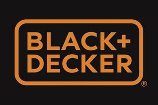
Black + Decker (formerly Black & Decker) gave its ageing logo and branding (below) a new lease of life in January with a fresh modern look (above).
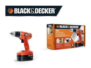
New York-based design agency Lippincott took the reigns for the redesign, ditched the hexagonal nut, swapped out the ampersand for a plus sign, and simplified the whole thing by making the typeface and colour border the same width.
02. Visa

This subtle logo redesign from Visa (above) took place in January, with the company changing their usual tag line 'for everyone, everywhere' and evolving it to 'It's everywhere you want to be.'
The first external expression of the new platform debuted with a new Olympic-themed television commercial airing in the United States, and then expanding to reach key audiences through variety of other traditional and digital channels in the coming months.
03. Absolut Vodka
The Absolut Vodka logo didn't changed massively in 2014, but it did change. Leaving the 'Country of Sweden' and 'Vodka' aspects of the old logo (below) behind, the new logo (above) now simply reads 'Absolut' followed by a full stop.
Get the Creative Bloq Newsletter
Daily design news, reviews, how-tos and more, as picked by the editors.
Global director of design strategy at Absolut, Anna Kamjou, said: "The brand has become so iconic that we no longer needed the full three-line logo to convey ourselves."
04. Lipton
March saw tea brand Lipton unveil a new logo design in a Muppets promo commercial, which saw the brand take on a cleaner, more crisp look.
Whilst the new typography enabled readability, some claimed the new design looks too much like the Lays logo.
05. Birds Eye
In March, Birds Eye spent £60 million in a Europe-wide brand relaunch that saw a new simplified logo (above).
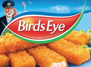
Launched by Havas Worldwide and designed by JKR, the new design saw the Captain illustration (see above) disappear entirely and the pre-2007 red marque reintroduced.
06. Reebok
After nearly 30 years of the same logo design, sports giant Reebok rolled out these brand new logo designs in March. Created by branding agency Les Mills, the new design aimed to 'encourage ordinary people to do sport.'
Reebok's Chief Marketing Officer Matt O'Toole stated: "It's an invitation for all of us to take part and fight against complacency for everyday people not just super stars and elite athletes."
07. Netflix

Debuting on a trailer for Orange is the New Black, April's redesign for Netflix was subtly simpler. Taking away the shadow aspect on the font allowed the logo design to convey a more modern, minimal feel.
08. PayPal
In April, online payments service PayPal has unveiled a new logo and brand identity, which was created in collaboration with San Francisco design agency Fuseproject. It was very much an evolution, not a revolution from its previous designs, which are shown below:
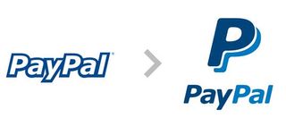
The refreshed branding featured four key elements:
- a new wordmark in a new typeface (Futura)
- a new version of the double-P monogram
- a refreshed colour palette
- a new 'dynamic angle graphic'
While the wordmark and the monogram locked up together for PayPal's new signature.

09. Indiegogo
As the first and original crowdfunding website, Indiegogo is still a relatively young company, having only launched back in 2008.
Released in April, this new logo (above) represented "the company’s mission to work hand-in-hand with campaigners to democratize finance and give people around the world the power to fund what matters to them," they explained.
10. Disney Channel
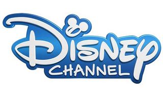
In May the Disney Channel rolled out a new logo design (above) across all its international TV networks - and it was a radical change from the previous identity.
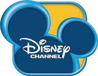
At first glance it looked like a purely typographic logo, in which the Mickey Mouse silhouette that dominated the old logo (above) remained only as a subtle squiggle.
Next page: 10 more logo redesigns...


