The best typographic logos show that an effective, distinct mark can be created with type alone, without need the for a lockup with an icon. While many brands will also want a logomark or at least some form of abbreviated design for small applications, a logotype, or wordmark, might perfectly convey their brand identity.
A type logo can be clean and modern or elegant and traditional, it can use type alone or it can include interventions that say something about the brand. And type logos can even include hidden treats in the negative space. Below we look at 12 examples of typographic logos that nailed it, sometimes through a beautifully thought-out ligature or an imaginative use of letters, sometimes through the use of colour or a perfect typeface.
For more inspiration, see our guides to how to design a logo and our guide to typography design. And for the basics, see our post on the 5 basic types of logo.
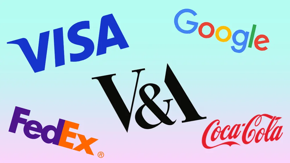
12 of the best typographic logos
01. Google logo
The Google logo is one type logo that many of us have seen online every day for years. It may look simple, but as we see in our piece on the history of the Google logo, it's been through many iterations over the years (Google does love to update its logos, sometimes to users' frustration as we've seen with the new Google Chat logo). One major change in the Google logo was in 2015, when the company switched from its stuffy old serif logotype to a friendlier, more contemporary sans serif. The result is a logo that feels super simple, both in form and colour, but is instantly recognisable.
02. Coca-Cola logo

No roundup of type logos could fail to mention Coca-Cola, perhaps the most famous wordmark of all. What's particularly notable about the Coca-Cola logo is how it's defied the passing of time. While even more recent brands have simplified and flattened their logo designs, often switching from serifs to sans serifs for a cleaner look, like Google above, Coca-Cola has barely changed its elaborate script logo in over 130 years of history. As we explore in our history of the Coca-Cola logo, the design has seen a few tweaks and refinements over the years, the Spencerian script is largely the same. This is part of the key to its success since it's what makes it feel so timeless and recognisable.
03. Science Museum
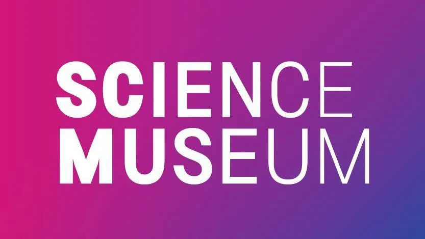
We've seen an example of a clean contemporary typographic logo and a traditional one, but the best wordmarks can also be unusual. The UK Science Museum's logo, designed by the consultancy North, sees the lettering narrow as the reader pans from left to right. It's strange because it creates a gradient-like effect that puts more emphasis on the start of the words, but that helps to make a statement. It also ties the logotype to a wider family of institutions under the NMSI (the National Museums of Science and Industry) umbrella.
When the new logo was released, it prompted some unkind comments from Johnson Banks – the agency behind the identity scheme the museum had sported for the previous seven years – on Twitter. Although these were later retracted. Who says type can't cause a stir?
04. V&A logo

Another London museum boasts what is perhaps the mark that Pentagram is most renowned for. The late Alan Fletcher's identity for the V&A Museum is breathtakingly simple and brilliant. The V and A mirror each other in form and the ampersand simply creates the crossbar of the A, ridding the need for any further detail on it.
The logo was designed in 1989, but remains as effective today as when it was first released. As the museum approached its 150th birthday in 2007, Wolff Olins was brought in to reinvigorate the institution's branding, but the logo remained unchanged at the heart of the scheme.
05. NME logo

Perhaps an unusual choice here, but the British music magazine NME (short for New Musical Express) is something of an institution, and this logo design – updated in October 2013 – simplified and already simply typographic logo further, showing just far it's possible to simplify things while still maintaining a distinct look. The confident use of simplified, all-caps type, set in Sharp Sans, a sans-serif font by Lucas Sharp, asserts the title's authority.
06. Action on Hearing Loss logo

Typographic logos can also incorporate other interventions, and sometimes simply underlining or striking through letterforms can convey an enormous amount of information. In this logotype for a hearing loss charity, Hat Trick Design's use of both underlines and strikethroughs helps highlights the positive aims of the company – namely taking action to help people hear and communicate – transforming the wordmark into an inspiring call to action.
06. Cutting Room logo

MadeThought old logo for Cutting Room's editing suite captured the software's simplicity by contrasting two very different typefaces next to each other. The result is an elegant logotype that was superbly executed across the website and packaging design. The identity is especially masterfully executed on the carrier bags, having been chosen to make full use of the corner of the bag.
08. MailChimp logo

The best wordmarks can communicate a lot of personality. This handwritten logo for the email newsletter platform MailChimp (since replaced with a different design) reflected the brand's informal, friendly vibe, which, along with its simian mascot, formed a central part of its appeal. Typography guru Jessica Hische was the designer behind this version. She lightened the weight of the previous logo and improved the vector drawing, revising the letterforms for legibility, especially at small sizes. The end result was a refined, refreshed look that embodied MailChimp's playful ethos.
09. SXSW logo

South by Southwest – styled as SXSW – launched as a music festival in 1987, and has since grown into a mega-event incorporating music, film and design. For a long time, the festival used to commission a new logo each year, but in 2017 the organisers asked Austin-based agency Foxtrot to create a permanent identity. The result is a clean, typographic logo with a self-explanatory directional arrow.
10. Visa logo

The Visa logo has gone through a few redesigns over the years, often with small tweaks to its colours to make it feel more contemporary. The latest update went for a more electric blue. It also has a logomark with its famous blue and yellow rectangles, but the iconic typography is so firmly embedded in the public consciousness that it's still instantly recognisable on its own.
11. FedEx logo

No typographic logo list would be complete without FedEx. Designed in 1994 by Lindon Leader, the then-senior design director at Landor, the FedEx logo is proof that simple, clever type-based logos can still look as fresh and smart 20 years down the line.
The FedEx logo shows that the best type logos can also be very clever and contain more than what initially meets the eye. It contains a very appropriate directional arrow, indicating FedEx's commitment to speedily delivering parcels. It's impossible to ignore once you've spotted it. The FedEx logotype also uses colour to indicate different sectors of the company.
12. Cadbury's logo

Another big daddy of typographic logos is Cadbury. Minor tweaks have been made to this logo since it first appeared on transport livery in 1921. But, based on the signature of William Cadbury, it's remained essentially the same almost a century later – it goes to show that when it comes to the best logotypes, the phase 'if it ain't broke, don't fix it' very much applies.
For more logo design inspiration, see our pick of the best animated logos and the best circular logos.

