I can already predict what you'll say about the rumoured Google Chat logo
Another week, another new Google logo (it seems). A new Google Chat logo appears to be the next design on the way, and it looks like it's almost guaranteed to provoke the same complaints we've seen with pretty much every other recent Google app icon redesign.
The new look is not yet official, but we've had a glimpse of it from a slide in a presentation, and it fits in with the transition we've seen in other Google app logos (see our pieces of the best animated logos and best circular logos for more logo inspiration, and we also have a piece on the Google logo history).

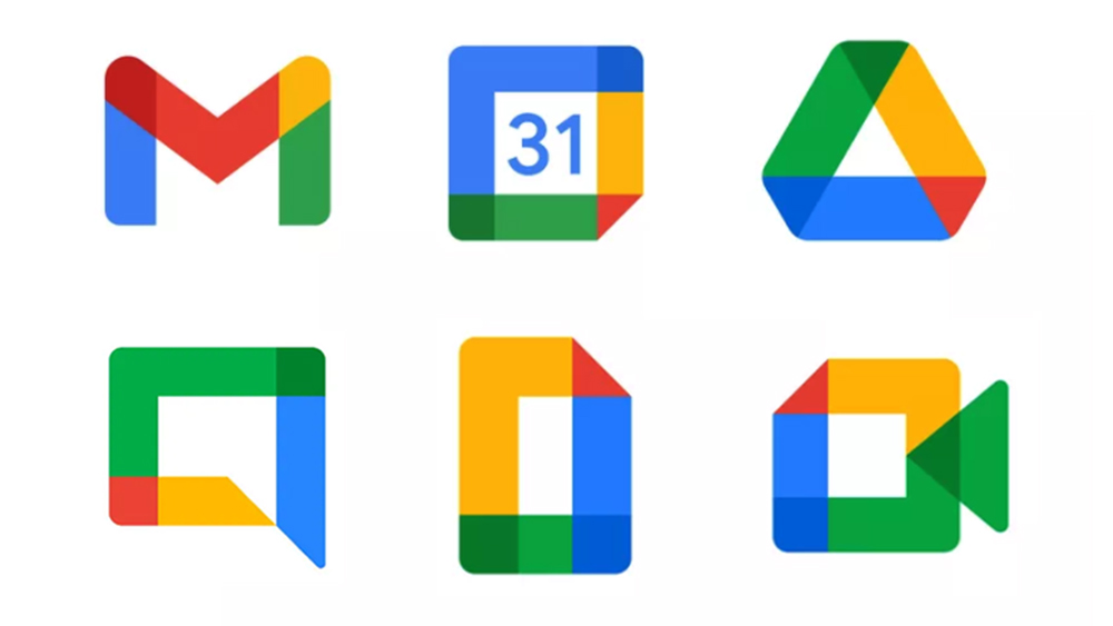
Google has been gradually updating the icons for its apps, bringing them in line with its Material You design language. In most cases, it's been going in heavy with the use of its brand colours – great for a consistent brand identity; not so great for when you want to find the right app in a hurry.
In the past two months alone, we've seen new logos for Google Authenticator, Google Play Books and Google Fi Wireless. And based on the response to those (with the exception of the Google Authenticator logo), I can predict what people are going to be saying about the rumoured new Google Chat logo.
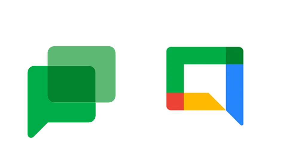
The app's current icon shows two overlapping conversation bubbles in dark green. The colour was presumably chosen to visually link the app to its predecessor, Google Hangouts, in order to help people understand what it is and locate it. But it seems Google thinks people have now had enough time to adjust.

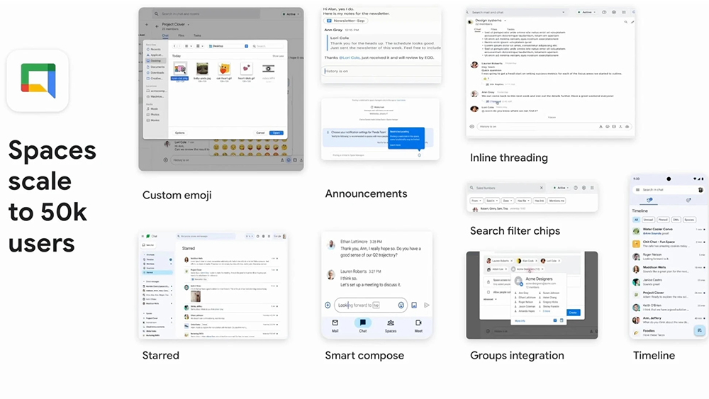
Spotted by 9to5Google, a slide from a presentation on Google Chat reportedly shown at Google's Workplace Summit, shows a logo design featuring two very rectangular chat bubbles – one formed by a colourful angular frame and the other by the negative space inside it.
Those already complaining that Google's app icons are too similar are going to have a field day. It's almost like Google heard the complaints and decided to double down with a logo that looks even more similar to its other designs. It could be the Google Meet logo without the front of the camera or the Google docs logo on its side.
Sign up to Creative Bloq's daily newsletter, which brings you the latest news and inspiration from the worlds of art, design and technology.

Will the criticism be fair? Partly. Consistency is important in creating a brand identity, but in mobile app icons, logo design meets UX, and a design has to be useable too. Some have even speculated that the reason some Google products don't take off is because it changes the logos before anyone can get used to them.
Google Chat is the company's answer to Slack and Microsoft Teams. As well as the apparent new logo, the presentation appears to show plans for a new timeline-based design for the mobile app that would show all the conversations the user is part of, allowing them to be organised by All, Unread, Pinned, direct messages and Spaces.
Google said there will be more news soon. In the meantime, don't miss our guide to the best drawing apps for Android. And if you're interested in learning about UX design, consider signing up for our online course, UX Design Foundations.

Joe is a regular freelance journalist and editor at Creative Bloq. He writes news, features and buying guides and keeps track of the best equipment and software for creatives, from video editing programs to monitors and accessories. A veteran news writer and photographer, he now works as a project manager at the London and Buenos Aires-based design, production and branding agency Hermana Creatives. There he manages a team of designers, photographers and video editors who specialise in producing visual content and design assets for the hospitality sector. He also dances Argentine tango.
