Circles are beautiful. Their combination of symmetry and round edges recalls the shape of the Earth, the sun, the solar system, and even the cycle of life itself. No wonder they've appealed to artists as diverse as Kandinsky, Bridget Riley and Frank Stella.
But let's talk about circles in logo design. I don't mean circular logos or roundels, of which there are plenty of great designs, but the tendency for graphic designers to place circles over logo designs in presentations to show... something.
There's an argument that using circles as guides helps ensure consistency. But does this really have any inherent benefit for a logo? And are they always part of the design process or sometimes an afterthought used to justify a design? That's the debate raging over on Reddit right now (see our pick of the best laptops for graphic design if you need a new device to draw them on).
What are those circles for in logo design? from r/graphic_design
"What are those circles for in logo design?" the OP asks on Reddit. And they've opened a whole can of worms.
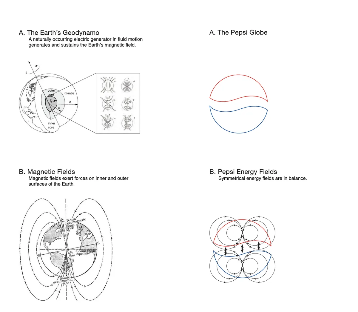
You can understand the confusion. We've seen no shortage of logo redesigns accompanied by presentations that look like technical manuals showing a new identity design overlaid by multiple overlapping circular outlines. The infamous Pepsi logo design document has to be one of the most hilariously earnest examples (the golden ratio is another common trope, and I still keep seeing people trying to wedge the Apple logo inside it).
While circles can be used to ensure consistent curves, some designers responding on Reddit suggest that they're overused and aren't always beneficial. "Mathematical accuracy isn't the same as visual accuracy," one person suggests, pointing to the famously imperfect Google G logo as a classic example of a design that's intentionally not a circle.
"It’s really important to remember that we’re ultimately designing for human eyes, and human eyes don’t always math very well," another designer adds.

Some are suggesting that the circles often aren't part of the design process at all but a form of post-rationalisation employed to try to justify the rationale behind a logo after it's finished – and to "make you look smart during your presentation."
"People see the greats using guides back in the day because they were using a draughting table and pencil with gridded paper. Now a lot people slap them all over a design for appearance sake, which, ironically is the opposite of good design," one person argues.
And some people acknowledge that they have done just that. "I've definitely made whole logos and then created a grid to get this look for the portfolio after the fact," one person admits.
Some of them argue that it's not that designers want to present logos like this, but that clients expect it. Corporate clients want a justification for everything, and circles provide something tangible and concrete that non-designers can get a hold on. One person even had a client "ask to see the circles" so quickly mocked up guides over their design.
"I have presented both with and without these kinds of visual aids, and I will tell you that these diagrams can absolutely save your ass in a board room," another person writes. "They work real well to prevent Leo the CMO from derailing a 5-year project because he doesn’t like the art style all of a sudden."

Some designers disapprove. "Graphic design is about going straight to the point in replying to a request, adding superfluous stuff is useless. Those grid things are a remain of fake projects posted on Behance then on Instagram by people that don’t really work in the field."
But circles guides have their defenders too. "Having a clear rationale and method means that the aesthetic is more easily reproducible," one designer writes. "The circles mean I can make other things constructed with similar circles and expect it to look consistent."
I can see the arguments on both sides. If using circles helps you design a great logo, great. And while it's nice to think that a great logo design always speaks for itself, the reality is that clients do sometimes needs to be convinced that a design works. On the other hand, if a design doesn't work, the fact that it has perfect radii isn't going to change that,
What do you think? If you're a logo designer, do you use circles as guides when you're designing, or do you apply them afterwards? Do they serve a purpose? Let us know in the comments section below.

