Bold Visa rebrand aims to show it's more than a credit card

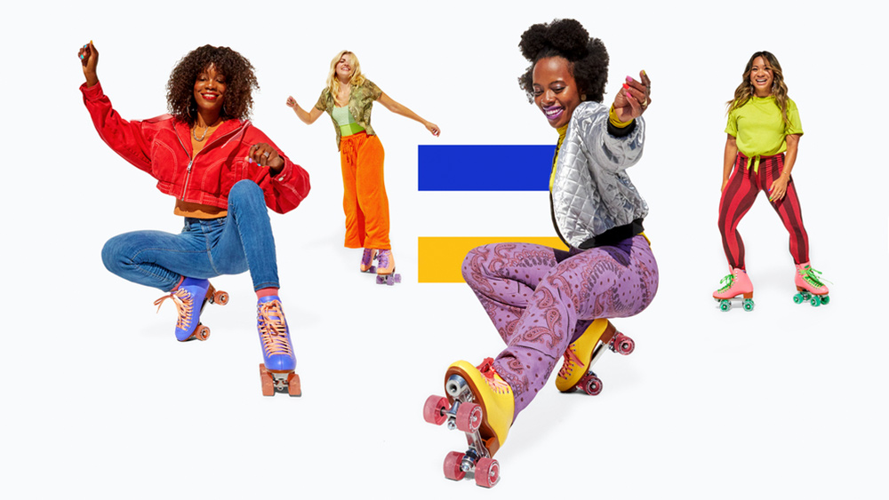
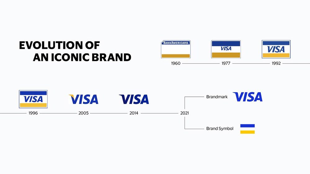
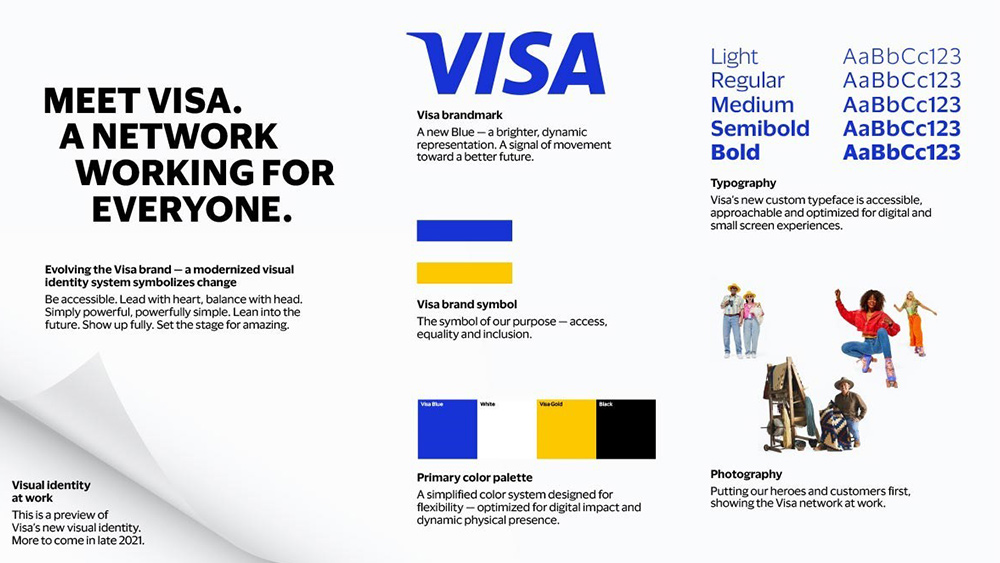
Visa has revealed a new identity as it seeks to refresh its image to communicate that it's more than a plastic credit card. Drawing on 60 years of brand history, the new identity doesn't stray too far from the branding we know, but rather exploits the recognisability of the Visa blue and gold colours by separating the brand symbol from the wordmark to create two separate assets.
The brand symbol will now be used on its own, as will the Visa brandmark, which has been given a fresh lick of paint in the process. The update is part of a wider marketing campaign that includes a series of ads to be launched during the Tokyo Olympic Games. For more on logo design, see our list of the best logos ever.


The campaign's being led by Wieden+Kennedy for the first time. It aims to show that Visa is opening access to the cashless society to "everyone, everywhere" by using the "democratic strapline", ‘Meet Visa’. The new logo, developed with brand design firm Mucho, will be phased in through the rest of 2021. The brand's launched the updated identity in a short film directed by Malik Hassan Sayeed, which travels the world to show how Visa helps businesses and merchants globally.
Article continues belowLynne Biggar, executive vice-president and global chief marketing officer at Visa, said: “People think they ‘know’ Visa. Consumers and businesses trust the power of those four letters and see it when they open their wallet, pay a vendor, walk into a store or check out online. What they don’t see is how those four letters operate the most dynamic network of people, partnerships and products."
If the update seems somewhat familiar, Mastercard also began using its logo without the wordmark back in 2019, a move that we liked at the time – see our article on 5 logo redesigns that got it right.
Read more:
- 18 controversial moments in logo design and branding
- Where to find logo design inspiration
- These bad logo redesigns are the best (and worst) thing you'll see all day
Sign up to Creative Bloq's daily newsletter, which brings you the latest news and inspiration from the worlds of art, design and technology.

Joe is a regular freelance journalist and editor at Creative Bloq. He writes news, features and buying guides and keeps track of the best equipment and software for creatives, from video editing programs to monitors and accessories. A veteran news writer and photographer, he now works as a project manager at the London and Buenos Aires-based design, production and branding agency Hermana Creatives. There he manages a team of designers, photographers and video editors who specialise in producing visual content and design assets for the hospitality sector. He also dances Argentine tango.
