While bad logos pop up all the time (we've already seen a few shockers this year), there are a few classics out there that are unlikely ever to leave the graphic design hall of shame. But one designer has at least given some of the all-time worst an ounce of (hypothetical) dignity.
Emanuele Abrate began 'fixing' the worst logos he had ever seen for his project, 'Worst Logos Ever Redesigned', last year – and it's still giving us a much-needed laugh here in 2021. Abrate chose nine of the most abominable examples of logo design, and set to work making them better. Which mostly involved removing a ton of accidental smut.

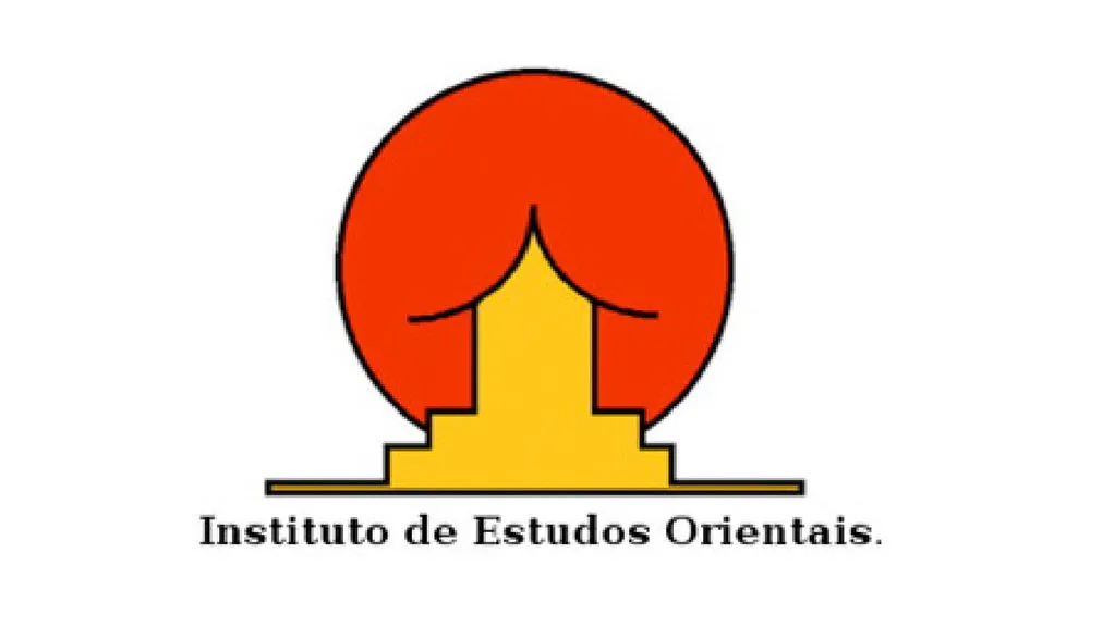
Kicking things off is a hilarious example of ambiguous imagery, from Instituto de Estudos Orientais. We're sure there isn't a designer in the land who hasn't wanted to get their hands on this one, and we're happy to report it's been finally been tweaked (read: redesigned from scratch).
As Abrate describes on his Behance page, though the shapes of the image are essential and simple, there's too much going on (as well as the obvious, and unfortunate visual connotations, of course). Abrate simplified the design, working with negative space, aligned the typography and switched it to a sans serif to 'better match the symbol'.

The original Computer Doctors logo is a hot mess, with confusing typography, and a flaccid, almost-but-not-quite-computer mouse interrupting the key word. As Abrate says, 'nothing could be saved from this design', so he went for a totally new concept – with clean typography and a clever use of negative space to create a medical cross.

What is it, exactly, that Mama is baking here? And where? Something is on fire, and it ain't the design. This is another example of a logo famous for ambiguous imagery and most designers probably have a bunch of ideas for how it could be transformed.
Abrate 'decided to start from the figure of the oven mitt as an iconic symbol: an oven mitt that joins the figure of the heart to convey the sense of love and passion.' He also modernised the use of colour, and used a rounded, friendly font.

There are six more examples to explore over on Abrate's Behance page, including well-known and not so famous designs, plus mock-ups showing the logos in situ on products and business cards. Redesigning logos is a great creative exercise, and finding your own angle for approaching a redesign project creates more interest.
If you're looking for a more contemporary logo to give the redesign treatment, the CIA's new symbol is confusing at best. Or there's always Myntra's recent offering – the logo so 'offensive' it received a police complaint.
Read more:

