The new CIA logo is being brutally mocked
We spy memes. Lots of memes.
Sign up to Creative Bloq's daily newsletter, which brings you the latest news and inspiration from the worlds of art, design and technology.
You are now subscribed
Your newsletter sign-up was successful
Want to add more newsletters?
Our first big rebrand of 2021 has arrived, and it comes from a rather unexpected place. Instead of a car brand, web service, restaurant or retailer, we're starting the new year with a brand new logo from the CIA. That's right, the Central Intelligence Agency has unveiled new look – and it's already spawned a ton of hilarious memes.
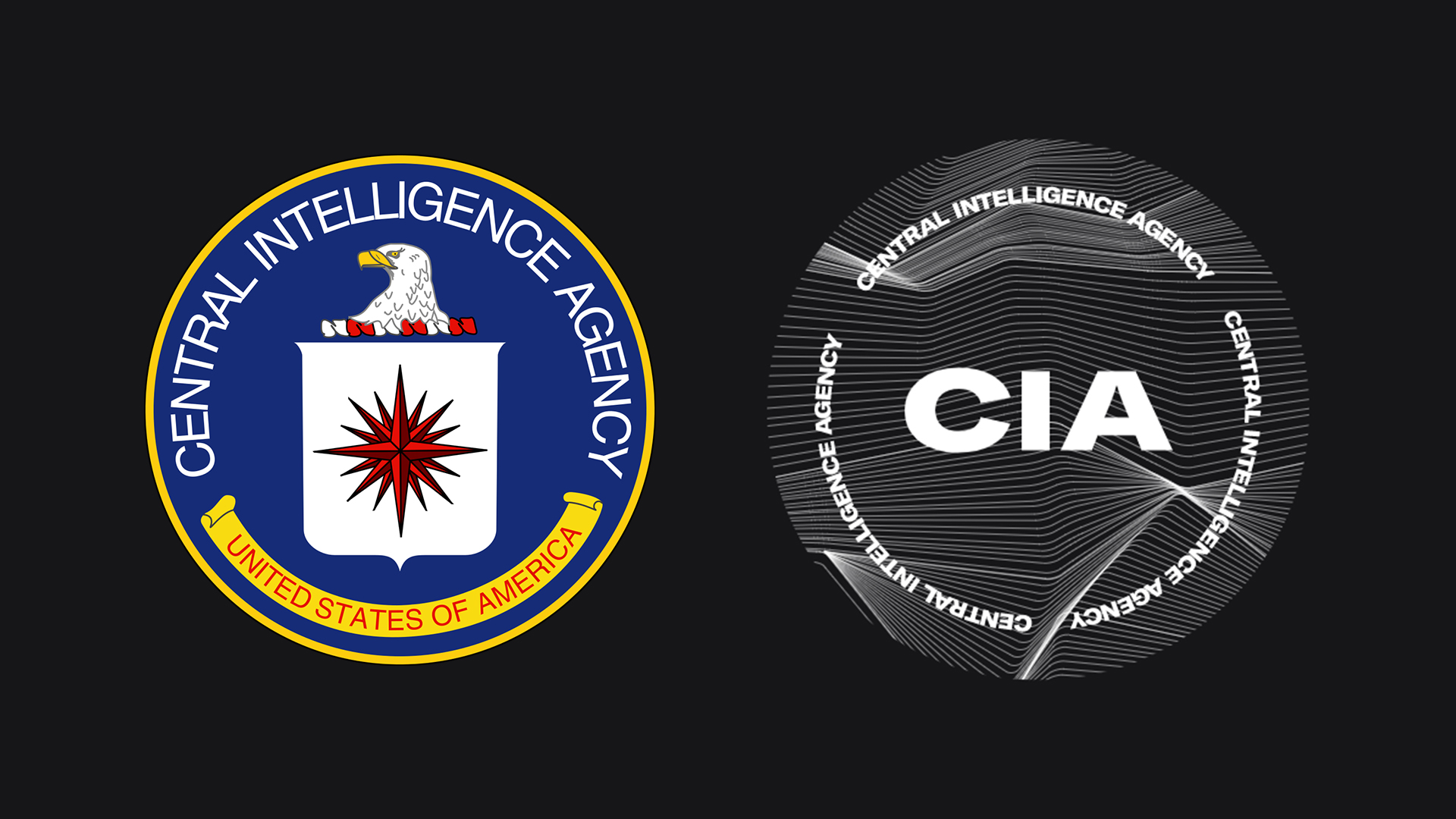
The CIA's new rebrand includes a refreshed logo (below) which retains its predecessor's circular shape – and very little else. With its bold, black-and-white typeface and wavy lines, the internet is wondering whether the CIA has been taking logo design inspiration from techno music posters.

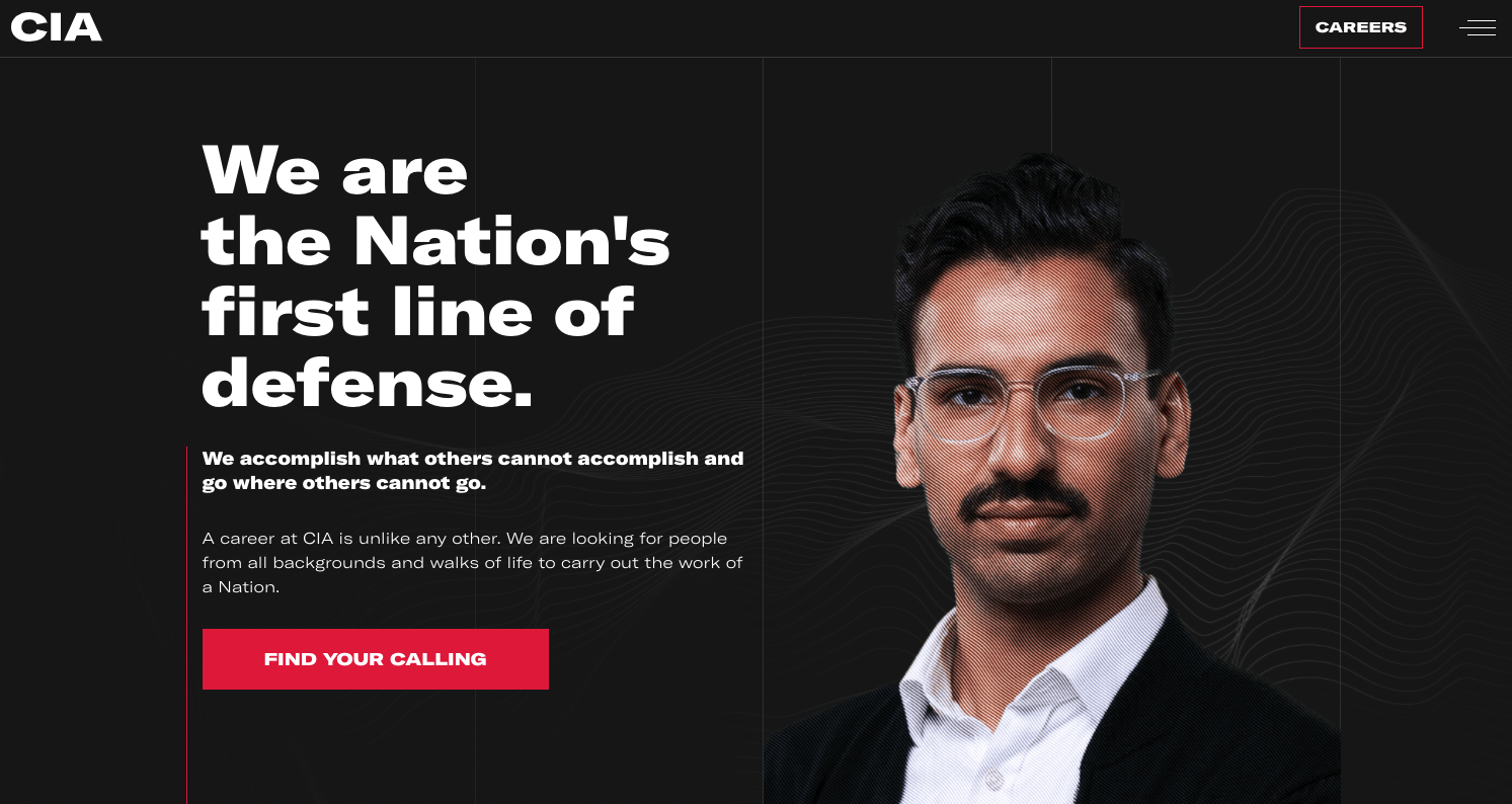
The logo features on the CIA's new recruitment website, and is part of a rebranding effort designed to encourage more diverse applicants "from people of all backgrounds and walks of life". According to Associated Press, "while the CIA has been diversifying for years, intelligence agencies still lag behind the federal workforce in minority representation".
Article continues below 
Like many of our favourite website templates, the CIA's new site (above) is clean, bold and striking in its simplicity. But conversely, the new logo is anything but simplistic with those frankly baffling waveform-esque curves. It looks as though the CIA is about to drop the hottest (presumably top secret) DJ set of the year – something that hasn't escaped Twitter's notice.
The new CIA logo is literally a Mutek poster pic.twitter.com/3RsPzWzDFtJanuary 4, 2021
new CIA logo looks like theyre going to send me a form email saying they loved the tracks on my soundcloud and they want to do a digital only release to their 147 followers https://t.co/q2mfaHcTaHJanuary 4, 2021
Can't wait for the CIA Boiler Room set https://t.co/QlHBXbHxDaJanuary 4, 2021
CIA rebranding as a modular synthesizer festival in Berlin pic.twitter.com/3PQwejMGUqJanuary 4, 2021
While it's admirable that the CIA is attempting to diversify its recruitment and target younger applicants, designing a T-shirt-ready logo feels like a step too far. We're not sure we're supposed to be able to imagine spotting the CIA logo in Urban Outfitters.
The best logos of all time are all truly unmistakeable, and judging by the amount of people mistaking this for a music festival logo, it seems the Central Intelligence Agency hasn't come up with the most intelligent logo. Let's just hope the CIA doesn't make the same mistake as the US Space Force and trademarks the logo pronto – there might well be a few plucky DJs with their eye on this one.
Read more:
Sign up to Creative Bloq's daily newsletter, which brings you the latest news and inspiration from the worlds of art, design and technology.
- Nintendo Switch deals: Nintendo Switch bundles and more at the lowest prices
- Apple's 2 new iPhone designs will change everything
- Ludicrous new PS5 design could be yours for just $2M

Daniel John is Design Editor at Creative Bloq. He reports on the worlds of design, branding and lifestyle tech, and has covered several industry events including Milan Design Week, OFFF Barcelona and Adobe Max in Los Angeles. He has interviewed leaders and designers at brands including Apple, Microsoft and Adobe. Daniel's debut book of short stories and poems was published in 2018, and his comedy newsletter is a Substack Bestseller.
