It was the David and Goliath battle of 2020, with Apple ruthlessly targeting a small business with a 'similar' logo to its own – even though said business' logo features a pear (instead of, you know, an apple). But if you were hoping for a dramatic, rock-throwing finale to the Apple/Prepear saga, it's time to pear back your expectations.
The case has finally settled, with meal-planning app Prepear agreeing to slightly alter its logo to avoid causing "dilution of the distinctiveness" of Apple's. Because who could possibly recognise the Apple logo, one of the best logos of all time, after seeing one small business's depiction of an entirely different fruit?
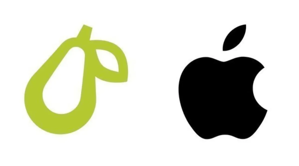
According to documents filed at the United States Patent and Tradekark office (USPTO), Prepear has amended the leaf on top of the pair, giving it a new, straight edge (below). And it seems that was enough for Apple, which has already consented to the change. At least this one was cleared up a lot quicker than the messy, ongoing battle between Nirvana and Marc Jacobs.

Back in August, Super Healthy Kids (Prepear's parent company) shared an Instagram post (below) explaining the situation, and how it felt "a moral obligation to take a stand against Apple’s aggressive legal action against small businesses and fight for the right to keep our logo". The company also shared a petition to keep its logo, which ended up with a whopping 270,000 virtual signatures.
If we're honest, we're just as perplexed now as we were when the case first came to light. The amended Prepear logo looks almost identical to the version Apple took umbrage with, which suggests it wasn't the use of the actual fruit that bothered the trillion-dollar company – it was merely the leaf. The change is so minor that we have to wonder if it was worth the the effort (and no doubt money) on Apple's part. And it seems Twitter agrees:
That whole Apple and Prepear logo case is really ridiculous. I love Apple but sometimes they really do fight the most stupid and unnecessary things.February 10, 2021
How many tens of thousands of dollars were spent on lawyers to change this drawing of a leaf😐 https://t.co/VBp0FtBg8UFebruary 10, 2021
Still, we're pleased for Prepear that the case as been amicably resolved without the company having to compromise its design too much. It's one of the most high profile logo disputes we've seen in recent months, but at least it's had a peaceful – if not happy – ending. If you're embarking on a logo design project, our logo design guide will help you create something truly unmistakeable.
Read more:
- 12 deepfake examples that terrified and amused the internet
- The game-changing Apple iPhone hack hiding in plain sight
- Is this hidden PS5 design the coolest gaming Easter egg ever?

