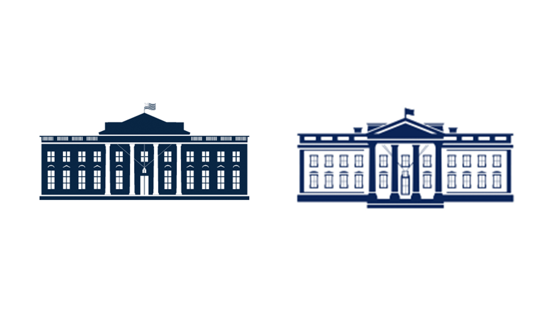
New White House logo goes against design trends – and we love it
It's going down a storm online.
Sign up to Creative Bloq's daily newsletter, which brings you the latest news and inspiration from the worlds of art, design and technology.
You are now subscribed
Your newsletter sign-up was successful
Want to add more newsletters?
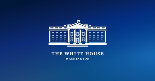
With all the changes that have taken place in the White House this month, you might not have noticed that the building itself has a brand new logo. Along with an entirely new web design, the White House website also features a new symbol – and the subtle redesign is going down a storm online.
The colours of the previous version have been inverted, with architectural details now navy blue (instead of the house itself, which is now white). And speaking of details, for once, we're not looking at a new logo thats flatter than its predecessor. (Check out our guide to logo design if you're looking for inspiration.)

According to Fast Company, creative agency Wide Eye added extra detail such as shadowing to reflect the goals of the new administration. “There’s a bit more texture than you might have on a flatter logo,” the agency says. “It is both forward looking while having its roots in something very traditional."
Article continues belowWith the trend for simplified logos as popular as ever, it's refreshing to see a logo that's actually more detailed than the previous version. From Google's confusingly similar new Workspace logos to Warner Bros's super-flat new symbol , minimal rebrands are everywhere – and it seems some corners of the internet are starting to suffer from flat design fatigue.

Indeed, even the White House logo itself was part of the trend until now. The Obama administration's logo removed the words 'The White House', while Trump's version went further by removing the decorative oval frame. The text is back in some applications of the the new logo (above), in either Mercury (a traditional serif typeface) or Decimal (a more contemporary sans serif affair). If you're looking for typographical tips, our best free fonts roundup has you covered.
The logo was designed as part of an overhaul of the entire White House website – and judging by the response on Twitter, Wide Eye's work is going down a storm:
Is the White House logo design new? The font is so cool. pic.twitter.com/vftEZripelJanuary 21, 2021
OMG the @WhiteHouse brand is like amazing. I am telling you the new logo for the White House and the entire brand from the color scheme to the website is like amazing. Well done whoever made the WH brand. #WhiteHouse pic.twitter.com/fJJgopzTuWJanuary 25, 2021
Am I the only graphic design nerd who wants to know about the lovely new White House logo? pic.twitter.com/jpgRgXe4ZvJanuary 21, 2021
I know it’s not important, but I like the new White House letterhead and logo.January 25, 2021
While it's hardly the most dramatic logo change of all time, that's no bad thing – we're big fans of the slightly more detailed look, especially in a world of overly minimal, abstract designs. And perhaps most importantly, unlike the CIA's new design, this is one new US government logo that doesn't feel like it's inviting us to an underground rave.
Sign up to Creative Bloq's daily newsletter, which brings you the latest news and inspiration from the worlds of art, design and technology.
Read more:

Daniel John is Design Editor at Creative Bloq. He reports on the worlds of design, branding and lifestyle tech, and has covered several industry events including Milan Design Week, OFFF Barcelona and Adobe Max in Los Angeles. He has interviewed leaders and designers at brands including Apple, Microsoft and Adobe. Daniel's debut book of short stories and poems was published in 2018, and his comedy newsletter is a Substack Bestseller.
