Google's bold new Gmail logo pushes the envelope
The company teases a new look.
Sign up to Creative Bloq's daily newsletter, which brings you the latest news and inspiration from the worlds of art, design and technology.
You are now subscribed
Your newsletter sign-up was successful
Want to add more newsletters?
From Photos to Maps, Google has been busy updating the logos for several of its G Suite apps this year. And now it seems one of its most popular services could be in for a design overhaul: Gmail.
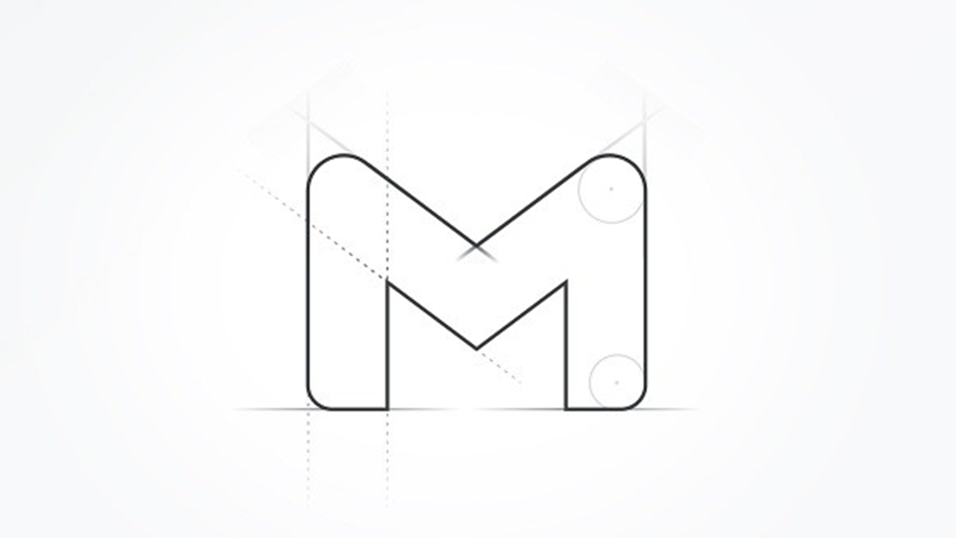
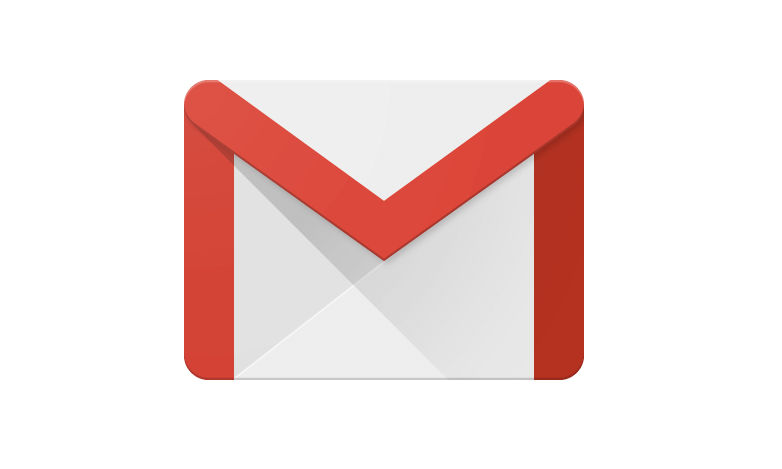
The company has revealed a technical drawing depicting the app's 'M' logo, along with angle and line markers. The letter itself is thicker and more rounded than the current iteration, but the most obvious change is the apparent removal of the icon's signature envelope behind it. While we're yet to see the concept come to fruition, the drawing suggests the new design, like many of our best logos, will be a clean and minimal affair.

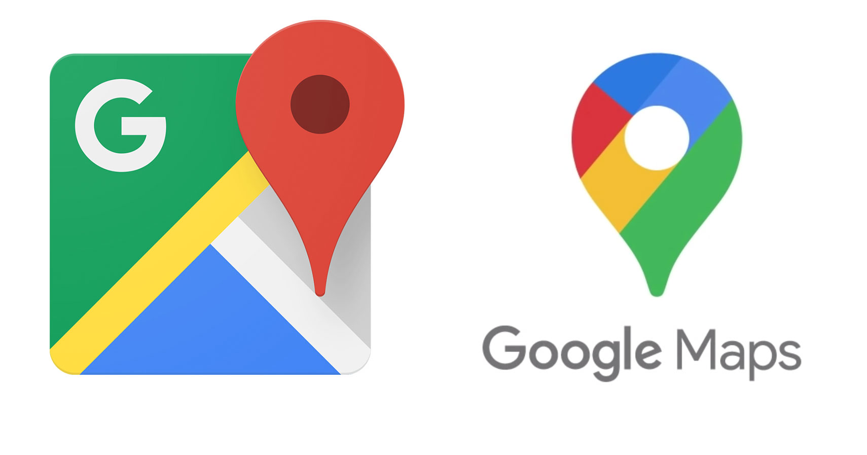
Allegedly shared with 9to5Google by Google itself, the image suggests that Gmail's logo could follow in the footsteps of Google Maps' recent redesign, with decorative elements stripped away to leave a single, bold symbol. Google Photos' logo went in a similar direction this summer, but not everyone was keen on the more minimal take on the pinwheel symbol.
Article continues below 
Based on other G Suite logos, we wouldn't be surprised to see the red 'M' (above) replaced with a version incorporating red, yellow, green and blue. This occurred with the Maps logo (below), with the previous red pin symbol replaced by a multi-coloured iteration.

While it's too early to judge the design itself (and we're only making an educated guess about the colours), we'd be pleased to see Google bring one of its most ubiquitous logos in line with the design language of the rest of G Suite. We wouldn't be surprised to see it join the flat design party, especially with the removal of that 3D envelope.
There's no official word on when the new logo might drop, or indeed whether it will accompany a broader redesign of the Gmail app itself. But one thing's for sure – if users aren't keen on the new look, Google will probably hear about it. When it comes to icon design, users aren't shy about making their feelings known (as Apple recently found out the hard way).
Read more:
Sign up to Creative Bloq's daily newsletter, which brings you the latest news and inspiration from the worlds of art, design and technology.

Daniel John is Design Editor at Creative Bloq. He reports on the worlds of design, branding and lifestyle tech, and has covered several industry events including Milan Design Week, OFFF Barcelona and Adobe Max in Los Angeles. He has interviewed leaders and designers at brands including Apple, Microsoft and Adobe. Daniel's debut book of short stories and poems was published in 2018, and his comedy newsletter is a Substack Bestseller.
