Google Photos’ new logo falls flat
Not everybody is convinced about the minimalist new design.

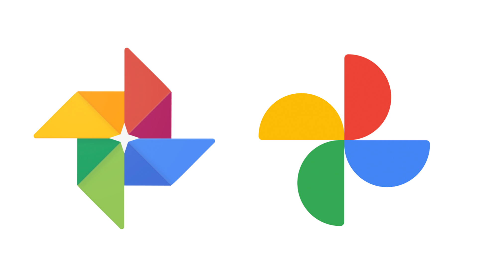
Google has released a huge update for its popular Photos app, including a simplified design and a brand new map view. But perhaps the most immediately noticeable aspect of the update is a new Google Photos logo.
The app logo has been flattened, with each of the four shapes now rounded instead of pointed. Logo design inspiration can come from many places, and in a blog post introducing the redesign, Google says the pinwheel (those lovely windmill beach toys) design is a nod to childhood and nostalgia. But some aren't totally sold on the simplified new look.
Thanks, I hate it. pic.twitter.com/W5NSKuDjiJJune 25, 2020
I'm torn. I like the simplicity, but there IS a point when something becomes TOO simple, to the point where it loses identityJune 25, 2020
Why are so many companies going for simplistic logos now? I get not being too complex but the Google Photos logo was fine with the way it was. There is no need for change https://t.co/iiVrlESRoBJune 25, 2020
Google claims to have retained "that familiar pinwheel shape to remind you of past memories," but we're not sure the pinwheel itself is particularly recognisable in this simplified form. The removal of both the two-tone shading and overlapping pointed shapes has led to the loss of a certain tactile quality, making the semicircles simply look like four separate abstract shapes. As one designer suggests (below), perhaps the logo's colours could have been simplified without losing the familiar overall shape.
Fixed it pic.twitter.com/K2AUcb9aJ3June 25, 2020
One Twitter user has even spotted a resemblance between the new Google Photos logo and that of a certain American supermarket chain. Indeed, it seems Google's new design is only a few Photoshop shortcuts away from turning into a fruit bowl.
Hi we’re @googlephotos and we’d like to sell you some groceries. @CreativeBloq pic.twitter.com/RXYFCa45svJune 25, 2020
Still, although it might not scream 'pinwheel' to us, we'd say Google's new logo is a nice, clean example of flat design – the rounded edges might be more abstract, but they're more consistent with the round logo design for other Google services such as Chrome and Maps.
While users will hopefully adjust to the new logo over time, when an icon greets a them on their home screen every day, it's important to get it right – something Apple is currently finding out the hard way with the backlash to its brand new MacOS Big Sur icons.
Read more:
Sign up to Creative Bloq's daily newsletter, which brings you the latest news and inspiration from the worlds of art, design and technology.

Daniel John is Design Editor at Creative Bloq. He reports on the worlds of design, branding and lifestyle tech, and has covered several industry events including Milan Design Week, OFFF Barcelona and Adobe Max in Los Angeles. He has interviewed leaders and designers at brands including Apple, Microsoft and Adobe. Daniel's debut book of short stories and poems was published in 2018, and his comedy newsletter is a Substack Bestseller.

