Google Maps came along 15 years ago, wiping out the need to commit routes to your long-term memory and provoking sales of road maps to plummet. To mark its birthday, Google has given the platform a total overhaul, with a brand new look, a plethora of new features and a shiny new app icon.
Google Maps' icon was last updated in 2015, to a map featuring a pin plus its 'G' symbol. But this new incarnation has ditched the lettering altogether, and put the well-known pin icon firmly centre-stage.
(If you'd like to up your icon game, check out our list of the best free icons. You can also explore Google's hidden features with our post on the best Google Easter Eggs)
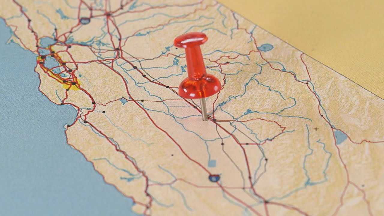
The above video tracks the evolution of the app icon, with a nod to the original real-life drawing pin that inspired the virtual one. Because the pin is now on its own, it has transformed from a humble red into a smorgasbord of Google's brand colours, in the formation of roads on a street map.
According to Google, the icon "represents the shift we’ve made from getting you to your destination to also helping you discover new places and experiences". And be sure to keep an eye out for a "celebratory party-themed car icon", which will appear for a limited time over this birthday period.

The updated app design will see the introduction of five tabs to organise your Maps experience into categories that include Commute and Explore. Live View is expanding, and there will be more capability in the Public Transit section, too.
We think the new design is streamlined and unfussy, and the evolution of the pin makes for a neat story.
Read more: