Discover the unknown stories behind everyday icons
There are symbols all around us that we take for granted. We know their meaning, use them every day and never question them. Some have fairly obvious origins, such as the use of a lightning bolt to indicate high voltage or a flame to indicate that a material is flammable. But there are others whose stories are less apparent.
Why does an 'S' with a line through it represent the US dollar? And why does a circle containing a vertical line and two angled lines signify peace? Here we trace the fascinating origin stories of eight everyday icons.
(To get your hands on all manner of free icons for use in your design work, see our free icon sets post.)
01. The power icon

Thanks to the globalised distribution of electronics, many symbols used in technology are recognised all over the world, the 'play' symbol being an example. But the meaning of the power icon is less obvious. As a sign of how unintuitive it is, television remote controls for a long time came with 'power' or 'standby' printed alongside the icon for clarification. The 'O' and line '|' had previously been used separately to indicate 'on' and 'off' positions on rocker switches, so when advances made it possible to replace these with press buttons, a new icon combining the two positions emerged.
The symbol showing a circle intersected by a vertical line was originally intended only to show a soft-off, or standby, rather than a hard-off, but it has been so misused and misinterpreted that the International Electrotechnical Commission, which regulates such things, now advocates its use as a power icon.
Despite a widely shared theory that the symbol represents a '1' and a '0' in binary notation, the IEC says they are not numbers but a vertical bar and a circle. The vertical bar represents a closed circuit through which current will pass, and so the device is on. The 'O' represents an open circuit, meaning the device is off.
02. The ampersand
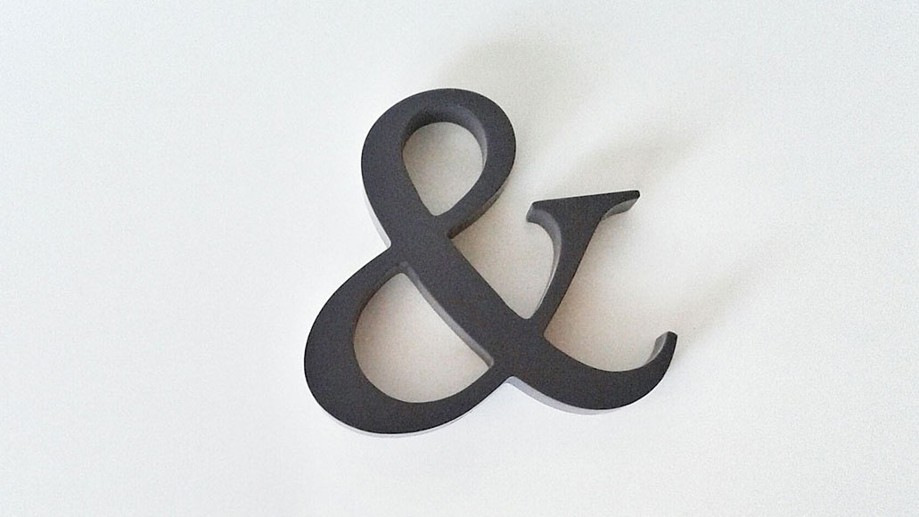
The ampersand is adored by designers and typographers all over and offers a world of creative possibilities, but just why does this elegant logogram denote the conjunction 'and'? The symbol appears to date back to the tradition for scribes writing in old Roman cursive to use a ligature combining the letters in 'et', the Latin word for 'and', in the first century AD. It had already come close to reaching its current appearance by the time the Carolingian minuscule script had become the calligraphic standard in Europe in the 9th century.
The symbol was apparently so often used that it was considered a letter in the alphabet in Latin, and this tradition was carried over into English in the early 1800s, the symbol being tagged on after the letter 'Z'. Schoolchildren would be made to recite, 'X, Y, Z, and per se and,' per se meaning by itself. The slurring of this final phrase by a generation of children gave the 'and per se and' its current name in English: the ampersand.
03. The peace sign

It’s known all over as the peace symbol, but just what does a circle containing a vertical line and two angled lines have to do with world peace? The symbol was actually designed for one specific grassroots organisation, the UK’s Direct Action Committee Against Nuclear War (DAC).
It was put forward by a designer called Gerald Holtom as a symbol to be used on lollipop placards on the group’s protest march from Trafalgar Square to the Atomic Weapons Establishment in Aldermaston in 1958. His inspiration? He based the design on the shape of a figure using flag semaphore to communicate the letters 'N' and 'D' (for nuclear disarmament).
He also considered that the two downward angled arms that form the semaphore signal for 'N' represented a gesture of human despair at nuclear arms proliferation. The symbol is striking, easy to draw and doesn’t need to be straight, which made it perfectly adaptable to pin badges, patches and bumper stickers. It was adopted by the Campaign for Nuclear Disarmament (CND) but never copyrighted and was soon picked up by groups in other countries, becoming a symbol of 1960s counterculture in general. Groovy!
04. The Smiley
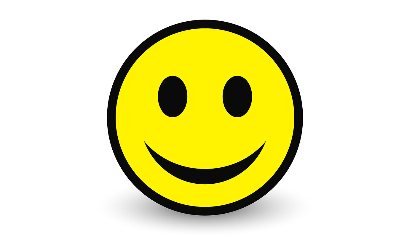
Another symbol that became a counter cultural icon, the smiley has its own intriguing story. Believe it or not something that became an icon of the 1980s acid house scene is actually the copyrighted property of the entirely real London-based Smiley Company.
The first yellow smiley seems to have been created by graphic designer Harvey Ross Ball in 1963. He was commissioned to design a graphic to boost morale at a Massachusetts insurance company and came up with a smiley face with oval eyes and a slightly off-centre smile. He never copyrighted the image and it soon started appearing on badges, stickers and greetings cards in the US, especially after it was printed on 50 million pin badged by the owners of two Hallmark shops in Philadelphia in 1971.
But meanwhile in France, journalist Franklin Loufrani began using an extremely similar smiley to flag up positive news stories in the newspaper France-Soir. Loufrani, however, saw the design’s potential and registered it with the French patent office. He actively promoted its use, printing it on stickers and handing them out for free to help it catch on.
In 1996, he and his son Nicolas founded the Smiley Company in London and now own the symbol in around 100 countries. It’s reported to be one of the biggest-grossing licensing companies in the world, and has mounted legal challenges against Kumon, Walmart, Joe Boxer and others who have developed their own face symbols.
05. The @ sign

Nowadays it’s almost impossible to imagine electronic communication without the @ symbol. Pronounced 'at' in English, but called the 'snail' in Italy and 'monkey tail' by the Dutch, it’s a symbol we use every time we send an email, tag someone in a group message or on social media.
The symbol is perhaps also an unlikely survivor because not so long ago the majority of people would not have been able to say what purpose it served. The Spanish name for the symbol comes closest to its original meaning – they call it the 'arroba' after an old standard of measurement, and it seems that in the 1500s it was being used by European merchants to denote units of wine called amphorae.
Both merchants and mathematicians continued to use it to signify 'at the rate of', but for most people the symbol was obscure and close to becoming obsolete. Its resurrection came in 1971 when computer scientist Ray Tomlinson sent the world’s first email via ARPANET. Needing a way to address a message to someone working at a different computers, he simply chose the key that was used the least, and gave the humble @ a whole new life.
06. The hash

The hash is another now ubiquitous symbol that was given a new chance by the social media age. Hashtags allow us follow trending topics on Twitter, find topics of interest on Instagram, and have even come to name political and social movements.
But like the @, the hash was originally used for measurements, and had long fallen out of use. Previously known as the pound symbol, it derived as a simplified version of the ligature ℔ which was used as an abbreviation for 'libra pondo', or pound weight, in the 1800s.
In Britain it became known as the 'number sign' to differentiate it from the pound sterling and because it would sometimes be used to mean number when added before rather than after a number. They symbol was added to telephone keypads by Bell Telephones in the 1960s but rarely used until voicemail services developed in the 1980s. More uses would be found for it later in computing. It was used to label groups and topics in internet relay chat in the 1980s, and this inspired Twitter’s adoption of it to allow users to tag topics of interest.
07. The heart
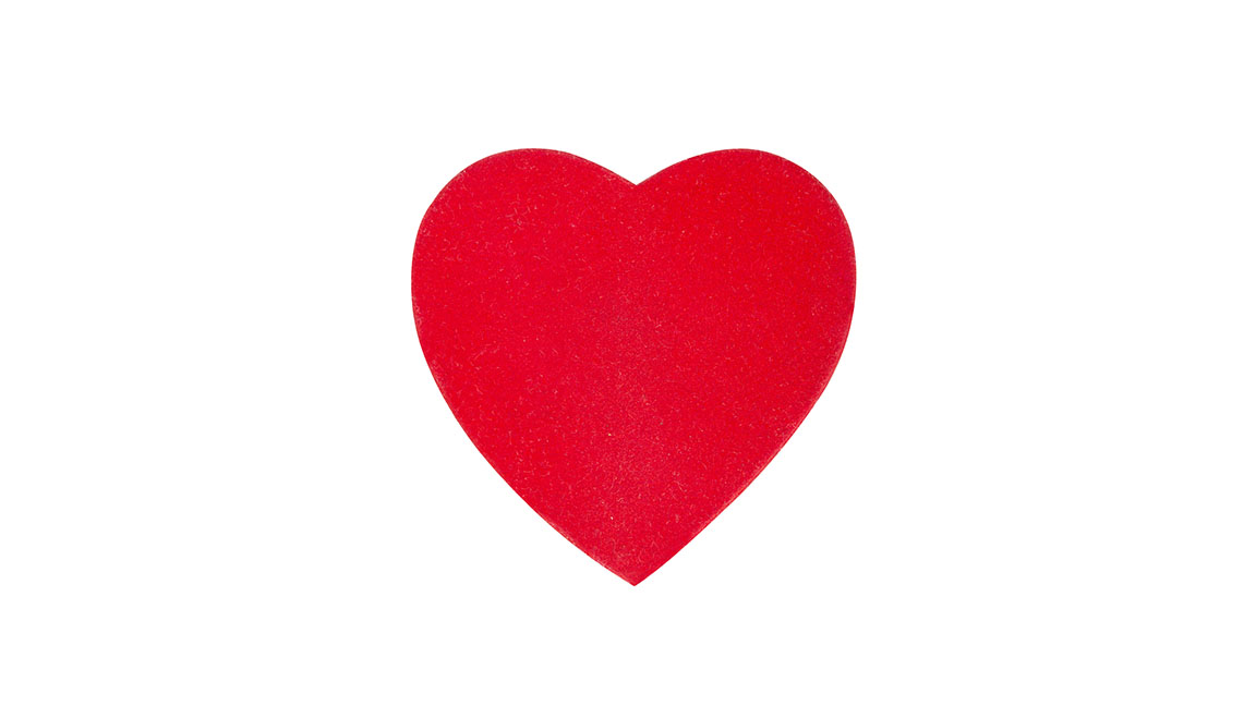
With Valentine’s Day approaching, we’ll soon be seeing a lot of this symbol. The heart is one of the most widely used symbols in graphic design. But with its two rounded lobes and pointed base, why does it look so unlike a human heart?
There are many theories behind its origin, including those that say it was not intended to look like a heart at all, but the intertwined necks of two swans. Other theories say it represents other parts of the human body, the shape of ivy leaves – which were associated with fidelity – or silphium, a North African plant with heart-shaped seed pods.
As for its ubiquity in graphic design today, part of that comes down its use by designer Milton Glaser as a logogram in his I Heart NY brand in the 1970s (listed as one of our best logos in the world). The incredible thing about the heart symbol is that despite being so used it never seems to become cliché.
08. The dollar sign
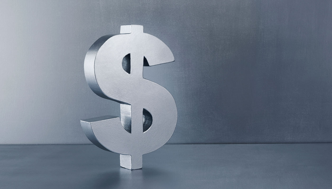
For greetings card companies and flower sellers, Valentine’s Day means $$$. But then this is another symbol with a mysterious origin. In English speaking countries, this glyph is most commonly referred to as the 'dollar sign', usually in reference to the US dollar although it’s also used for other dollar currencies.
But the symbol is also used throughout much of Latin America to denote everything from the Argentinian peso to the Nicaraguan córdoba. There are various theories as to its origin. One is that it comes from an abbreviation of 'peso' as ps, which occurred in the 1770s when English-Americans had trading relations with the Spaniards.
Read more:
Sign up to Creative Bloq's daily newsletter, which brings you the latest news and inspiration from the worlds of art, design and technology.

Joe is a regular freelance journalist and editor at Creative Bloq. He writes news, features and buying guides and keeps track of the best equipment and software for creatives, from video editing programs to monitors and accessories. A veteran news writer and photographer, he now works as a project manager at the London and Buenos Aires-based design, production and branding agency Hermana Creatives. There he manages a team of designers, photographers and video editors who specialise in producing visual content and design assets for the hospitality sector. He also dances Argentine tango.
