The 20 biggest logo designs of 2014
Sign up to Creative Bloq's daily newsletter, which brings you the latest news and inspiration from the worlds of art, design and technology.
You are now subscribed
Your newsletter sign-up was successful
Want to add more newsletters?
11. Google

Kerning. It can be the difference between your type being aesthetically pleasing and jarringly horrid, and getting it right is one of the 10 commandments of typography.
Never one to rest on laurels, in May the Google branding team adjusted the famous logo – which had received a redesign only eight months previously – to improve the kerning. Subtle stuff, but nothing gets past us at Creative Bloq...
12. Vimto
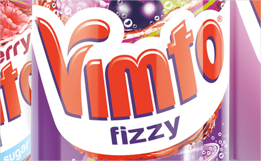
Released in May, the new logo from soft drink brand Vimto was designed to drive trial and frequency of purchase.
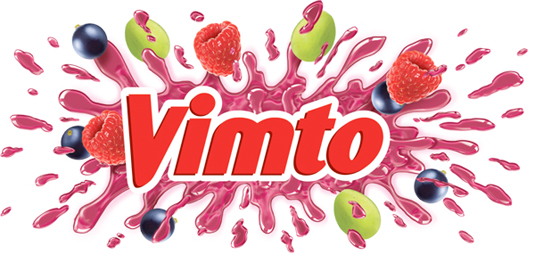
Article continues belowCreated in conjunction with Springetts Brand Design and inspired by the brand's 'Seriously Mixed Up Fun' tag line, the logo was designed to 'burst' from the packaging, although less explosively that the previous logo (below).
13. Intel
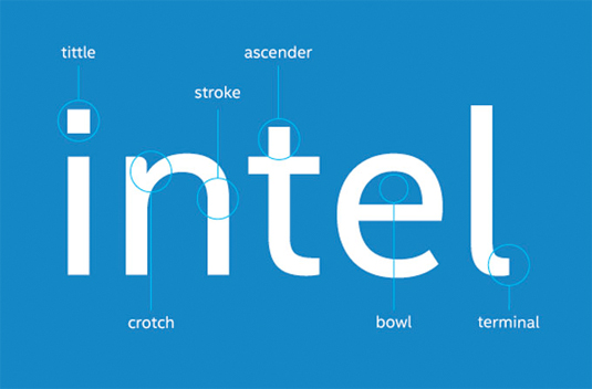
With more and more of you visiting sites via your mobile devices, Intel were very clever with this very subtle logo redesign. The tech giant has created its own proprietary font, Intel Clear, designed to be easier to read on screens and which can be used across different alphabets. The new font was developed by Red Peak and font house Dalton Maag.
14. Airbnb
Airbnb is a popular web service enabling you to rent rooms in your home out on a per-night basis for those looking for an alternative to hotels. In July it unveiled a new website design and logo, which raised eyebrows for four reasons.
Firstly, it gave the new logo symbol a name – Bélo – and explained that it was "the universal symbol of belonging", which seemed like a slight case of PR overreach. Secondly, it allowed users of Airbnb to make their own version of the logo.
Sign up to Creative Bloq's daily newsletter, which brings you the latest news and inspiration from the worlds of art, design and technology.
Thirdly, it attracted complaints that it was too similar to another company's logo. And finally (and there's no polite way of putting this) it provoked considerable social media chatter over whether it looked most like male or female genitalia.
15. Penguin Press
Penguin Press is a mainly non-fiction imprint of Penguin Random House books, that's been around for 11 years now. In July the company decided to give it a new look, and worked with Michael Bierut at Pentagram to create a new identity (above) that establishes an iconic symbol for the imprint.
The previous wordmark (below) had been almost illegible when reproduced at smaller sizes and particularly suffered onscreen, a liability in the age of social media
The designers decided to drop 'The' and focused on working with the 'PP' acronym. Noticing the similarity to ¶, the proofreader’s symbol for a paragraph (known as a pilcrow) they came up with an evocative symbol that looks at once modern and classic.
16. Foursquare
Location-based social networking app Foursquare unveiled a brand new logo and branding in July, alongside an entirely new app platform.
The company removed its check-in system – once the app's USP – to become a slimmed-down local guidebook personalised to your tastes, akin to Yelp or Google Maps, and the new look (above) was designed to reflect that.

The new logo design was a far cry from its bouncier predecessor (above). Designed in collaboration with New York agency Red Antler, the all-caps wordmark presented a cleaner and more professional face to the world.
The new logo design aims lend a graphic unity to way-finding signs, building entrances, digital directories, kiosks, uniforms, websites, apps and marketing materials.
17. Volvo

September saw the silver and black versions of the new Volvo logo, created for the car company by Swedish design agency Stockholm Design Lab in collaboration with Tröllback & Company.
The new design was a subtle but important tweak of the defiantly masculine logo created by Bite in 2006 (see below), and continues to evolve the iconic 'Ironmark' symbol first created in 1927.

18. Hershey
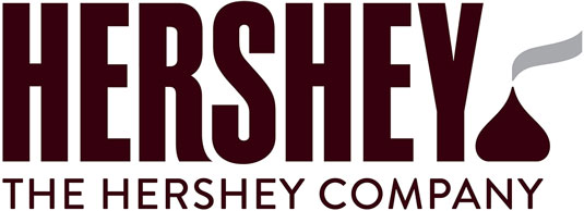
In September, The Hershey Company, known for its Hershey's Milk Chocolate bars and more than 80 other confectionery brands, including Reese's and KitKat, unveiled a refreshed corporate visual identity, including the new logo shown above.
A move towards flat design and away from the 3D styling of the old logo (below), the new logo aims to reflect the company's evolution from a predominately US chocolate maker to a global confection and snack company.
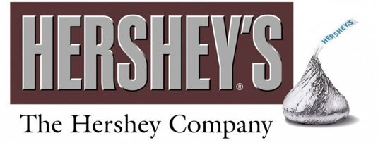
The new branding was created in-house by Hershey Global Design, with assistance from goDutch and Alexander Design Associates. It will be incorporated into all of Hershey's consumer communications and websites, as well as the interior design of its offices and retail stores.
Most notably, the new design featured a new interpretation of the iconic shape of its Kisses brand chocolate. But it attracted the wrong kind of attention on social media, for its perceived resemblance to something dogs leave on the street...
19. Pizza Hut
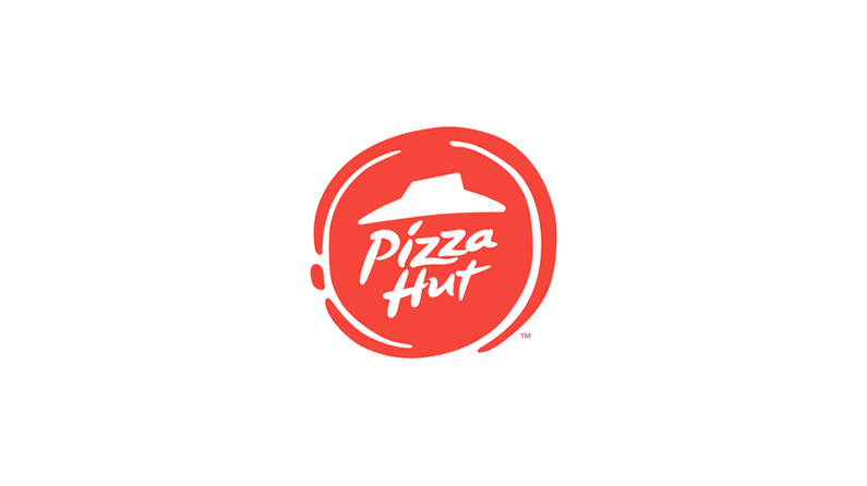
In November, one of the biggest restaurants in the world announced a major change in its menus and overall look of its restaurants , including a change in their branding and logo designs.
Stripping back the design, the new logo (above) is a big step away from the old design (below) – portraying a pizza-like circle with a more muted red whilst still keeping the iconic 'hut' illustration.

20. DeviantArt
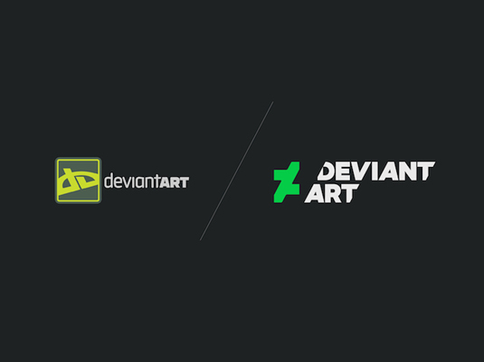
DeviantArt, the online art gallery that boasts 32 million registered members, revealed a radical new rebrand in December.
The new look, created by Moving Brands, led with a new logo – a slice of the well known DA initials – in a bespoke 'Calibre' font, created by Klim Type Foundry.
However, reactions to the new logo were mixed, with the new branding dramatically dividing the community.
What do you think of the logos unveiled in 2014? Let us know in the comments box below!

Tom May is an award-winning journalist specialising in art, design, photography and technology. His latest book, The 50 Greatest Designers (Arcturus Publishing), was published this June. He's also author of Great TED Talks: Creativity (Pavilion Books). Tom was previously editor of Professional Photography magazine, associate editor at Creative Bloq, and deputy editor at net magazine.
