Official: Google unveils its new logo
It's not a rumour this time. The search giant has a new logo and (surprise, surprise) it's a flat one.
Sign up to Creative Bloq's daily newsletter, which brings you the latest news and inspiration from the worlds of art, design and technology.
You are now subscribed
Your newsletter sign-up was successful
Want to add more newsletters?
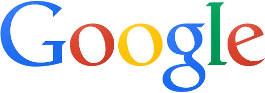
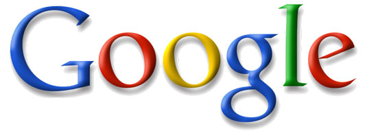
After a few weeks of confusion, with Google's new logo (above) accidentally being released into the wild, the search giant has finally showed its cards, officially rolling it out on its homepage.
In tandem with the trend for flat design, the shadows of the old logo (below) have been flattened, which Google says makes it more consistent with the current user interface.
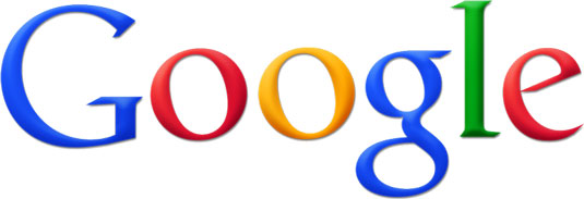
However, Google cannot accused of making a knee-jerk reaction to the flat design trend - as this 'new' logo has actually been in use on internal company documents for years, such as this PDF from 2010.
Article continues belowThe search giant announced the changes in this blog post, saying: "As part of this design, we've also refined the color palette and letter shapes of the Google logo. We'll be rolling out this update across most Google products over the next few weeks, so keep an eye out and let us know your thoughts."
The new logo is being accompanied by a new-look top nav bar:
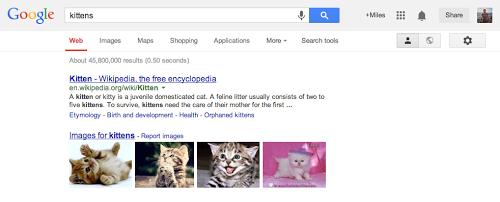
Google products such as GMail, YouTube and Maps are now accessible under a new app launcher: the nine-dot grid icon, located at the top right of the screen:
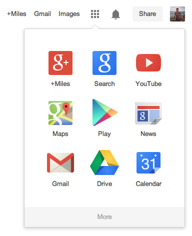
"Regardless of your routine, getting around Google should be seamless, and once you're inside an app, you don't want any distractions," says Google. "So we're introducing an updated Google bar that streamlines your experience across products and devices."
Sign up to Creative Bloq's daily newsletter, which brings you the latest news and inspiration from the worlds of art, design and technology.
With fresh looks for both the Yahoo logo and Bing logo recently, not to mention Apple jettisoning skeuomorphism in iOS7 it seems that shadows are definitely out of fashion. For those who miss a sense of depth to their search logo, here's a look back at some of Google's chunkier past logos...


Like this? Read these!
- The best Google Doodle designs
- Free tattoo fonts for designers
- Create a perfect mood board with these pro tips
What do you think of Google's new logo design? Let us know in the comments box below!

The Creative Bloq team is made up of a group of art and design enthusiasts, and has changed and evolved since Creative Bloq began back in 2012. The current website team consists of eight full-time members of staff: Editor Georgia Coggan, Deputy Editor Rosie Hilder, Ecommerce Editor Beren Neale, Senior News Editor Daniel Piper, Editor, Digital Art and 3D Ian Dean, Tech Reviews Editor Erlingur Einarsson, Ecommerce Writer Beth Nicholls and Staff Writer Natalie Fear, as well as a roster of freelancers from around the world. The ImagineFX magazine team also pitch in, ensuring that content from leading digital art publication ImagineFX is represented on Creative Bloq.
