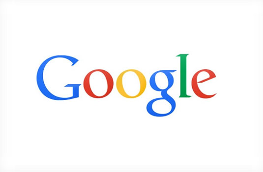
Google's flatter logo released by accident
Google accidentally released a logo into the wild that's more in keeping with today's 'flat design' trend. What do you make of it?
Sign up to Creative Bloq's daily newsletter, which brings you the latest news and inspiration from the worlds of art, design and technology.
You are now subscribed
Your newsletter sign-up was successful
Want to add more newsletters?

Love it or hate it, there's no denying that flat design is big news in the creative world at the moment. And so the design world jumped on this variation of Google's logo design (above), which was spotted by Ars Technica in the latest Chrome beta for Android.
Things got even more exciting when The Verge said a Google source had told them this logo was intended to be used "in instances where the beveled logo may not display well".
So was this a secret rollout of a brand new Google logo? Well it appears not. The Verge has now updated its original post and confirmed that the distinctly two-dimensional logo - which has already been pulled from the Chrome for Android beta - is purely meant for use on printed and corporate materials. So it looks like its online use was pure accident.
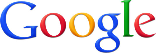
Article continues belowStill it's interesting to see such a 'flat' identity appearing on our screens, and we wonder if this could be a future direction for the Google logo. Here's a look back at the evolution of the logo to put this possibility into context:


Like this? Read these!
- The best Google Doodle designs
- Free tattoo fonts for designers
- Create a perfect mood board with these pro tips
What do you think of Google's new logo design? Let us know in the comments box below!
Sign up to Creative Bloq's daily newsletter, which brings you the latest news and inspiration from the worlds of art, design and technology.

The Creative Bloq team is made up of a group of art and design enthusiasts, and has changed and evolved since Creative Bloq began back in 2012. The current website team consists of eight full-time members of staff: Editor Georgia Coggan, Deputy Editor Rosie Hilder, Ecommerce Editor Beren Neale, Senior News Editor Daniel Piper, Editor, Digital Art and 3D Ian Dean, Tech Reviews Editor Erlingur Einarsson, Ecommerce Writer Beth Nicholls and Staff Writer Natalie Fear, as well as a roster of freelancers from around the world. The ImagineFX magazine team also pitch in, ensuring that content from leading digital art publication ImagineFX is represented on Creative Bloq.
