Artists respond to the controversial new deviantArt logo
Reaction to deviantArt’s new logo has been as varied as the website's content - but what do you think?
Creatives have reacted passionately to deviantArt's revamped website and brand new logo, as designed by Moving Brands. But not everyone is happy.
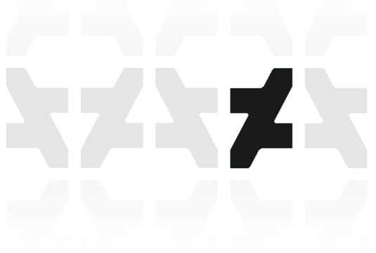
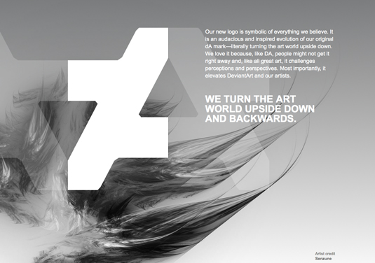
Using the previous logo initials of a small d and capital a – cut either side at a 62 degree angle – the new logo is slick. Some have been quick to point out, however, that it resembles the logo of Russian design studio PlatzKart.
Claims of plagiarism aside, perhaps the worse accusation so far has been the new logo just doesn't scan.
Going for a clean, abstract design that has a cool geometrical tilling effect when multiplied, many have missed the implied link with the site's initials.

However, the response from the creative community has not been entirely negative.
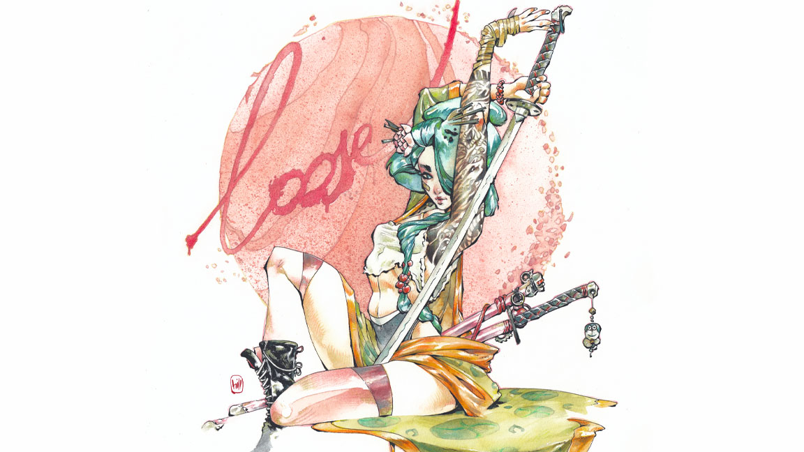
Deviant artists, both professional and amateur alike, have paid homage to the new design, with a variety of digital paintings representing the diverse audience deviantArt has attracted since it started in 2000.

With much of the attention on the logo, the newly revamped, and far easier to navigate, website has been somewhat left in the shade.
The home page still pushes 'what's hot' and 'daily deviates' to the top, but there's now a more pronounced news section.

With stories on modern artist Damien Hirst already getting hits, it's interesting to speculate if deviantArt is set to take a new direction with its new look logo.
What do you think about the new logo? Join the discussion – leave your comments below.
Like this? Read these!
- The ultimate guide to logo design
- DeviantArt reveals new logo and website
- Get inspired by the Illustration Master Class mastermind

Thank you for reading 5 articles this month* Join now for unlimited access
Enjoy your first month for just £1 / $1 / €1
*Read 5 free articles per month without a subscription

Join now for unlimited access
Try first month for just £1 / $1 / €1
Daily design news, reviews, how-tos and more, as picked by the editors.

The Creative Bloq team is made up of a group of art and design enthusiasts, and has changed and evolved since Creative Bloq began back in 2012. The current website team consists of eight full-time members of staff: Editor Georgia Coggan, Deputy Editor Rosie Hilder, Ecommerce Editor Beren Neale, Senior News Editor Daniel Piper, Editor, Digital Art and 3D Ian Dean, Tech Reviews Editor Erlingur Einarsson, Ecommerce Writer Beth Nicholls and Staff Writer Natalie Fear, as well as a roster of freelancers from around the world. The ImagineFX magazine team also pitch in, ensuring that content from leading digital art publication ImagineFX is represented on Creative Bloq.
