As creatives, we constantly strive to reinterpret the world in new and visually exciting ways. Yet we can also be conservative and often have a knee-jerk reaction to something new.
So, on the day a new logo design is launched for a familiar brand, the first reactions are usually negative. Once some time has passed and the new design has been seen in action, though, it can be a different story.
Here we take a look back at the month's biggest new designs and redesigns: with a bit of fresh perspective, what do you think of them now?
01. World Trade Center
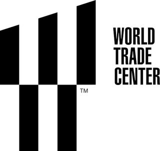
Landor Associates was last year tasked with creating a new logo for New York's World Trade Center, which is still under reconstruction. And here it is. Set in Helvetica Ultra Compressed and making good use of negative space, the design performs a number of symbolic functions:
- The slant of the top half is at a precise 17.76-degree angle, in tribute to 1 World Trade Center’s 1,776-foot height.
- The logo contains a trident, symbolising the steel columns at the base of the twin towers which remained standing after the 2001 attack.
- The two parallel spaces in the top half of the logo represent the memorial beacons of the Tribute in Light.
- The two bars in the lower half represent the deep pools of the National September 11 Memorial.
- The design as a whole is a stylized W, standing for both World Trade Center, and Westfield World Trade Center, a shopping mall due to open there next year.
The new logo design aims lend a graphic unity to way-finding signs, building entrances, digital directories, kiosks, uniforms, websites, apps and marketing materials.
02. WWE
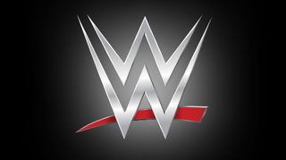
The wrestling franchise previously known as WWF has unveiled a new logo (see above) to mark the WWE network going worldwide to more than 170 countries.
Created by WWE's in-house team of designers, the new logo abandons the scratch lettering of the old design (see below) completely.
Get the Creative Bloq Newsletter
Daily design news, reviews, how-tos and more, as picked by the editors.
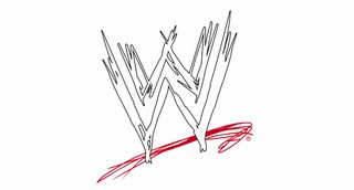
The new logo will appear on all the WWE's branding and is currently flying about the company's head offices in Stamford, Connecticut.
03. Smithsonian Design Museum
There are plenty of museums around the world that feature design in their galleries but the Cooper Hewitt Smithsonian Design Museum is the only museum in the United States that devotes itself entirely to design. Now Pentagram has redesigned its logo (above), using a specially designed typeface called Cooper Hewitt.
The new logo also features a new name. Formerly the Smithsonian’s Cooper-Hewitt, National Design Museum (see old logo, below), the new name replaces 'National' with 'Smithsonian' and eliminates the hyphen, simplifying the brand while emphasising its heritage.

The design has been rolled out across the board, with the website, promotional materials, signage and more using the new identity. You can also download the typeface for free over on the Cooper Hewitt website.
04. Volvic
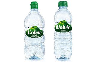
The French company behind one of the world's most popular brands of bottled water has unveiled new bottle design, packaging and logo. The new label design (above) takes the green volcano of the old design (below) and brings it front and centre.
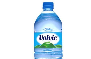
The graphic has been enlarged and redrawn, giving it much more definition, in line with the brand slogan 'Filled with Volcanicity'. Overall, the design is defiantly green, with blue now entirely absent from both the label and the bottle itself.
It's a radical move, with blue the dominant colour in bottled water branding due to its association with coolness, tranquility, and clarity. The new bottle will be rolled out aross this month and the next, and be accompanied by a multi-platform advertising campaign.
05. British Horseracing Authority
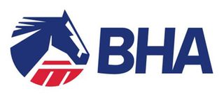
Firedog was the agency behind this redesign of the logo for BHA (above), the governing body for the UK's second largest sporting industry.
The old logo (below) was becoming outdated and was difficult to read a digital context – partly because the word mark and symbol were inseparable.

The new brand mark is easily separable from the word mark, and using the BHA acronym has created a much visually stronger identity. Opting for a red, white and blue colour scheme reinforces the BHA's British values and unites the BHA's look and feel with other sports governing bodies, such as the British Olympic Association and British Tennis.
Firedog also designed and built the BHA's website from scratch. You can see more details of the rebranding in this case study.
What do you think of these logo redesigns? Let us know in the comments box below!


