Tourism logos can be difficult to get right, but Zurich-based MADE Identity has come up with the goods in its rebranding of Switzerland Tourism. The national tourism marketing body is replacing its various dated logo variants with a 'one brand' approach and a versatile brand ecosystem that really pops.
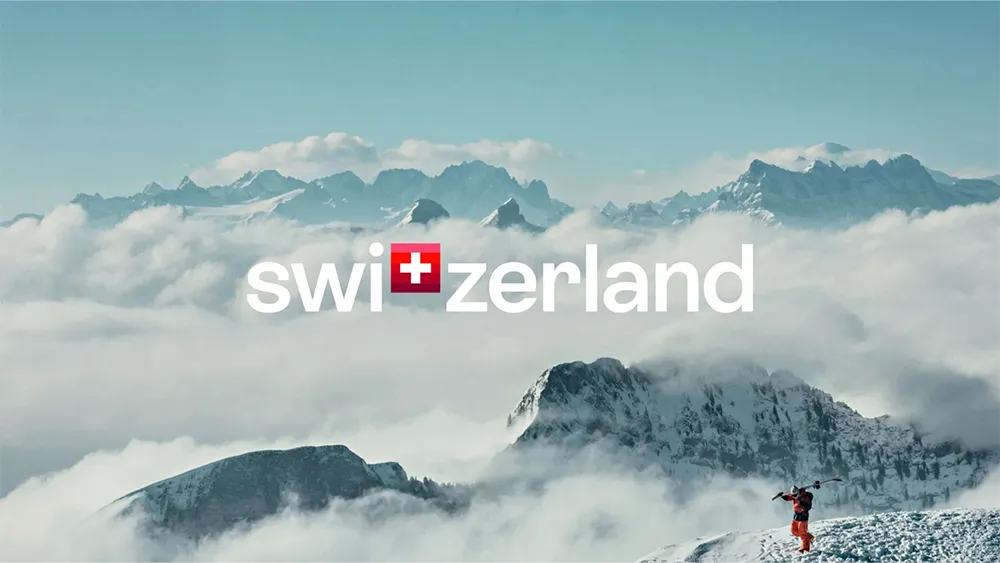
Central to the identity is a new logo designed for maximum impact. It's simple but effective: a logotype that reads 'Switzerland' but with the letter 'T' replaced by the well-known equilateral cross of the Swiss flag.
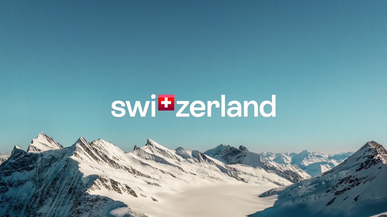
Such games with symbols and text can sometimes feel a bit gimmicky, but in this case it doesn't feel forced or overstated. It's a simplicity that works thanks to the familiarity and positive associations of the Swiss flag. It certainly makes a much more immediate impact than the previous identity, which dates back to 1995. While Switzerland Tourism says that many Swiss were fond of the design, the 'goldenflower' logo was a little obtuse: for anyone not familiar with the edelweiss, it just looked like some weird gaudy brooch.

From Switzerland's various names, the rebranding has gone with the English name, which was found to be the "most popular and the most charismatic", as confirmed by a representative study in key markets (Germany, France, Italy, South Korea and the Gulf States).
The new identity also features a new colour palette. Naturally, red and white dominate, again drawing on the Swiss flag, but the palette has been expanded to include five shades of red, inspired by the alpenglow, a phenomenon that occurs when the sun is just below the horizon. This is intended to symbolise modernity, diversity and independence while also offering more versatility for brand applications and making the identity clear when the logo isn't present.

As for the typography, MADE Identity notes that Switzerland is a country with influential fonts and font designers: Miedinger, Frutiger, Maag. In the spirit of this tradition, it developed a custom font with the Geneva type foundry Extraset: ST Allegra.
MADE says it "became tourists in our own country and traveled all parts of the country incognito" as part of its research for the project. "We experienced the brand and its promise from the guest perspective," it says. The result is an identity that will not just advertise the destination, but will "accompany tourists throughout their entire journey, from inspiration to travel planning."
Tourism logos don't necessarily need to reference a country's national flag, and many of them don't. In fact, doing so can be a risk since it can sometimes feel more nationalistic rather than inviting. It can also lead to a confusion of identities. We saw with the recent Portugal logo debacle how people confuse national symbols and government identity. Flags tend to come loaded with connotations, but in the case of Switzerland many of these are positive, from Swiss watches to Victorinox's Swiss Army knives, it tends to be associated with reliability and trustworthiness.
For more branding and logo design news, see the history of the Deutsche Bank logo and the new Umbro logo.

