Colour theory: a complete jargon-free designer's guide
Everything you need to know about colour theory, from concepts to terminology.
Colour theory is something that all artists and designers should have a good understanding of. Colour often becomes an intuitive choice for many, but understanding how colour is formed and the relationships that exist between different hues can help you pick the right palette for your projects and use colour more effectively in your designs Understanding colour spaces is also vital for anyone doing digital work.
You probably learned some of the very basics of colour theory at school. There are three primary colours – red, yellow, and blue – and any colour can be created by mixing these three colours in varying quantities. But, while this is true enough to be workable for teaching five-year-olds, it isn't quite the whole story. In this guide, we'll walk through what you need to know about colour theory, explaining colour jargon and design terms along the way.
If you need new software to put all this theory into practice, we recommended you get Adobe Creative Cloud. And if you want to ensure you're seeing accurate colours on your screen, make sure you have one of the best monitor calibrator tools. For more tips on using colour, see our guide to colour grading.
A complete guide to colour theory
What is colour theory?
The Bauhaus school understood the power of colour in the 1920s and 1930s, with staff and students going on to develop colour theories for evoking particular moods and emotions through choice of palette in design and architecture. (Take a look at our guide to Bauhaus design for more on this.)
But colour theory is a discipline that stretches back much further than that – at least to the 15th century – and uses physics, chemistry and mathematics to fully define and explain the concepts. You don't need to know all of that, but here we'll provide a concise overview of the most important aspects of colour theory you need to help you start making informed decisions in your own work.
What are colour systems?
So what are colour systems? A colour system is a method by which colour is reproduced. There are two primary colour systems: additive and subtractive (also known as reflective). We use both on a daily basis. Screens use additive colour to generate all the colours you see, while books and other print materials use subtractive colour for their front covers.
In simple terms, anything that emits light (such as the sun, a screen, a projector, and so on) uses additive colour, while everything else (which instead reflects light) uses subtractive colour.
Get the Creative Bloq Newsletter
Daily design news, reviews, how-tos and more, as picked by the editors.
01. Additive colour

Additive colour works with anything that emits or radiates light. The mixture of different wavelengths of light creates different colours, and the more light you add, the brighter and lighter the colour becomes.
When using additive colour, we tend to consider the building block (primary) colours to be red, green and blue (RGB), and this is the basis for all colour you use on screen. In additive colour, white is the combination of colour, while black is the absence of colour.
02. Subtractive colour

Subtractive colour works on the basis of reflected light. Rather than pushing more light out, the way a particular pigment reflects different wavelengths of light determines its apparent colour to the human eye.
Subtractive colour, like additive, has three primary colours – cyan, magenta, and yellow (CMY). In subtractive colour, white is the absence of colour, while black is the combination of colour, but it’s an imperfect system.
The pigments we have available to use don't fully absorb light (preventing reflected colour wavelengths), so we have to add a fourth compensating pigment to account for this limitation. We call this 'key', hence CMYK, but essentially it's black. Without this additional pigment, the closest to black we'd be able to render in print would be a muddy brown.
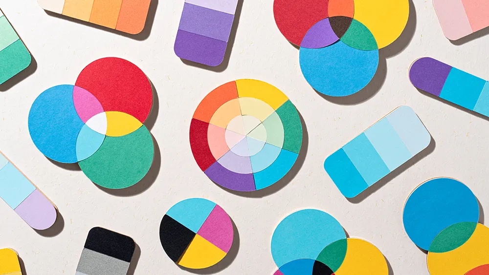
The colour wheel

In order to make it easier to see the relationship between different colours, the concept of the modern colour wheel was developed around the 18th century. Although colours exist on a continuous spectrum, it helped artists to break them down into individual blocks that could be named.
Colour wheels show the primary colours (conventionally red, yellow and blue in painting) on the outermost ring. The secondary colours are created by mixing two primary colours – if red, blue and yellow are the primary colours, the secondary colours are green, orange and violet. Tertiary colours are then created by mixing a primary with a secondary colour.
Note that using red, yellow and blue as the primary colours is not entirely accurate since greens and blues actually take up more of the colour spectrum. As a result, sometimes alternative colour wheels are used, such as red, blue and green, or cyan, magenta and yellow. It is possible to mix traditional primary colours with these alternative colour wheels, though they won't be as intense as pure pigments.
The colour wheel allows us to see at a glance which colours are complementary (opposite on the wheel), analogous (adjacent on the wheel), triadic (three colours positioned at 120 degrees on the wheel from each other) and so on (see below). Each of these relationships can produce pleasing colour combinations, and there are many more pleasing relationships between colours based on their position on the wheel.
What are complementary colours?

Complementary colours sit opposite each other on the colour wheel. These pairs have the highest colour contrast, so they often look very intense when placed next to each other. Two saturated complementary colours can sometimes clash and strain a viewer’s eyes, especially in close proximity, so it can be better to ensure that one of them is more neutral if you're going to use them together.
Mixing two complementary colours together produces a neutral grey, or even a black, as they cancel each other out. The greys in the centre of the colour wheel can be created in this way.
What are analogous colours?

Analogous colours sit next to each other on the colour wheel, so they have less colour contrast and therefore harmonise easily. In fact, sometimes they harmonise too easily, which means you might want to add contrast in these sorts of combinations, for example by pushing the tonal or saturation contrasts (or both).
When mixed together, analogous colours produce bright intermediary hues. The closer two colours are on the colour wheel, the more intense their mixture is. The further apart they are, the duller the mixture.
What are triadic colours?

Triadic colour schemes comprise three colours that are evenly spaced around the colour wheel. This type of scheme can be challenging if you're using saturated colours as it will include a large area of the wheel, which makes colour contrast hard to manage. One solution is to pick a dominant colour and let the other two support it as more subdued tones.
Another option is to tie a triad of saturated colours together with whites. This allows the eye a break and reflects subtle indications of the triad. Alternatively, triad colours can be used in small amounts to ‘spice up’ neutral arrangements.
Split complementary colours

Finally, split complementary colour schemes are like complementary schemes, but in this case, one of the colours is split into two. The other colour sits opposite the centre point of this pair. The separation between the split pair can be narrow or can expand until it transforms into a triadic scheme.
This kind of scheme is a good option for a limited palette because it offers the harmony of a complementary colour scheme while covering more ground on the colour wheel and including a wider range of colours. Complementary schemes sometimes split both colours (this is sometimes called a tetradic scheme). They work especially well if the range of each pair is limited.
There are free apps for picking a colour scheme, or you could use your designer's eye to pick your own. Click through to the next page for a little help on this.
Hue, saturation and brightness
Yellow is yellow is yellow, right? Well, actually, no. There are many different colours we could refer to as yellow. Different shades or tints, saturations and hues are all possible while still being within the yellow part of the colour wheel. As a result, there are three primary component parts that help us define a colour: hue, saturation and brightness.

Hue
This is the position on the colour wheel, and represents the base colour itself. This is typically referred to in degrees (around the colour wheel), so a yellow colour will appear between 50 and 60 degrees, with the perfect yellow appearing at 56 degrees. Green, meanwhile, appears at 120 degrees on the wheel at so on.
Saturation
This is a representation of how saturated (or rich) a colour is. Low saturation results in less overall colour, eventually becoming a shade of grey when fully desaturated. Saturation is normally referred to as a percentage between 0 and 100%.
Brightness
This is how bright a colour is, typically expressed as a percentage between 0 and 100%. A yellow at 0% brightness will be black, while the same yellow hue and saturation at 100% brightness will be the full yellow colour.
Colour spaces

So we've seen colour systems and the colour wheel, and we've looked at the components that make up the individual colours. But what's a colour space? You'll surely have heard this term if you work in digital art, design or photography, and it's important to understand because it can have big implications for how your work looks. A colour space is a range of colours on a spectrum that can be interpreted and displayed on a visual plane. While the CMYK colour space is used for printing, for digital use there are several different colour spaces in use based on RGB, and they all have different sizes.
The image above compares the sizes and coverage of several of the main colour spaces. Note that the range of colours achievable in CMYK is different to the range you can achieve with RGB. This is partially because of the nature of the two different systems, but also (in the real world at least) as a consequence of the limitations in our technology.
You can also see above that ProPhoto RGB and Adobe RGB 1998 both contain more colours than sRGB, which was created by HP and Microsoft in 1996 for monitors printers and the web. So it's best to work in one of those larger colour spaces, right? Well, yes, if your device supports them, but the problem is that other devices (laptops, monitors, tablets and phones) may not support the space you use.
The key thing to be aware of here is that a file created in a certain colour space may look dull or unsaturated on a device that doesn't support it. Most digital devices support sRGB, so that's usually the space to go for when you're saving documents that are intended to be seen on a standard phone or laptop.
What is colour gamut?

So what about colour gamut? This describes the range of potential colours that a device can reproduce. The manufacturers of monitor screens will generally rate the colour gamut of their products' displays as a percentage of certain colour spaces, so you will see screens that claim to cover 90% of Adobe RGB, for example. We check those claims through our own tests when we review monitors for the site (see our pick of the best monitors for photo editing for displays that offer good colour coverage).
Colour perception

It’s worth also looking at how different colours can affect the way we perceive other colours. A typical illustration of this features a mid-grey tone placed over a light grey background, and the same mid-grey tone shown over a dark grey background.
The apparent brightness of the mid-grey is altered according to the context in which you see it – a trick of the eye, working to make sense of its surroundings (this is the concept behind many optical illusions). Hues work in the same way as tones when placed adjacent to other colours, allowing you to create different effects using the same palette of colours.
The emotions of colour
Colour can play a vital role in how people feel when they see an image since certain colours tend to be associated with certain emotions. There are many complex reasons why a colour creates a psychological reaction in a viewer, and it depends on context, societal influences and interactions with other colours rather than the colour’s inherent properties alone.
A field of yellow flowers would be a bright, uplifting scene, but yellow is also associated with danger as it appears on warning signs and poisonous insects. As a result, some associations may seem contradictory, but it's worth bearing in mind how they can affect the way people feel.
RED = excitement, aggression, romance
YELLOW = warmth, friendliness, danger
GREEN = nature, sickliness, envy
BLUE = relaxation, coldness, grief
WHITE = cleanliness, innocence, emptiness
BLACK = oppressive, calm, powerful
See our article on colour psychology for web design for examples of this in use.
Key in colour theory
What do we mean by high, middle and low key colors, then? When it comes to painting, the key of an image is the dominant tonal value that it has overall, and how limited its tonal values are to a certain range. A high key composition is dominated by light tonal values. It will tend to omit or only minimally use dark tonal values, with more pastel colours dominating, while saturated colours act as colourful shadows. As a result, high key compositions often have a light, airy feel.
In contrast, low key compositions allow dark tonal values to predominate, and omit, or minimally use light tones. This can be good for creating atmospheric effects. The addition of small touches of light values creates dramatic tonal contrast.
Further reading
This was just a primer on colour theory, and there's a lot more to explore . You can browse all of our articles on colour in one place, or see below for some of the highlights.
01. A designer's guide to using colour in branding

What are the ‘right’ combinations of colours, and how can designers sidestep subjective debates to harness the power of colour more effectively in branding projects? We speak to experts in colour branding and look at tools to help you make the right choices in our designer's guide to using colour in branding.
'Owning' a colour is a big deal in branding, and there are some great examples of brands that have achieved that. In out article on uses of colour in branding, we explore ten brands that have each successfully claimed a colour as their own.
02. How to choose the right website colour palette

Get started picking the perfect colour scheme with help from this guide on how to choose the right colour palette for your website. It's a good introduction to the different things to consider when making your design decisions, with references to psychological studies and colour theory.
03. How to pick the perfect colours every time

The Colour Affects System identifies links between four colour groups and four basic personality types. If harnessed correctly, designers can use this system to kill subjective debate around colour in client meetings. This guide explains how.
04. Using colour in UX

When creating a site that resonates with your audience, your choice of colour can be surprisingly impactful. This article on how to use colour to shape UX takes an in-depth look at how you can use specific colours to build trust and increase revenue.
05. 10 colour management terms to know
Getting your colours right means getting your head around some tricky terms. There are a number of jargon terms that might baffle you, but our guide to colour management terms should help. You'll soon be able to sort your spectrophotometer from your tristimulus colorimeter...
06. Outstanding uses of colour in branding

Colour FAQs
Are black and white colours?
There has long been a debate about whether black and white are technically considered colours. In practical terms for art and design, black is generally considered to be a color since you can create it by combining other pigments on paper. Black, white and grey are often referred to as achromatic colours since they have no hue.
However, in the technical sense, black and white are shades rather than colours. They augment colors but do not function like colours themselves.White is the result of all wavelengths of light reflected off an object, while black results from the absence or complete absorption of visible light.
What colours can't be made by mixing?
The three primary colors of red, yellow, and blue are the only colors that cannot be made by mixing any other colors. According to colour theory, you can mix all three secondary colours with the three primaries, but this will only work if a pure primary colour is used. For example, with paint pigments, there is no 'pure' red that will make both a good orange when mixed with yellow and a good purple when mixed with blue.
What are clashing colours?
When people talk about clashing colours, they generally mean that the colours compete with each other, leading to a chaotic result. There's no clear definition of what makes a clashing colour combination. Some refer to colours that are opposite each other on the colour wheel, as 'contrasting' or 'clashing colours', but as we've seen above, this is totally incorrect. 'Opposite' colours are actually complementary and often go very well together.
Rather, clashing colours are colours that have unrelated resonance, which is more to do with the intensity and and undertone of the shade than the colour's place on the colour wheel. For example, if you mix a warm shade with a cool shade, or a muted colour with a bright colour, it could create a jarring effect. But there is no rule. Muted variations on a colour are often used with brighter shades for certain effects.
For more tips, you also might want to see our guide to how to manage colours in Photoshop.

Thank you for reading 5 articles this month* Join now for unlimited access
Enjoy your first month for just £1 / $1 / €1
*Read 5 free articles per month without a subscription
Join now for unlimited access
Try first month for just £1 / $1 / €1

Sam is a designer and illustrator based in Scotland, UK. He splits his time between art and design, motion and video and writing for various creative titles. He has written a book about web design, Pro CSS3 Layout Techniques and contributed to typography book, Fonts and Typefaces Made Easy.
Related articles
-
-

-

-