Sorry, but I don't believe the Coca-Cola logo is hiding a secret message
This might be a design theory too far.
Sign up to Creative Bloq's daily newsletter, which brings you the latest news and inspiration from the worlds of art, design and technology.
You are now subscribed
Your newsletter sign-up was successful
Want to add more newsletters?
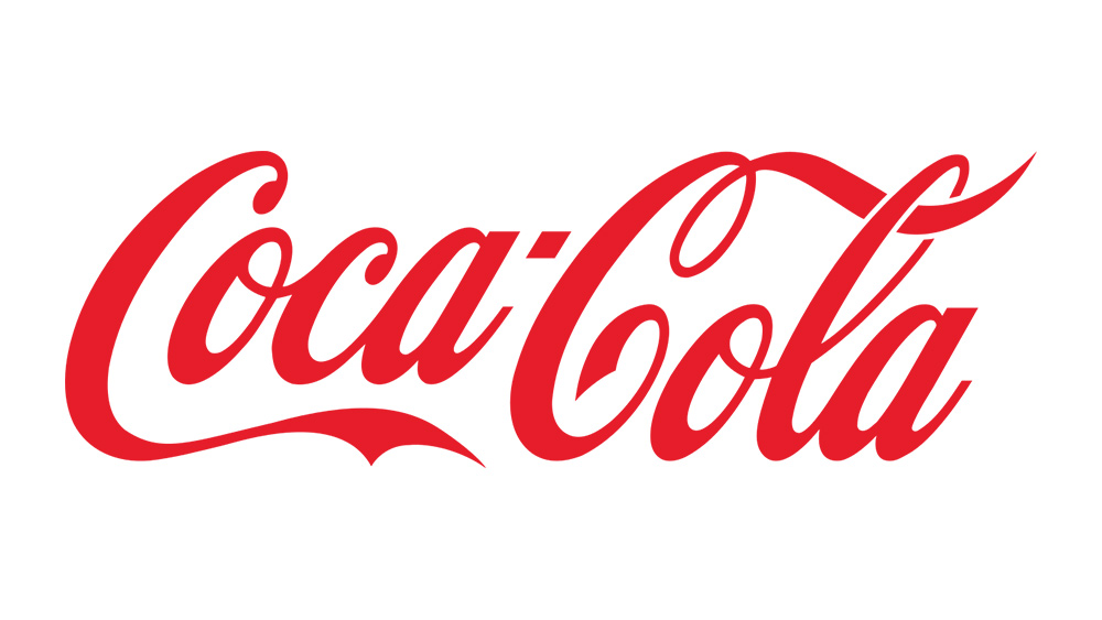
Plenty of the best logos of all time contain hidden messages. From FedEx's famous 'negative space arrow' to the 'A - Z smile' of the Amazon wordmark, it's the double-take-worthy details that often elevate a logo to the design hall of fame. But is there really anything hiding inside the Coca-Cola logo?
Arguably the most famous soft drink logo of all time, the Coca-Cola logo as we know it first appeared in 1887. This week, several news outlets are aflutter with what fans are claiming to be the 'discovery' that the elongated 'C' at the front of the logo looks like, wait for it, a smile. But with no official mention of said resemblance throughout the history of the Coca-Cola logo, I couldn't be less convinced.

Whereas the Amazon smile is blatantly obvious, this one couldn't be less so. The tail of the C curves upwards, and that's about it. Since Coca-Cola's own history of its logo through the years contains no mention of a smile, it's looking unlikely to be a conscious design choice.
Article continues below 
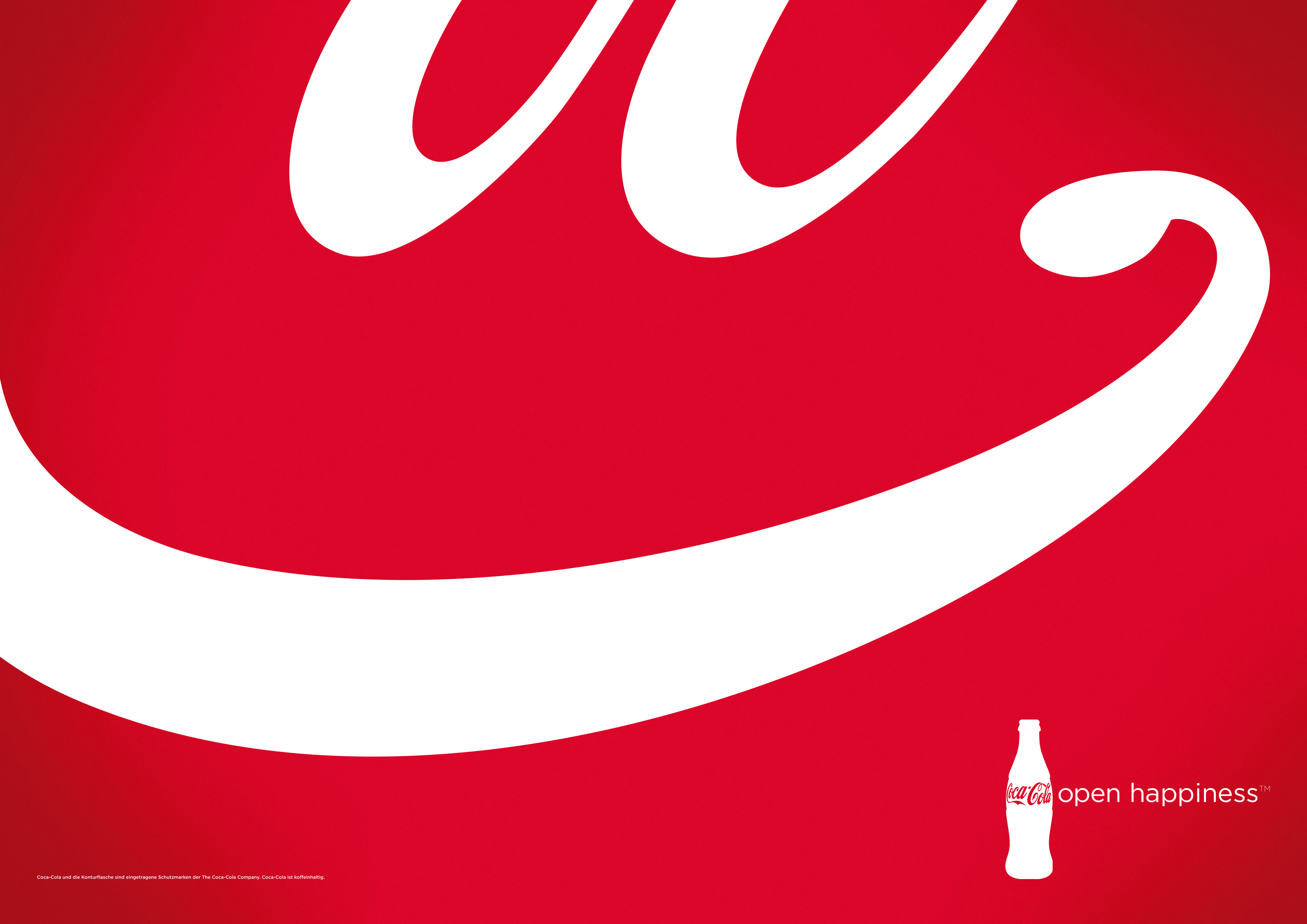
And then there's the fact that the elongated 'C' once was designed to resemble a smile in a specific print campaign. In 2013, design agency McCann Berlin created an ad for the brand's 'Open Happiness' campaign which zoomed-in on the bottom of the 'C'. Except, in order to create the effect, the agency had to edit the logo so that the tail curled upwards. If such edit was needed, the original design probably wasn't smiling.
Still, it isn't unusual for logos to contain genuine hidden messages (or indeed several of them). Check out our logo design inspiration guide for more ingenious examples.
Sign up to Creative Bloq's daily newsletter, which brings you the latest news and inspiration from the worlds of art, design and technology.

Daniel John is Design Editor at Creative Bloq. He reports on the worlds of design, branding and lifestyle tech, and has covered several industry events including Milan Design Week, OFFF Barcelona and Adobe Max in Los Angeles. He has interviewed leaders and designers at brands including Apple, Microsoft and Adobe. Daniel's debut book of short stories and poems was published in 2018, and his comedy newsletter is a Substack Bestseller.
