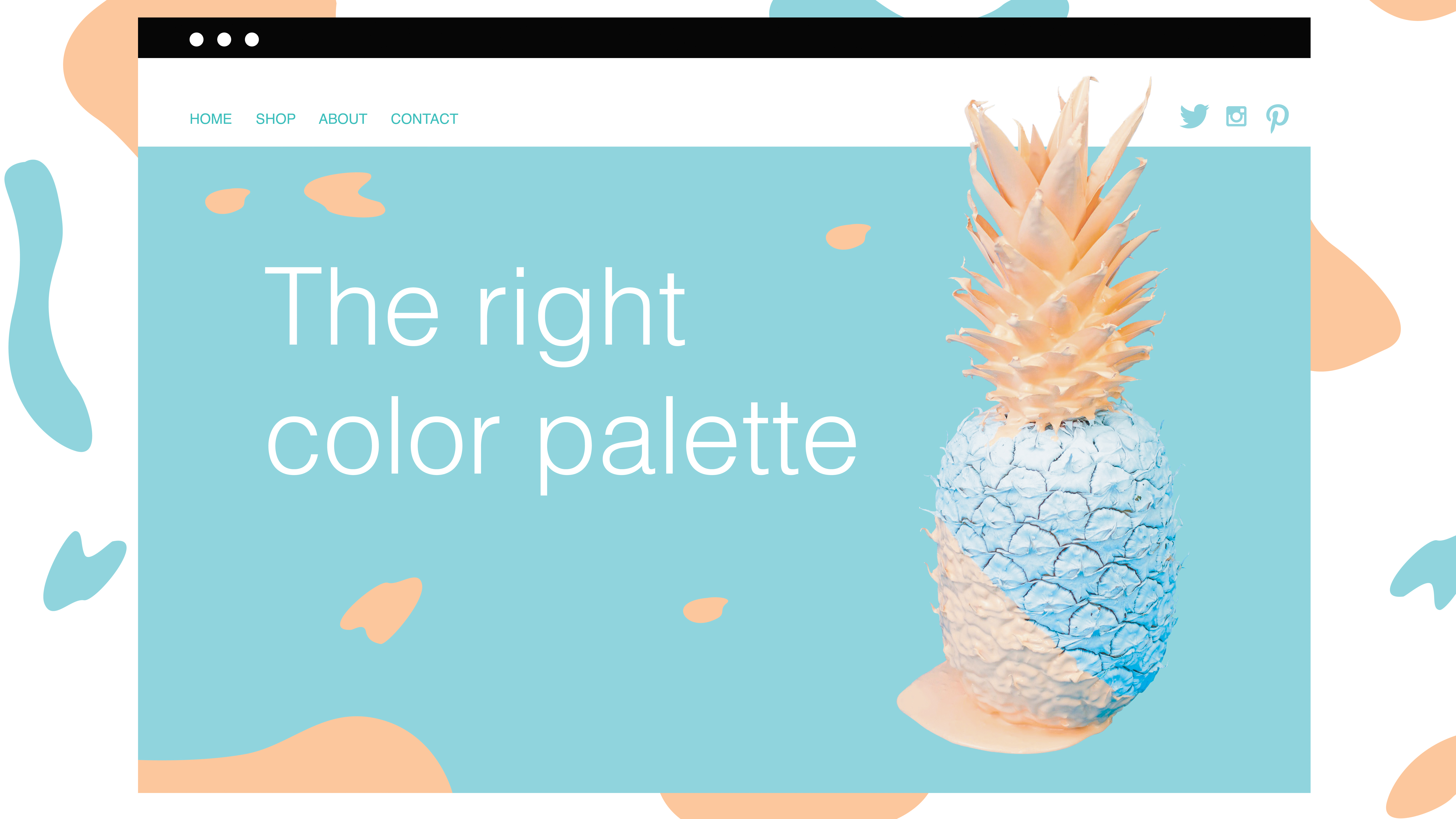
Choose the perfect colour palette for your website
How to use colour theory to create the right palette.

While there are many steps in creating a website, branding is one of the most important. Whether you're working for another company or simply designing your own web design portfolio, it's vital to choose an approachable and relatable colour palette. This can seem a bit tricky, but don’t fret! In this article, I'll offer some advice for finding the right colour palette for you, using psychological studies and the theory of colour.
Know what emotions colours evoke
You may have an idea of what you’d like the colour palette for your business to be, but before you set anything in stone, try to take a look at what the colours you’re thinking of using actually mean. That means asking: Do the colours convey the right emotions and are they attractive to my target market? It might seem like a silly question, but you can gain a lot of insight by looking into the psychology of colours and colour theory.
Think of the logos of some companies you know, like Coca Cola, Facebook and Apple. They are three incredibly recognisable brands, all of which you can likely recall the colour of their logos as red, blue and white. For a more in-depth look at this, take a look at our article on outstanding uses of colour in branding.
Article continues belowWhile a logo’s colour may seem like a casual choice made by the brand, you can be assured a lot of thought went into it. The colours used in the logos of these brands exude what they stand for – or at the very least, what they’re trying to stand for.
If you're confused or lacking inspiration, the best place is to start is by playing around with some online colour tools. There are plenty of these around, and you'll find our pick of the best ones in our roundup of the best colour tools for web designers. You could also try making a mood board to get an idea of what you want your design to look like (and store it in secure cloud storage, of course).
Choose your dominant colours
Once you're feeling inspired enough, you can begin choosing your main or ‘dominant’ palette colours. These are the colours that you will want your target audience to recognise you by. They will adorn your website and business cards, so it’s important to get them right.
While it’s not imperative, you’ll most likely only want two dominant colours, with the others left as accent colours (we'll cover these later on). It’s also important to note that out of your two dominant colours, one will be used more than the other in your branding materials, whether it be a website, banner or anything else.
Sign up to Creative Bloq's daily newsletter, which brings you the latest news and inspiration from the worlds of art, design and technology.

First and foremost, your dominant palette colours should either complement each other or contrast well together, and neither should outshine one another. If they do, you can play with tints, tones and shades to find a happy balance between the two. Here’s a quick explanation of these last terms:
- Tones: Mixing grey to a pure colour
- Tint: Mixing white to a pure colour
- Shades: Mixing black to a pure colour
This isn’t a step that’s to be rushed, as these will be the defining colours of your brand. You’ll be happy that you spent the extra time finding the perfect colour values.
Choose your accent colour(s)
Accent colours play an incredibly important role – they’re supposed to draw your viewer’s eyes to something you want to highlight. A poor choice can make people miss what’s essential for you. Accent colours are usually bolder than your dominant colours.

For your website, accent colours are best applied to elements like your navigation menu, calls to action and other crucial items that you would like to showcase. A great example of a successful accent colour application can be found in the Design Conference template by Wix.com (see more website templates here, and be sure to pick a top website builder) . The red accents on the menu show you what section of the page you are on and the bright Buy Tickets call to action is begging to be clicked.
Apply with the 60-30-10 rule
With your colour palette complete, it’s time to give yourself a pat on the back, but you’re not done just yet. The way you actually apply your colour scheme matters, and you can let the popular 60-30-10 rule guide you: use 60 per cent of your dominant colour, 30 per cent of your secondary colour and 10 per cent of your accent colour. When it comes to web design, you can rework the rule as 60 per cent negative space, 30 per cent content, and 10 per cent ‘call to action’ elements.

One good way to visualise this rule comes from MMI Creative: “Think of a man in a business suit: 60 per cent is the slacks and jacket, 30 per cent is the shirt, and 10 per cent is the tie”. By following this rule, you will be able to achieve balance both in colour and content for your website.
And remember, once you've got your site's aesthetic nailed down, check out these top web hosting services to help it run smoothly.
This article originally appeared in a 2017 edition of net magazine. Subscribe here.
Read more:

