Design that resonates with an audience is about more than clever copy and well-crafted photography. An intuitive website (created with a top website builder) goes deeper than thoughtful information architecture guiding users toward their destination. Peeling back the layers will bring you to a core principle in design education: the decisive selection of colour.
The validity of colour psychology and colour theory as a marketing strategy is an often-debated topic because we each have different preferences. Your favourite colour may be blue. Or it may be orange. Or purple. Red? You get the point.
But couldn’t that suggestion also relate to any design methodology? When designing a website, are you trying to design it for one person or are you trying to connect with a generalised audience that is representative of your ideal customer? The base of successful design requires you to remove the bias of an individual and step back to see how it affects a larger audience (either way, you'll need to get your web hosting right).
Design around audience expectations
When it comes to selecting the 'best' colour for a brand, research has found that predicting consumer sentiment toward the relevance of a colour and a brand is more important than the colour selection itself.
For example, when thinking of health, many people correlate that to the colour green. If a new health initiative for a large organisation or food product decided to brand themselves with bright red, something would feel off about that choice. We may not always consciously realise why it feels that way but behind the scenes that feeling is our brain's way of filtering through what aligns with past experiences that were learned or conditioned. This is even more apparent in colour choices.
Much like in UX, it's important to consider how jarring things that don't match user expectations can be.
In 2003, Joe Hallock wrote an undergraduate paper on colour assignment. He surveyed a sample size of 232 people and was able to distil core colour associations by gender and age. For example, he was able to determine that the emotional resonance of trust correlated mostly to blue (34 per cent of all survey participants).
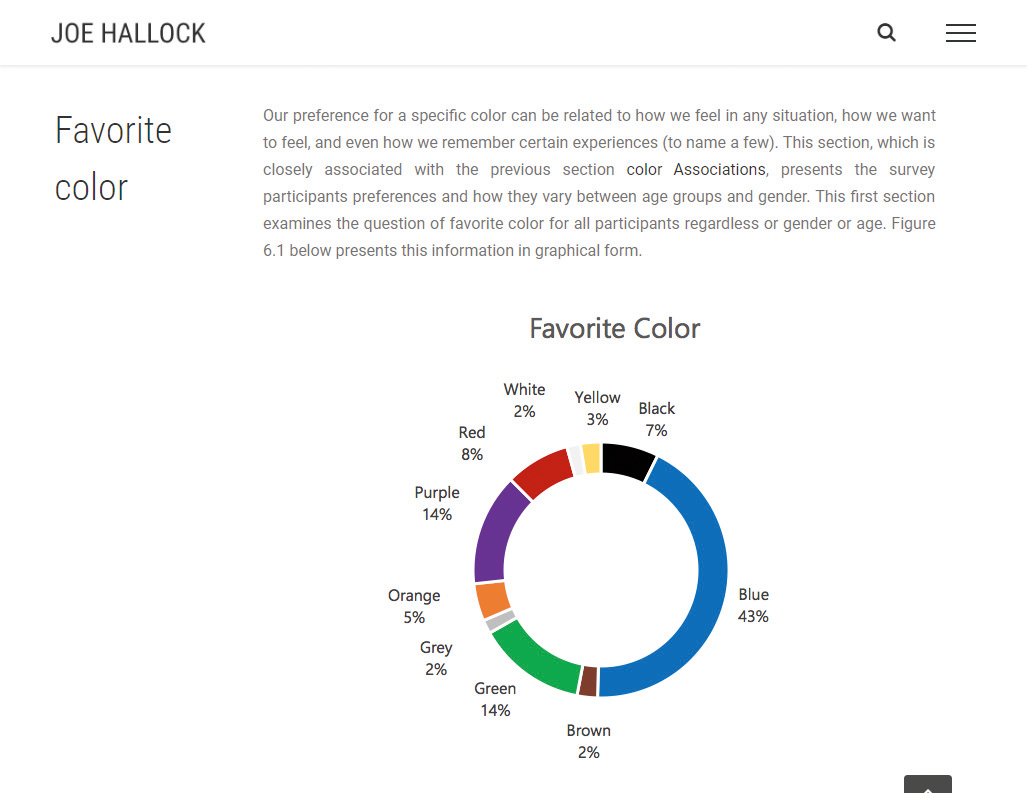
Again, whether you personally feel blue best represents trust or not isn't the focus. There were plenty of others that felt white (21 per cent) or green (11 per cent) conveyed trust.
When designing for larger audiences or market segments, we want to assess the ideal customer over anyone else's personal bias. If you are Microsoft and you'd like to position Bing in the marketplace to imply trust, you look at it as a numbers game. Internet Live Stats suggests there are over 3.5 billion searches per day on Google; it has a market share of about 93 per cent of all searches. If Microsoft is looking to gain more of a market share, a focal point of that effort may be establishing trust through design and branding.
According to a recent survey facilitated by SurveyMonkey, 65 per cent of all participants said that trust influences either a lot or a great deal in their decision making when supporting a brand. If blue represents trust in 34 per cent of that (1.19 billion) audience, that’s a large segment of people over white (735 million) or green (385 million).
Percentages on a graph can be misleading until you apply the context of what they really represent. Building trust with the colour blue is often used with businesses that carry out transactions using personal or financial information. It’s why you see banks and social media rely on blue as a primary colour in their branding. Leveraging small subconscious triggers, like using blue in branding, can help new customers connect quickly.
It's not magic but meeting the expectation of an audience will prevent their brain from firing off a warning signal that something isn’t quite right. Buying a few extra seconds to solidify sentiment toward your brand is highly valuable.
Know the financial power of a single colour
Did you know that 84.7 per cent of a customer's purchasing decision is influenced by colour usage? Selecting the right colour can have a large impact in revenue and conversions.
When Microsoft was designing what would eventually become Bing, its design team explored a large variation of colours to represent links. In 2010, Bing's user experience manager Paul Ray gave a presentation at MIX10, a long-gone Microsoft conference. He discussed the level of multivariate testing done on the factors of colours and typography – among others – and the impact they had on revenue, return rate, time to first click and more.
Microsoft's testing was so granular that it included multiple shades of blue for the link colour. It found that a specific colour blue (#0044CC) drove an estimated $80m to $100m dollars a year more than the lighter blue that was originally used.
This shade of blue is special. It goes beyond the colour psychology 101 understanding of blue being a representation of trust. What's fascinating is that this particular shade of blue uses the golden ratio mathematically.
The golden ratio – closely tied to the Fibonacci sequence – is best known as the rule of thirds. It's used in photography to frame a composition by dividing the image into three equal vertical rectangles and three equal horizontal rectangles. This is something designers do innately as our brains are conditioned to perceive value in compositions that align to that ratio.
So how does this golden rule of thirds factor into a website Hex code for Bing’s blue? Hold on. We’re almost there.
Hex codes represent the red, green and blue markers of a pixel. The first two numbers of a hex code determine the value of red, the second two the green, and the final two blue. Bing's blue is #0044CC. Converting that to a standard RGB colour spectrum results in: Red: 0, Green: 68, Blue: 204. Still with me?
What do you get when you divide the blue value by the green? Exactly three. Paul Ray’s presentation defined Bing’s shade of blue as a perfect mathematical blue.
Keep in mind your design context
It’s important to note that the perfect blue doesn’t increase conversions by itself, much in the way that having a red button doesn't magically generate more sales. Selecting a single colour for an element of your design is a portion of the collective design psychology. As with user experience, colour theory is best understood in context.
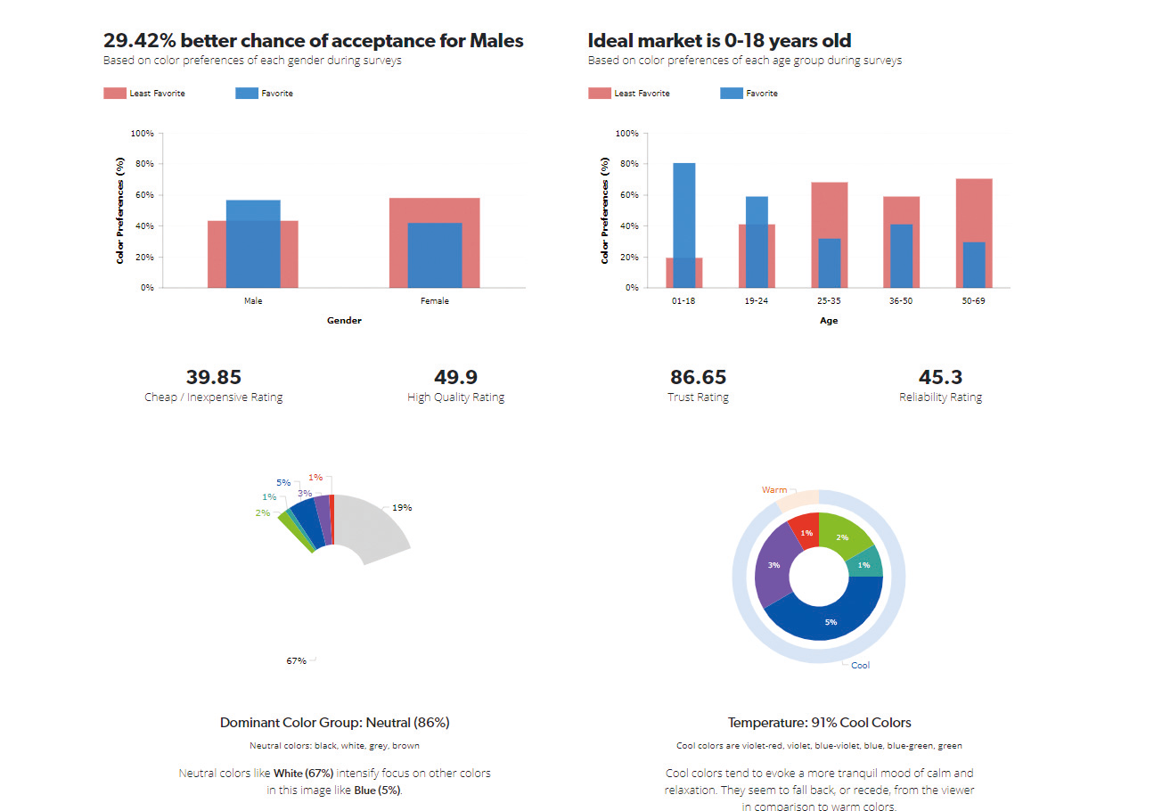
Bing's blue stands out because it's paired with a large percentage of neutral colours. Eighty-six per cent of the 'above the fold' search results on Bing are neutral according to a study done by UX Triggers (UXT).
UXT is a colour psychology analysis tool that breaks down each pixel of an image to determine the percentage of colour use in relation to other colours and how that context impacts the perception of different genders and age groups in terms of factors such as trust and quality.

In the study, neutral colours (predominantly white with 67 per cent of the image) intensifies the focus on secondary non-neutral colours. In this case, blue was the most prevalent colour used at 5 per cent of the screen. The overall design focuses heavily on cool colours (91 per cent). Cool colours tend to evoke a more calm or tranquil mood. Which is important when looking at the context of the design itself.
Search results pages contain a massive amount of information. Each page only has ten total results but includes hundreds of words describing each page, the website URL, the page title and additional sidebar callout information that may be pertinent to the user. It’s a lot to consume when most users only spend between 4.39s and 8.64s on the first page of a search engine.
This is why colour selection plays such a crucial role in user experience and design overall. It’s not about the colour blue or red: it’s actually about all of the colours surrounding it.
Bing’s three top colours are white (67 per cent), grey (19 per cent) and blue (5 per cent). The top two are neutral, as already discussed. Because of this, anything blue pulls the user’s primary attention toward it. When you factor in that the blue text links are also larger than the secondary description text (20px for the enlarged links versus 13px for body copy), it creates tunnel vision and enables users to focus on the page titles, which provide the most value on the page.
Our brains quantify what we perceive as ideal subconsciously
All other content becomes secondary by design. Oh, and guess what: the size of the enlarged blue link text (20px) is mathematically perfect in relation to the body text (13px). The blue text is 65 per cent the size of the body copy – which is only 1 per cent away from a perfect golden ratio.
That’s not to say that designers purposely create mathematical fractions or equations to drive their design. The takeaway from this is that our brains quantify what we perceive as ideal subconsciously. It just so happens that we can define that with some maths after the fact.
It’s like design science. Just because we can add comprehension to something that exists with maths doesn’t mean that it exists purely because someone used maths to make it that way. Maths is a language and it’s often overlooked in design or colour theory because some designers can innately make those connections.
Influence customers with colour and texture
It’s important to understand the purpose of design before doing any actual design work. Strange, right? You need to ask questions like: how does it relate to the business goals? How does it relate to the customer’s expectations?
From a website perspective, colour choice won’t necessarily slow down a visitor and encourage them to spend more time on the page. That’s more of a user experience, product value and market messaging topic. What colour can do is help establish your place in the ecosystem.
Last year Slack redesigned its website and featured wonderfully textured illustrations and thoughtful colour usage. It helped it stand out in a sea of overly corporate-style SaaS websites vying for attention. The result was professional yet playful, which spoke to its core market. Got a desktop stuffed with inspiration for your site? Keep your files safe in top cloud storage.

But then everyone copied it. The same font style. The same illustration style. The same colour scheme. Slack’s brand style became a template for everyone else. No one stood out any more. Not because the product was the same but because the overall collective design experience was the same. That works well for organisations looking to establish themselves but it’s counterproductive for industry leaders because these are two different business models with two different use cases.
You may be asking: how do business goals relate to colour usage and design decisions? Did you know that the dining areas of fast food restaurants were traditionally painted in bright colours, like red and yellow, because it created a sense of action or unrest in patrons?
Fast food generates revenue from being fast and convenient. If patrons take their time while eating, it impedes the table turnover and slows the amount of product the restaurant can sell in a day. They were focused on the potential revenue and not the customer experience.
This trend has begun to shift in the last few years. They’ve started using neutral colours, natural design elements like wood and softer lighting. It’s less abrasive and more comforting. Market expectation has dictated that families want to sit down and enjoy a meal, even if done on a budget and relatively quickly. Working with your customer is necessary for long-term success.
Influencing behaviour should be done with restraint and care. It’s not always about driving customers into a sales funnel. Sometimes the most proactive design decision is slowing down.
This article was originally published in net, the world's best-selling magazine for web designers and developers. You can subscribe to net here.
Related articles:

