25 pro tips to breathe new life into your CSS
Craig Grannell proves there's still plenty of excitement left in CSS with this collection of top tips from industry experts.
Sign up to Creative Bloq's daily newsletter, which brings you the latest news and inspiration from the worlds of art, design and technology.
You are now subscribed
Your newsletter sign-up was successful
Want to add more newsletters?
At some point with any technology, there's a feeling that pretty much anything that can be done has been done. When something is no longer quite as new and shiny, interest wanes and attention is drawn to the next big thing. This has often been the case in the web industry, which is prone to getting terribly excited by a certain aspect of technology before, sooner or later, relegating it to the mundane.
When CSS first appeared, it was revolutionary, and over time it has evolved to enable designers to create flexible, tightly-crafted and beautiful web page layouts. Of late, though, there's been the suggestion from various quarters that CSS is tired and perhaps its time in the sun has gone.
I want to showcase that there's still plenty of excitement and life in the world of CSS, whether that's in cutting-edge properties you may not yet have explored, or through using an aspect of CSS in a way you'd not previously considered.
Article continues belowHere are some tips from some of the industry's top CSS experts.
(Note: Some techniques in this feature are cutting-edge and may not be fully supported across all browsers. Thoroughly test and ensure fallbacks are in place before making any work live.)
01. Match images to site colour schemes
Christopher Schmitt, conference organiser

Conferences have their own colour schemes and, with many speakers, workflow for managing portraits can be complex. Manually applying filters doesn't scale and relies on you having access to, say, a specific Photoshop action. I now use high res greyscale PNGs and add tones using CSS filters. This enables me to match any portrait to an event's scheme, and to also reuse images across multiple themes. I just need a new CSS rule for each. See a demo.
Sign up to Creative Bloq's daily newsletter, which brings you the latest news and inspiration from the worlds of art, design and technology.
02. Evenly share space in a grid's last row
Stephen Hay, designer and author
If you've an unknown number of items to be displayed in a grid, you can use Flexbox to split the last row evenly. So if there's only one item, it will take up the entire row; if there are two items, the row will be split in half, and so on. See a demo.
03. Create particle animations with box-shadow
Ana Tudor, coder and maths fanatic
By mixing box-shadow with some maths and Sass, you can graph 2D curves, emulate 3D motion and create crazy particle animations everyone's going to mistake for canvas ones! See a demo, and another.
04. Animate polyhedra with transforms
Ana Tudor, coder and maths fanatic

You've probably seen pure CSS polygons created with borders, but we've a much more powerful tool in the transform property. Chaining and applying transforms on nested elements allows us to create complex polygons with image backgrounds or borders and transparent interiors. Using 3D transforms, we can combine these 2D shapes into polyhedra and make the solids merge, unfold, explode or recombine in a manner easily mistaken for WebGL. See a demo.
05. Master 'calc()' for positioning
Ana Tudor, coder and maths fanatic
I loved calc() from the moment I discovered it. It's useful for taming margins, padding or dimensions, and can be a lifesaver when used for positioning or sizing backgrounds, inside gradients or transforms, and combined not just with the same old units, but also the new and cool viewport ones.
06. Make the box model sane with 'box-sizing'
Sawyer Hollenshead, Oak Studios dev and designer
Use box-sizing to save your sanity. Without it, an element with a defined width of 250px and 25px of padding combines to a width of 300px, making mixing pixels and percentages tough. With box-sizing: border-box borders and padding are instead placed within the defined width.
07. Vertically centre with CSS
Trent Walton, Paravel founder
Historically, it's been tough to vertically centre something with CSS, such as if you've an image with adjacent text you want vertically aligned. Instead of stomping and cursing, use Flexbox to deal with alignment woes. See a demo.
08. Target a bank of related objects
Jonathan Smiley, Zurb partner and design lead
Shave CSS line weight by using approximate attribute selectors on class names, to target a large bank of related objects, rather than attaching common attributes to every single class. For example ... [class*="-block-grid-"] { } ... would target the likes of: .small-block-grid-3 .large-block-grid-5
09. Control hyphenation
Savid Storey, open web advocate
Hyphenation is taken for granted in print, and some developers use the hyphens property online, but few are aware of other properties that provide finer control. If you're not careful, you get hyphenation ladders where hyphens are used across multiple lines. A general rule of thumb is no more than two in a row, which you can control using hyphenate-limit-lines. Also, hyphenate-limit-chars enables you to specify the minimum length of a word that will be hyphenated, along with the minimum number of characters before and after the hyphen break.
10. Take advantage of writing Modes
David Storey, open web advocate
Writing modes enable you to define the direction in which text flows. Some East Asian text is written vertically, lines growing from right to left, specified with writing-mode: vertical-rl (tb-rl in IE). Vertical text isn't really used in European writing systems, but can be handy for table headings when you've limited horizontal space.
11. Use gradients in unusual ways
Ruth John, designer
Background gradients can look great when used with borders and bullets. I use both on my blog and with a preprocessor can call a mixin with the reused code, so as not to repeat it manually. Don't go supercrazy because gradients can be processor-heavy. SCSS mixin for list bullets:
@mixin gradedBullet($colour) {
background-image:
linear-gradient(left,
lighten($colour, 15%) 10px,
$colour 11px,
$colour 20px,
darken($colour, 15%) 21px,
darken($colour, 15%) 30px,
transparent 31px
);
}
12. Use string-Matching on links
Ruth John, designer

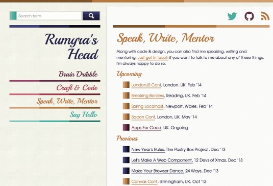
On my blog, I've used CSS attribute selectors with string-matching to style social icons. These appear throughout my blog, sometimes with text and sometimes without, but always with an icon. To style the right link with the correct social icon, I use a string match on the href attribute of the anchor element. I use *= so the href on the anchor element only has to contain the string I specify.
/* for all social links */
.social a:before {display: inline-block; padding-right: 30px; font-family: 'FontAwesome';}

/*Each specific link*/
.social a[href*="twitter"]:before {content:"\f099"; color:#52ae9f;}
.social a[href*="github"]:before {content:"\f09b"; color:#5f2e44;}
.social a[href*="feed"]:before {content:"\f09e"; color:#b47742;}
13. Make FOUT work for you
Jason Pamental, principal at H+W design

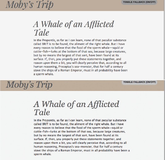
The web is built on the premise it should deliver content, even if the browser can't render the bling. Slow-loading web fonts can be frustrating, FOUT (Flash Of Unstyled Text) jarring as navigation and text reflows while fonts download. Google and Typekit provide an answer: the web-font loader. By injecting classes in a page, based on the loading status of fonts, you can style fallbacks with those classes to keep reflow to a minimum, also eradicating WebKit's 'invisible content' syndrome. See a demo.
14. Explore SVG for backgrounds
Emil Björklund, inUse web developer
The only browsers now without SVG support are IE8 and below and Android 2 WebKit, and so using SVG for backgrounds in CSS is feasible, especially along with a PNG fallback solution, such as Grunticon. SVG can be styled by CSS, and there is interesting bleed-through of CSS properties (filters!) from SVG that we can play with as applied to HTML.
15. Focus users with 3D transitions
Emil Björklund, inUse web developer
Using 3D transformations and making use of the z-dimension in user interfaces can be really useful, notably for hiding/showing or collapsing/expanding content. It's also quite easy to have a fallback to a 2D transition, or no transition at all, in those situations. It's an area where a little progressive enhancement can go a long way.
16. Create circular menus with CSS and maths
Sara Soueidan, frontend developer
Circular menus are popular in mobile apps, and you can use CSS transforms and transitions to create a simple circular menu. This menu can be modified and customised to create an upwards- or downwards-opening menu, too. There's no direct way in CSS to translate an item diagonally, but you can use the value of the circle's radius on which you want to position the items, and apply a simple mathematical rule to calculate the horizontal and vertical translation values to pass to the translateX() and translateY() functions. That way, you end up with a diagonal translation to move the menu items to the correct positions on the circle. The click event that closes/opens the menu can be handled using JavaScript, or you can take it one step further and have a CSS-only menu by using a CSS checkbox hack. In my demo, I use JavaScript and the HTML5 classList API, which isn't supported in all browsers so you'll need to view the demo in a modern browser to make it work, or uncomment the jQuery code instead of using the classList API code.
See a demo and full tutorial. CSS Checkbox hack example.
17. Animate links on hover
Paul Lloyd, The Guardian interaction designer

Hover states shouldn't be relied on to make an action work or provide important information, but you can still enhance interfaces for mouse-based users. On 24ways.org, we reveal article titles when you hover over links in the previous/next navigation. This was achieved by creating a ::after pseudo-element containing generated content sourced from the value of a data- attribute, with a CSS transition applied to have it slide into view on hover. See a demo.
18. Make simple keyframe animations
Paul Lloyd, The Guardian interaction designer
On 24ways.org, we added animated corner flaps to summaries, which opened on hover. This was done by combining the @keyframes rule with the animation property, altering the position of a background image to achieve sprite-based animation. The trick is to declare the number of frames you have in your animation sprite with the steps() value. See a demo.
19. Create floating 3D effects with shadows
Catherine Farman, Happy Cog developer

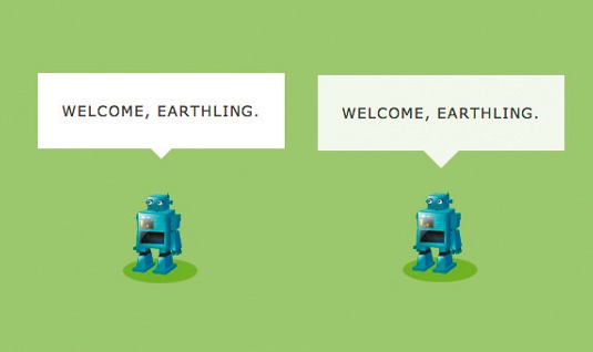
A recent project required a floating product photo with a round shadow beneath, creating a 3D effect of popping off the screen. The shadow uses several CSS3 features: border-radius alpha transparency and box-shadow. It works well for product grids, showcase imagery in a homepage hero, or any whimsical design with a skeuomorphic bent. See a demo.
20. Update page eleMents using ':target'
Simon Madine, HeRe senior web developer
CSS isn't a programming language in the usual sense, but you can still do clever things without falling back to JavaScript. For example, the :target pseudo-class is applied to elements that are the target of a clicked link.
You can use this to define the state of a page, target a parent containing lots of elements, and your links become a means to control the look and layout of all the children with a single click. See a demo.
21. Provide feedback with subtle animations
Neil Renicker, designer and developer

CSS pseudo-elements ::before and ::after along with CSS transitions, can enable delightful animation that provides subtle feedback to mouse users. For example, build a CSS arrow within a pseudo-element, apply a transition to the pseudo-element (transition: all ease-in-out .15s;), and then add a simple layout change to the :hover pseudo-class (such as amending margin-top). See a demo.
22. Prepare for 'will-animate'
Paul Lewis, coder and Chrome developer relations team member
If you've used -webkit-transform: translateZ(0) to magically make your pages faster, the hack, which in many browsers simply creates a new compositor layer, is being replaced by will-animate. Soon, you'll be able to tell the browser what you plan to change about an element (its position, size, contents or scroll position) and the browser will apply the right optimisation under the hood. More information.
23. Humanise input fields
Yaron Schoen, Made For Humans founder
Adding quick animations to elements that users interact with makes an interface feel less computery. With input fields, try putting a transition call within, so whenever you focus or unfocus it, there's a smooth transition.
input, textarea {
-moz-transition: all 0.2s ease-out;
-o-transition: all 0.2s ease-out;
-webkit-transition: all 0.2s ease-out;
-ms-transition: all 0.2s ease-out;
transition: all 0.2s ease-out;
24. Pause and play CSS animations
Val Head, designer and consultant
You can 'pause' and 'play' CSS animation by changing its animation-play-state property. Setting it to 'paused' stops your animation in place, until you change animation-play-state to running, for example on hover.
.animating_thing {
animation: spin 10s linear infinite;
animation-play-state: paused;
}
. animating_thing:hover {
animation-play-state: running;
}
25. Don't use CSS variables
Dave Shea, designer and author
We're finally getting CSS variables, for example to write a colour's hex value once and reference it through a stylesheet. But the official spec is verbose, adds syntactic complexity, offers underwhelming functionality, and is largely unsupported by most browsers. In an era where Sass is widely popular and goes beyond variables with powerful programming logic like custom functions and if/else statements, the official spec comes up far short.
Hopefully these top tips have renewed your view of CSS and the possibilities it represents in web development and design. Don't forget to test any of these techniques thoroughly to check browser support before putting any work live.
Words: Craig Grannell Illustration: Mike Chipperfield
This article originally appeared in net magazine issue 253.

The Creative Bloq team is made up of a group of art and design enthusiasts, and has changed and evolved since Creative Bloq began back in 2012. The current website team consists of eight full-time members of staff: Editor Georgia Coggan, Deputy Editor Rosie Hilder, Ecommerce Editor Beren Neale, Senior News Editor Daniel Piper, Editor, Digital Art and 3D Ian Dean, Tech Reviews Editor Erlingur Einarsson, Ecommerce Writer Beth Nicholls and Staff Writer Natalie Fear, as well as a roster of freelancers from around the world. The ImagineFX magazine team also pitch in, ensuring that content from leading digital art publication ImagineFX is represented on Creative Bloq.
