25 cool CSS animation effects and how to create them

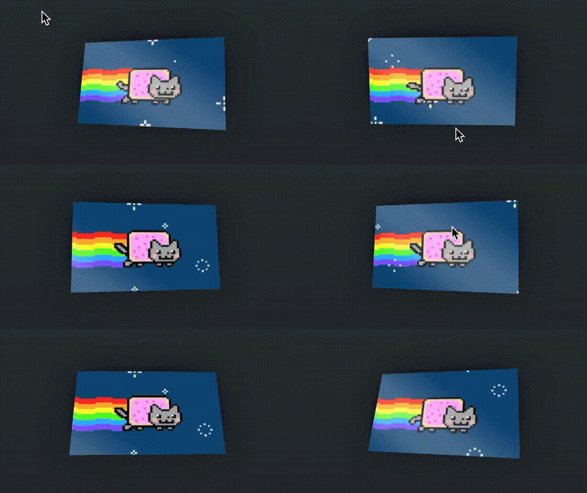
A CSS animation example that moves when the mouse moves over it
(Image credit: Donovan Hutchinson)

CSS animation can be very effective when it's employed well. Subtle CSS effects can be super engaging, generating interest and sometimes improving the user experience by giving direction or by explaining something quickly and easily. 

It might seem like CSS animation is rather limited as a resource, but that can also be one of its advantages. In fact, it's that simplicity that makes some of the good CSS animation examples we've seen on websites and apps work so well. CSS can be used to create smooth 60fps animations, and best of all it's relatively easy to use

Front-end web developer Adam Kuhn, the creator of some of the CSS animation examples below, sums it up well. He says: "Delivering thoughtful, fluid animations that contribute meaningful depth to your site doesn’t have to be difficult. Modern CSS properties now hand you nearly all of the tools you’ll need to create memorable experiences for your users."

Looking for some CSS animation examples to try out for yourself? Below, we show how to create 25 cool CSS animation examples, some of them from commercial websites. We've provided the CSS code directly here on the page for many of them, and for others, we've linked to where you can find it.

To learn more about animation in general, see Disney's classic 12 principles of animation, which we mention in the article below. We also have a roundup great animated music videos, and if you're looking at exploring user interface design in general, see our choices of the best UI design tools.

25 cool CSS animation examples

For the first examples in our pick of cool CSS animation affects, we've provided complete tutorials and the code you'll need to recreate each animation. After that, we move on to show some other examples CSS animation effects with links to where you can find out more.

01. Fun mouse effect

Some of the best CSS animation examples are the most simple. This is a fun CSS effect that follows your mouse around. It could be useful when you want to draw attention to an element on your page.

It's a great effect to start with because very little HTML is needed:

<div class="demo">
  <div class="perspective-container">
    <div class="card"></div>
  </div>
</div>

First, we position the demo and set perspective for our 3D transform:

.demo {
  background-color: hsl(207, 9%, 19%);
  display: flex;
  align-items: center;
  justify-content: center;
  height: 100vh;
  width: 100%;
}

.perspective-container {
  perspective: 800px;
}

Then we style the div we want to animate:

.card {
  background-image: url(https://media.giphy.com/media/sIIhZliB2McAo/giphy.gif);
  background-size: cover;
  box-shadow: 0 0 140px 10px rgba(0,0,0,.5);
  position: relative;
  height: 300px;
  width: 500px;
  overflow: hidden; /* Try removing this to see how the sheen works! */
  --sheenX: 0; /* Set these with JavaScript */
  --sheenY: 0;
}

Here we set a background, then we set overflow to hidden so that we can add a sheen effect later. We also set css variables, sheenX and sheenY.

These sheen variables will help position the sheen effect. We use them in our card's after pseudo-element:

.card::after {
  content: "";
  position: absolute;
  top: -400px;
  right: -400px;
  bottom: -400px;
  left: -400px;
  background: linear-gradient(217deg, rgba(255,255,255,0), rgba(255,255,255,0) 35%, rgba(255,255,255,0.25) 45%, rgba(255,255,255,.25) 50%, rgba(255,255,255,0) 60%, rgba(255,255,255,0) 100%);
  transform: translateX(var(--sheenX)) translateY(var(--sheenY));
}

Here we're making sure the pseudo-element is bigger than the container. This will give us something to slide around on top of the card using transform.

The transform property is making use of those CSS variables we set earlier. We will set those with JavaScript. Let's set up the JavaScript to first listen for mouse events:

document.onmousemove = handleMouseMove;

We now need a handleMouseMove function to handle onmousemove:

function handleMouseMove(event) {
  const height = window.innerHeight;
  const width = window.innerWidth;
  // Creates angles of (-20, -20) (left, bottom) and (20, 20) (right, top)
  const yAxisDegree = event.pageX / width * 40 - 20;
  const xAxisDegree = event.pageY / height * -1 * 40 + 20;
  target.style.transform = `rotateY(${yAxisDegree}deg) rotateX(${xAxisDegree}deg)`;
  // Set the sheen position
  setSheenPosition(event.pageX / width, event.pageY / width);
}

Our function takes the window height and width and creates an angle on the X and Y axes. We then set these to the transform style of our card. This gives the card an angle based on the mouse!

We next call a function to set the pseudo-element's position:

function setSheenPosition(xRatio, yRatio) {
  // This creates a "distance" up to 400px each direction to offset the sheen
  const xOffset = 1 - (xRatio - 0.5) * 800;
  const yOffset = 1 - (yRatio - 0.5) * 800;
  target.style.setProperty('--sheenX', `${xOffset}px`)
  target.style.setProperty('--sheenY', `${yOffset}px`)
}

Our pseudo-element looks best when it moves in the opposite direction to the mouse. To achieve this we create a number between -0.5 and 0.5 that changes in the opposite direction by calculating the ratio by -1.

We multiply this number by 800 as we want it to scale up to a maximum of 400px, which is how far we set the sheen pseudo-element outside the card.

Lastly, we set these offset values to our CSS variable properties, and the browser's renderer does the rest. We now have a card that turns to face our mouse while the sheen effect moves in the opposite direction on top. This creates a nice, eye-catching effect.

02. The big reveal

Animated content reveal effects have proved popular, and used properly they can capture user focus and engage your audience. You’ve seen this before: a block of colour grows from one side or another horizontally or vertically, and then retreats to the opposing side, this time revealing some text or an image beneath. It’s a concept that might seem tricky but really relies on just a few things.

First, we’ll set up our element positioning (download the full code here) – define it as relative (only static will fail in this case). In text cases it’s best to allow automatic height and width, although a bit of padding doesn’t hurt. We’ll also define a transform origin, in the case of the parent element we want to use the starting position. Since we want the element hidden initially, we’ll use a scale transform along the appropriate axis to shrink it.

Next, we'll use a pseudo element to mask our parent, setting the transform origin to the opposing option. Finally, string together the animations, using either the timing functions or delays to offset each.

Note that we’ve offset the parent and pseudo element’s animations with a delay to tell the box that hides our text to reveal it only after the element itself has fully scaled into view. See the Codepen below.

03. Stagger on

  • Author: Adam Kuhn

Once you’ve begun to accumulate a decent library of easing snippets, it’s time to look into other ways to enhance the depth of your CSS animations, and one of the best ways is to offset your animated elements.

It’s all too common that a JavaScript trigger is set to initiate a bunch of animations based on scroll position, only for all to move in tandem. Fortunately CSS itself provides a simple property that can make (or break) your animated experience: animation-delay.

Let’s say we have a grid of images we want to animate into frame when the user scrolls. There are a number of ways we could trigger this, most likely by adding classes to the elements as they enter the viewport. This can be quite a heavy lift on the browser, however, and can be avoided by simply adding a single class to a container element and defining animation delays on child elements.

This is a particularly good use case for preprocessors like SCSS or LESS, which allow us to use a @for loop to iterate through each element.

#parent{
.child{
     animation: animationName 1.5s ease-in-out 1 forwards;
@for $i from 1 through 20{
     &:nth-of-type(#{$i}){
animation-delay:#{$i/10}s;
                 }
}
    }
}

Here you’ll see with SCSS we are able to loop through each :nth-of-type selector, then apply an animation delay based on each child element’s numerical value. In this case you’ll note we divide up our timing to reduce each increment to a fraction of a second. While offsetting your animated elements can lend emotion to your animation, too much delay can make it feel disjointed. Check out this CodePen below.

04. Squigglevision

  • Author: Adam Kuhn

SVG filters provide a great way to achieve a natural, hand-drawn feel and escape some of the flat-feeling rendering constraints of CSS alone. Animating them can further enhance the effect.

Squigglevision is a case in point. So no, this isn’t a technical term known to most animators, but you’ve surely seen it employed in cartoons. The idea is that the edges of these animated elements are somewhat jagged and rough-hewn and that these rough edges quickly variate, frame by frame, making them feel as though they've been ripped from the pages of a sketchbook and brought to life.

To achieve this effect, we can include an SVG on our page with multiple filters and slight variations in turbulence levels for each. Next, we’ll set up our animation timeline, calling each filter in its own keyframe. It’s important to play with the timing durations as we anticipate the animation will feel 'jumpy' but don’t want it so slow as to feel disjointed or so fast as to feel crazy. 

To that end, it’s important to note that CSS lacks the ability to smoothly transition between SVG filters as there is no way to access properties such as turbulence and scale, so these types of animations should always be expected to be choppy. 

05. Tumbling lettering

CSS animation: tumbling lettering

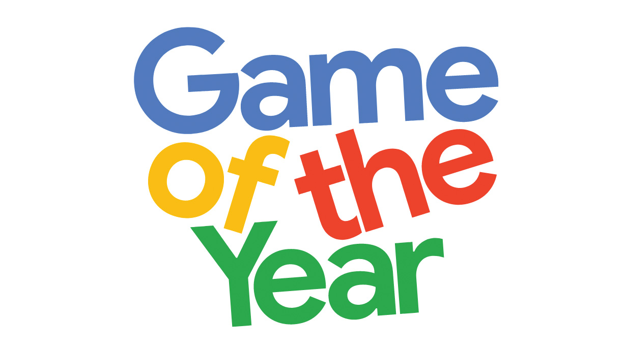
Google's Game of the Year features a playful CSS animation on the homepage, with the title words tumbling and bumping into one another. Here's how it was done. 

The first step is to define the webpage document with HTML. It consists of the HTML document container, which stores a head and body section. While the head section is used to load the external CSS and JavaScript resources, the body is used to store the page content.

<!DOCTYPE html>
<html>
<head>
<title>Off Kilter Text Animation</title>
<link rel="stylesheet" type="text/css" href="styles.css"/>
<script src="code.js"></script>
</head>
<body>
  <h1 class="animate backwards">The Animated Title</h1>
  <h1 class="animate forwards">The Animated Title</h1>
  <h1 class="animate mixed">The Animated Title </h1>
</body>
</html>

The page content comprises three h1 title tags that will show the different variations of the animation effect. While any text can be inserted into these tags, their animation is defined by the names in the class attribute. The presentation and animation settings for these class names will be defined in the CSS later on.

Next, create a new file called 'code.js'. We want to find all page elements with the animate class and create an array list representing each word of the inner text. The initial animation delay is also defined in this step. Page content is not available until the page has fully loaded, so this code is being placed inside the window’s load event listener.

The word content of the animation items needs to be contained inside a span element. To do this, the existing HTML content is reset to blank, then a loop is used to make the word in the identified 'words' list a span element. Additionally, an animationDelay style is applied – calculated in relation to the initial delay (specified below) and the word’s index position.

window.addEventListener("load", function(){
	var delay = 2;
	var nodes = document.querySelectorAll
(".animate");
	for(var i=0; i<nodes.length; i++){
		var words = nodes[i].innerText.split(" ");
		nodes[i].innerHTML = "";
for(var i2=0; i2<words.length; i2++){
			var item = document.createElement("span");
			item.innerText = words[i2];
			var calc = (delay+((nodes.length + i2)/3));
	item.style.animationDelay = calc+"s";
			nodes[i].appendChild(item);
}
	}
});

Create a new file called styles.css. Now we'll set the presentation rules that will be part of every word element in the animation, controlled by their span tag. Display as block, combined with centred text alignment, will result in each word appearing on a separate line horizontally aligned to the middle of its container. Relative positioning will be used to animate in relation to its text-flow position.

.animate span{
	display: block;
	position: relative;
	text-align: center;
}

Animation elements that have the backwards and forwards class have a specific animation applied to them. This step defines the animation to apply to span elements whose parent container has both the animate and backwards or forwards class. 

Note how there is no space between the animate and backwards class reference, meaning the parent element must have both.

.animate.backwards > span{
	animation: animateBackwards 1s ease-in-out 
forwards;
}
.animate.forwards > span{
	animation: animateForwards 1s ease-in-out 
forwards;
}

The mixed animation is defined using the same settings used for the forwards and backwards animations. Instead of applying the animations to every child of the parent, the nth-child selector is used to apply alternating animation settings. The backwards animation is applied to every even-number child, while the forwards animation is applied to every odd-number child.

.animate.mixed > span:nth-child(even){
	animation: animateBackwards 1s ease-in-out 
forwards;
}
.animate.mixed > span:nth-child(odd){
	animation: animateForwards 1s ease-in-out 
forwards;
}

The animations we've just created are made with an initial 'from' starting position, with no vertical position or rotation adjustment. The 'to' position is the final state of the animation, which sets the elements with an adjusted vertical position and rotation state. Slightly different ending settings are used for both animations to avoid the text becoming unreadable due to overlap in mixed animations.

@keyframes animateForwards {
	from { top: 0; transform: rotate(0deg); }
	to { top: .9em; transform: rotate(-15deg); }
}
@keyframes animateBackwards {
	from { top: 0; transform: rotate(0deg); }
	to { top: 1em; transform: rotate(25deg); }
}

06. Flip book

  • Author: Adam Kuhn

When animating with CSS sometimes a dead simple approach is necessary. And there are few simpler animation methods than the flip book. Using steps () as our timing function, we are able to replicate this effect. While this might sound choppy and directly contradict our mission to maintain fluidity, with the right pacing it can feel just as seamlessly organic.

So how does it work? We define our animation easing function with just a few additional parameters – telling our animation how many steps are needed and at which point during the first step we’d like to begin (start, end) – looking a little like this, for example steps (10, start).

Within our keyframes, we can now designate an end point to our animation: for this example let's assume our animation is 10 seconds long and we’re using 10 steps. In this case, each step will be one second long, immediately moving to the following one-second frame with no transition between.

Again, this seems to fly in the face of fluidity, but here’s where stepped animations can really shine. We can incrementally iterate through a sprite sheet and animate frame-by-frame just like a flip book. By defining frames of equal size but compiling them onto a single horizontal (or vertical) image, we can set this image as an element background and define a pixel or percentage background position as an end point to our animation, allowing a single step for each frame. The sprite sheet will then shift and populate the element frame by frame with a fresh background image based on its position.

Let’s take a look at an example. In this case some sets of animated legs appended to some text characters. First, we’ll define our animation name, duration, step count, start position and iteration count:

animation:runner 0.75s steps(32, end) 
infinite;

Again, note that the duration is relatively speedy at less than one full second for 32 total frames. Next, we’ll define our keyframes: 

@keyframes runner{
      from{
      background-position:0px 50%;}
      to{
      background-position:-
1280px 50%; }}

Note that the vertical positioning of the image is consistent throughout, which tells us that the sprites are horizontally stretched across the image, which is 1280px in total width. As we’ve defined 32 total frames for that image, we can deduce that each frame should be 40px wide. Check out this Codepen below.

It’s important to note that a large sprite sheet can potentially be a severe drag on performance, so be sure to size and compress images. With a well-crafted sprite sheet and an appropriate animation duration you now have a smooth animation able to convey complex motions.

07. Blowing bubbles

The CSS bubble animation that features on 7UP is a beautiful example of carrying a brand theme through into the website design. And it shows how CSS animation using super simple code can produce quite complex animations. 

The animation consists of a few elements: the SVG ‘drawing’ of the bubbles and then two animations applied to each bubble. The first animation changes the opacity of the bubble and moves it vertically in the view box; the second creates the wobbling effect for added realism. The offsets are handled by targeting each bubble and applying a different animation duration and delay.

To create our bubbles, we’ll be using SVG. In our SVG we create two layers of bubbles: one for the larger bubbles and one for the smaller bubbles. Inside the SVG we position all of our bubbles at the bottom of the view box.

<g class="bubbles-large" stroke-width="7">
  <g transform="translate(10 940)">
  <circle cx="35" cy="35" r="35"/>
  </g>
  ...
</g>
<g class="bubbles-small" stroke-width="4">
  <g transform="translate(147 984)">
  <circle cx="15" cy="15" r="15"/>
  </g>
</g>
  ...
</g>

In order to apply two separate animations to our SVGs, both utilising the transform property, we need to apply the animations to separate elements. The <g> element in SVG can be used much like a div in HTML; we need to wrap each of our bubbles (which are already in a group) in a group tag.

<g>
  <g transform="translate(10 940)">
  <circle cx="35" cy="35" r="35"/>
  </g>
</g>

We’ll start by moving the bubbles up the screen and changing their opacity to fade them in and out at the beginning and end of the animation.

@keyframes up {
  0% {
  opacity: 0;
  }
  10%, 90% {
  opacity: 1;
  }
  100% {
  opacity: 0;
  transform: translateY(-1024px);
  }
}

In order to create a wobbling effect, we simply need to move (or translate) the bubble left and right, by just the right amount – too much will cause the animation to look too jaunting and disconnected, while too little will go mostly unnoticed. Experimentation is key with when working with animation.

@keyframes wobble {
  33% {
  transform: translateX(-50px);
  }
  66% {
  transform: translateX(50px);
  } }

In order to apply the animation to our bubbles, we’ll be using the groups we used earlier and the help of nth-of-type to identify each bubble group individually. We start by applying an opacity value to the bubbles and the will-change property in order to utilise hardware acceleration.

.bubbles-large > g {
  opacity: 0;
will-change: transform, opacity;}
.bubbles-large g:nth-of-type(1) {...}
...
.bubbles-small g:nth-of-type(10) {...}

We want to keep all the animation times and delays within a couple of seconds of each other and set them to repeat infinitely. Lastly, we apply the ease-in-out timing function to our wobble animation to make it look a little more natural.

.bubbles-large g:nth-of-type(1) {
  animation: up 6.5s infinite; }
.bubbles-large g:nth-of-type(1) circle {
  animation: wobble 3s infinite ease-in-out; }
...
bubbles-small g:nth-of-type(9) circle {
  animation: wobble 3s 275ms infinite ease-in-out; }
.bubbles-small g:nth-of-type(10) {
animation: up 6s 900ms infinite;}

08. Scrolling mouse

A subtle scrolling mouse animation can give direction to the user when they first land on a website. Although this can be accomplished using HTML elements and properties, we're going to use SVG as this is more suited to drawing.

Inside our SVG we need a rectangle with rounded corners and a circle for the element we’re going to animate, by using SVG we can scale the icon to any size we need.

<svg class="mouse" xmlns="..." viewBox="0 0 76 130" preserveAspectRatio="xMidYmid meet">
  <g fill="none" fill-rule="evenodd">
  <rect width="70" height="118" x="1.5" y="1.5" stroke="#FFF" stroke-width="3" rx="36"/>
  <circle cx="36.5" cy="31.5" r="4.5" fill="#FFF"/>
  </g>
</svg>

Now we’ve created our SVG, we need to apply some simple styles in order to control the size and position of the icon within our container. We’ve wrapped a link around the mouse SVG and positioned it to the bottom of the screen.

.scroll-link {
  position: absolute;
  bottom: 1rem;
  left: 50%;
  transform: translateX(-50%);
}
.mouse {
  max-width: 2.5rem;
  width: 100%;
  height: auto;
}

Next we’ll create our animation. At 0 and 20 per cent of the way through our animation, we want to set the state of our element as it begins. By setting it to 20% of the way through, it will stay still for part of the time when repeated infinitely.

@keyframes scroll {
  0%, 20% {
  transform: translateY(0) scaleY(1);
  }
}

We need to add in the opacity start point and then transform both the Y position and the vertical scale at the 100% mark – the end of our animation. The last thing we need to do is drop the opacity to fade out our circle.

@keyframes scroll {
  ...
  10% {
  opacity: 1;
  }
  100% {
  transform: translateY(36px) scaleY(2);
  opacity: 0.01;
  }
}

Finally, we apply the animation to the circle, along with the ‘transform-origin’ property and the will-change property to allow hardware acceleration. The animation properties are fairly self-explanatory. The cubic-bezier timing function is used to first pull the circle back before dropping it to the bottom of our mouse shape; this adds a playful feel to the animation.

.scroll {
  animation-name: scroll;
  animation-duration: 1.5s;
  animation-timing-function: cubic-bezier(0.650, -0.550, 0.250, 1.500);
  animation-iteration-count: infinite;
  transform-origin: 50% 20.5px;
  will-change: transform;
}

09. Animated writing

CSS animations: writing

Click to see the animation in action

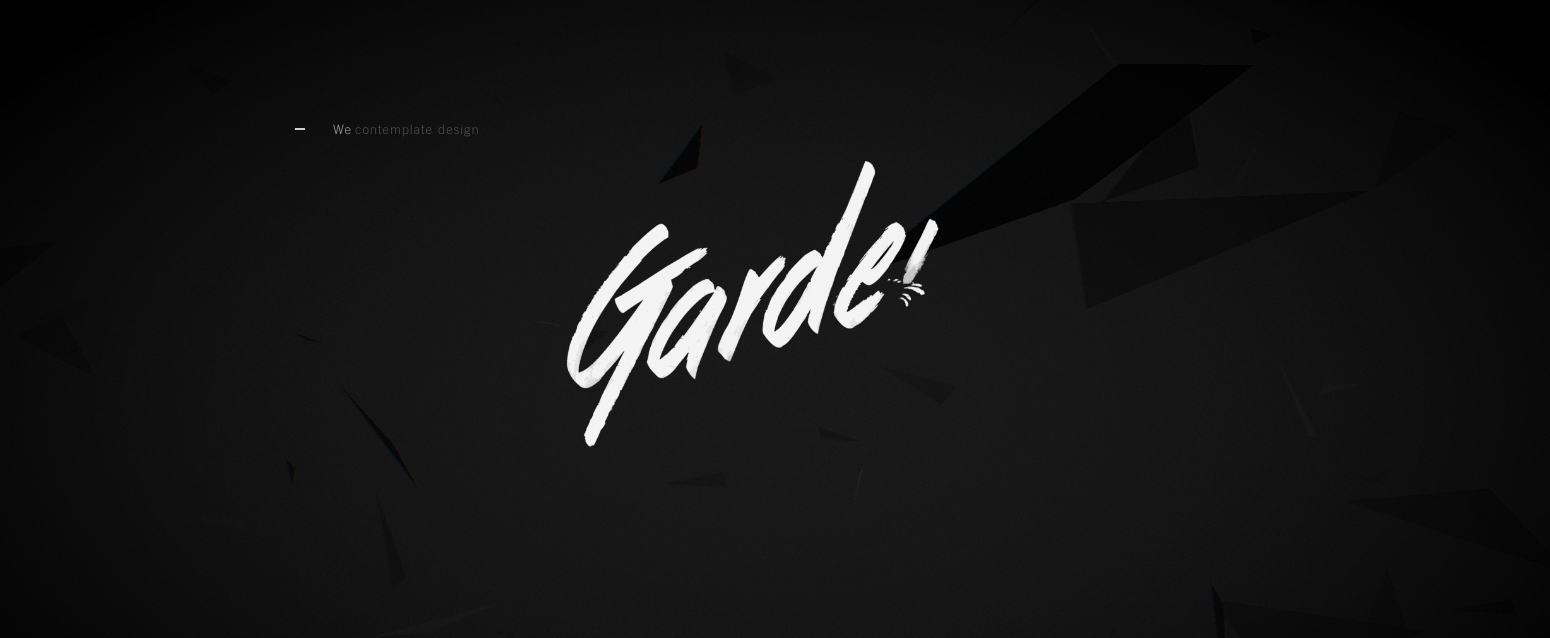
The Garden Eight website uses a common animation technique through which text appears to be written out. To achieve the effect, we'll again turn to SVG. To begin with, we’ll create the SVG. There are two approaches here: convert the text to paths to animate them or use SVG text. Both approaches have their pros and cons.

Start by creating our keyframe animation. The only function we need it to perform is to change the stroke-dashoffset. Now we’ve created our animation, we need to apply the values we want to animate from. We set the stroke-dasharray, which will create gaps in the stroke. We want to set our stroke to be a large enough value to cover the entire element, finally offsetting the dash by the length of the stroke.

The magic happens when we apply our animation. By animating the offset, we’re bringing the stroke into view – creating a drawing effect. We want the elements to draw one at a time, with some overlap between the end of drawing one element and beginning to draw the next. To achieve this we turn to Sass/SCSS and nth-of-type to delay each letter by half the length of the animation, multiplied by the position of that particular letter.

10. Flying birds

We start this CSS animation with completely straight vector lines, drawing each frame of our animation, showing the bird in a different state of flight. We then manipulate the vector points and round the lines and edges. Finally, we put each frame into an equally sized box and place them side-by-side. Export the file as an SVG.

The HTML setup is really simple. We just need to wrap each bird in a container to apply multiple animations – one to make the bird fly and the other to move it across the screen.

<div class="bird-container">
  <div class="bird"></div>
</div>

We apply our bird SVG as the background to our bird div and choose the size we want each frame to be. We use the width to roughly calculate the new background position. The SVG has 10 cells, so we multiply our width by 10 and then alter the number slightly until it looks correct.

.bird {
  background-image: url('bird.svg');
  background-size: auto 100%;
  width: 88px;
  height: 125px;
  will-change: background-position;
}
@keyframes fly-cycle {
  100% {
  background-position: -900px 0;
  } 
}

CSS animation has a couple of tricks you may not be aware of. We can use the animation-timing-function to show the image in steps – much like flicking through pages in a notebook to allude to animation.

animation-name: fly-cycle;
animation-timing-function: steps(10);
animation-iteration-count: infinite;
animation-duration: 1s;
animation-delay: -0.5s;

Now we’ve created our fly cycle, our bird is currently flapping her wings but isn’t going anywhere. In order to move her across the screen, we create another keyframe animation. This animation will move the bird across the screen horizontally while also changing the vertical position and the scale to allow the bird to meander across more realistically.

Once we’ve created our animations, we simply need to apply them. We can create multiple copies of our bird and apply different animation times and delays. 

.bird--one {
  animation-duration: 1s;
  animation-delay: -0.5s;
}
.bird--two {
  animation-duration: 0.9s;
  animation-delay: -0.75s;
}

11. Cross my hamburger

This animation is used all over the web, turning three lines into a cross or close icon. Until fairly recently, the majority of implementations have been achieved using HTML elements, but actually SVG is much more suited to this kind of animation – there’s no longer a need to bloat your buttons code with multiple spans. 

Due to the animatable nature and SVG and its navigable DOM, the code to accomplish the animation or transition changes very little – the technique is the same. 

We start by creating four elements, be it spans inside of a div or paths inside of an SVG. If we’re using spans, we need to use CSS to position them inside the div; if we’re using SVG, this is already taken care of. We want to position lines 2 and 3 in the centre – one on top of another – while spacing lines 1 and 4 evenly above and below, making sure to centre the transform origin.

We’re going to rely on transitioning two properties: opacity and rotation. First of all, we want to fade out lines 1 and 4, which we can target using the :nth-child selector.

.menu-icon.is-active {element-type}:nth-child(1),
.menu-icon.is-active {element-type}:nth-child(4) {
  opacity: 0; }

The only thing left to do is target the two middle lines and rotate them 45 degrees in opposite directions.

.menu-icon.is-active {element-type}:nth-child(2) {
  transform: rotate(45deg); }
.menu-icon.is-active {element-type}:nth-child(3) {
transform: rotate(-45deg); } 

12. Chasing circles

The animated loading icon is made up of four circles. The circles have no fill, but have alternating stroke-colours.

<svg class="loader" xmlns="http://www.w3.org/2000/svg" viewBox="0 0 340 340">
  <circle cx="170" cy="170" r="160" stroke="#E2007C"/>
  <circle cx="170" cy="170" r="135" stroke="#404041"/>
  <circle cx="170" cy="170" r="110" stroke="#E2007C"/>
  <circle cx="170" cy="170" r="85" stroke="#404041"/>
</svg>

In our CSS, we can set some basic properties to all of our circles and then use the :nth-of-type selector to apply a different stroke-dasharray to each circle.

circle:nth-of-type(1) {
  stroke-dasharray: 550; 
}
circle:nth-of-type(2) {
  stroke-dasharray: 500; 
}
circle:nth-of-type(3) {
  stroke-dasharray: 450;}
circle:nth-of-type(4) {
  stroke-dasharray: 300; 
}

Next, we need to create our keyframe animation. Our animation is really simple: all we need to do is to rotate the circle by 360 degrees. By placing our transformation at the 50% mark of the animation, the circle will also rotate back to its original position.

@keyframes preloader {
  50% {
  transform: rotate(360deg);
  } 
}

With our animation created, we now just need to apply it to our circles. We set the animation name; duration; iteration count and timing function. The ‘ease-in-out’ will give the animation a more playful feel. 

animation-name: preloader;
animation-duration: 3s;
animation-iteration-count: infinite;
animation-timing-function: ease-in-out;

At the moment, we have our loader, but all of the elements are rotating together at the same time. To fix this, we’ll apply some delays. We’ll create our delays using a Sass for loop.

@for $i from 1 through 4 {
  &:nth-of-type(#{$i}) {
  animation-delay: #{$i * 0.15}s;
  } }

Due to the delays, our circle now animates in turn, creating the illusion of the circles chasing each other. The only problem with this is that when the page first loads, the circles are static, then they start to move, one at a time. We can achieve the same offset effect, but stop the unwanted pause in our animation by simply setting the delays to a negative value.

animation-delay: -#{$i * 0.15}s;

13. Off the beaten path

  • Author: Adam Kuhn

SVG-related properties are becoming more and more usable within CSS. Two of the most uniquely capable animatable properties include paths: offset-path and clip-path. For instance, using offset-path we can define (and even hand draw) an SVG path and adjust our offset-distance (or in the case of legacy browsers, motion-offset) to allow our elements to move around our defined path.

Below, we’ll define an SVG path and tell our element to move from beginning to end.

animation:followPath 5s ease-in-out 
infinite;
offset-path: path("M 40 0 C 75 170 160 140
  200 280 Q 220 400 340 400 Q 420 380 480 540");
motion-path: path(“M 40 0 C 75 170 160 140
  200 280 Q 220 400 340 400 Q 420 380 480 540”);
@keyframes followPath{
  from{ offset-distance:0%;
    motion-offset:0%;}
  to{ offset-distance:100%;
motion-offset:100%;}}

Keep in mind when drawing your path, it will fit itself within the SVG's viewbox, with all numerical values being translated to pixels. This can pose responsive challenges as offset-path animations do not accept relative units. 

The other really neat animatable path property is clip-path. What’s great about animating clip-path is the ability to smoothly transition the positioning of path points. For instance, we can transition clip-path: polygon(0 0, 100% 0, 100% 100%, 0% 100%) to clip-path: polygon(50% 0%, 50% 0%, 100% 100%, 0% 100%); and smoothly transition a square into a triangle – a feat otherwise near impossible with CSS. 

Important note on animating clip-path: the number of points on the path must remain equal for both the beginning and ending shapes. For an easy way to visualise how clip-path will animate check out Bennett Feely’s Clippy.

Check out this offset-path example Ghibli Slider:

And clip-path example First Light:

14. Randomly appearing letters

Jam3 used JavaScript and CSS to create an animated content overlay for a full-screen video background on its site Nuclear Dissent. 

To copy this CSS animation, the first step is to initiate the structure of the HTML document. This consists of the document container that stores the head and body sections. While the head section is used to load the external CSS and JavaScript resources, the body will contain the visible page content created in the next step.

The foreground page content is placed inside the main container to deliver the advantage of easy control of content flow. The text element has the overlay class applied so that it can be referenced by the JavaScript and CSS for applying the text animation. Multiple elements can have the animation applied by using the overlay class.

<main>
<h2 class="overlay">
  This is a story all about how...
</h2>
</main>

The final part of the HTML is to define the background video element. Not all browsers are able to support each video standard, hence the need to specify different sources. The browser will display the first source it is able to support. Take note of how the video element has the autoplay, muted and loop attributes applied so that it automatically plays and repeats without sound.

<video autoplay muted loop>
	<source src="http://techslides.com/ 
demos/sample-videos/small.webm" type="video/
webm" />
	<source src="http://techslides.com/
demos/sample-videos/small.mp4" type="video/
mp4" />
	<source src="http://techslides.com/
demos/sample-videos/small.ogv" type="video/
ogg" />
	<source src="http://techslides.com/
demos/sample-videos/small.3gp" type="video/3gp" 
/>
</video>

Create a new file called styles.css. The first step in this file is to define the properties of the main content container. Default settings for font and colour are applied for child content to inherit. Auto values are applied to the side margins so that child content appears centrally aligned.

main {
	font-family: Helvetica, sans-serif;
	color: #fff;
	padding: 2em;
	width: 75%;
	min-height: 100vh;
	margin: 0 auto 0 auto; }

The background element requires specific styling in order for the effect to work. Firstly, fixed positioning is important to guarantee that it stays in the same position if the user scrolls the page. Secondly, it must use a negative z-index that will guarantee its position underneath the main page content. Transform and size are also used to set the element’s size and location to cover the full-page window.

video {
	position: fixed;
	top: 50%;
	left: 50%;
	min-width: 100%;
	min-height: 100%;
	z-index: -9999;
	transform: translateX(-50%) 
translateY(-50%);
	background: #000; }

The overlay element will be manipulated by JavaScript to split each letter of its text content to be wrapped by a span tag. This allows individual letters to be animated via CSS. Firstly, the default settings for the span letters are defined to have relative positioning, invisible opacity and an applied animateOverlay animation. Secondly, a delay to their animation is applied based on their child positioning.

.overlay span{
	position: relative;
	opacity: 0;
	top: 1em;
	animation: animateOverlay 1s ease-in-
out forwards;
}
.overlay span:nth-child(4n) { animation-delay: 
0s; }
.overlay span:nth-child(4n+1) { animation-
delay: 1s; }
.overlay span:nth-child(4n+3) { animation-
delay: 2s; }
.overlay span:nth-child(4n+2) { animation-
delay: 3s; }

The animation applied to each span element consists of just one frame that the elements will animate towards. This sets their opacity to become fully visible, along with their vertical positioning to animate towards their default text flow position. Take note of how step 6 sets each span element to be pushed down by 1em.

@keyframes animateOverlay {
  to {
opacity: 1;
top: 0;
} }

Create a new file called code.js. This first step will search for all of the elements using the overlay class – of which a for loop is used to apply the code later on. These elements are not available until after the page has loaded, so they need to be placed inside an event listener in the browser window that is triggered on its load completion.

indow.addEventListener("load", function(){
	var nodes = document.
querySelectorAll(".overlay");
	for(var i=0; i<nodes.length; i++){
	} 
});

Each element found here needs to have its HTML contents redefined so each letter is inside a span element. This is achieved by reading its plain text using innerText, and then using a second for loop to individually add each letter to the new version of the HTML – complete within its span tag. After each letter has been read, the parent node’s innerHTML is updated with the new HTML.

var words = nodes[i].innerText;
var html = "";
for(var i2=0; i2<words.length; i2++){
	if(words[i2] == " ")html += 
words[i2];
		else html += 
"<span>"+words[i2]+"</span>"
}
nodes[i].innerHTML = html;

15. Falling snow

This falling snow CSS animation example is created using an SVG and the technique is very similar to the way we created the bubbles earlier. To start, we create two layers of circles inside an SVG, then we animate those two layers by translating the Y value with a keyframe animation. 

We apply the animation to each layer instead of individual elements and reuse the same animation for both layers. By simply giving them different durations, we can add some depth to our scene.

16. Pulsing circles

The pulse animation used on the Peek-a-Beat website is simple yet effective and not difficult to reproduce. It consists of three circles inside an SVG – we simply animate their scale and opacity.

17. Glitch text

Glitchy effects are ideal for giving a website an anarchic or distressed look. You can use CSS keyframes to create this kind of animation. The process is similar to working with animation software, except that keyframes in CSS are written as percentages for the timeline of animation in the code. In this glitch text tutorial, designer and developer Mark Shufflebottom walks through the process. You'll also use CSS Grid to position elements on the screen. 

18. Moving background

The website A Violent Act uses masking and subtle movement to grab the attention of the user. The majority of the work here is in the setup and creating the SVG.

19. Colourful transitions

The DaInk website uses a really effective technique to transition between pages. The transition is simple and consists of an SVG containing a number of different-sized rectangles of different colours positioned on top of one another. 

The animation consists of transforming the X position by the width of the SVG. Then, using nth-of-type, we apply delays, offsetting each by 75ms from the last to create a smooth transition.

20. Expanding highlight

This is a very simple, yet really effective technique. The transition is accomplished using the ::before pseudo element. To begin with, the pseudo element is placed at the bottom while spanning the full width, but only a few pixels in height. 

When the element is interacted with, the width and height of the pseudo element are both transitioned to 105% of the parent’s size (the change is much more dramatic vertically), as well as transitioning the colour of the text. 

21. Elevated title

Ensemble Correspondances uses simple animation to convey movement in music. The design loosely represents sheet music. 

22. Spinning menu icon

The animated menu button is created using an SVG. The animation occurs when the user interacts with the menu button. Two transitions take place: the circular group around the menu spins 360 degrees and the menu icon in the centre changes colour. 

The most complicated part is the timing-function. Utilising cubic-bezier to gain complete control, we’re able to start the animation slowly, race through the middle part and slow it down again at the end.

23. Underline from the centre

CSS animations: underline from centre

Click to see the animation in action

The animation consists of positioning the ::after pseudo element to the bottom and then scaling it when the button is interacted with.

24. Expanding corners

The Princess Alexandra Auditorium website has a visual way to show the categories of its shows. Each of the show cards has a triangular corner set in a colour which represents the category and then, on hover, the name of the category is displayed. 

The effect is accomplished using the ::before and ::after pseudo elements, transitioning the size of the triangle and fading the name in when the element is interacted with.

25. Sliding arrow

The Greenwich Library has a really interesting transition on its buttons. When interacting with the button, two things happen: the text part of the button is covered and the arrow is then animated off the right-hand side of the button and back in from the left. 

The colour transition is accomplished with the transition property and the arrow using a simple keyframe animation. Both the transition and the animation use the same duration in order to synchronise the movements.

What is CSS animation?

CSS animation is a method of animating certain HTML elements without having to use processor- and memory-hungry JavaScript. There's no limit to the number or frequency of CSS properties that can be changed. CSS animations are initiated by specifying keyframes for the animation: these keyframes contain the styles that the element will have, and they're no difficult to create.

What makes a good CSS animation effect

The best CSS animation examples are normally very simple – just a small movement can have a big impact. At the other extreme, too much animation can be distracting and irritating for users – the opposite of what we want to achieve in a user interface, so it's best to avoid going for something too overblown.
Read more:

Thank you for reading 5 articles this month* Join now for unlimited access

Enjoy your first month for just £1 / $1 / €1

*Read 5 free articles per month without a subscription

Join now for unlimited access

Try first month for just £1 / $1 / €1

Donovan Hutchinson is a front end designer and developer who specialises in CSS animation, web design and development.