Studio Analogous created a set of flash cards aimed at helping others embrace more inclusive design practices. The studio's 'Designing for Everyone' cards contain clearly laid out information to help adjust designs for hearing or visually impaired audiences, and is useful for digital and print designers alike.
The set of 11 cards include advice on designing for colour blind viewers, those with poor vision who might use screen magnifiers, severely blind users who use Braille, and those with hearing impairments who rely on sign language.
The argument for building accessibility into your designs is a strong one: and in commercial terms as well as ethical ones – it could help you reach a much wider market. Virgin.com increased its online sales by 60 per cent after adding accessibility features to its website, while Tesco found that when it had an accessible and non-accessible version of its site, the accessible version was preferred by customers.
![Around 8 per cent of men struggle with colour blindness [click the image to see it full-size]](https://cdn.mos.cms.futurecdn.net/GarzURPpaPqkphKougR6rm.jpg)
An estimated 8 per cent of men experience colour blindness, which can render traditionally designed advertising confusing or even incomprehensible. These cards outline the colour combinations that most people struggle with so you can avoid them in your designs – as well as offering straightforward tips to help ensure your designs are clear to everyone. That's a sizeable segment of potential customers you've opened up.
Check out the cards to start integrating the inclusivity tips into your design practices. Studio Analogous is a New-York based design and strategy firm with a special focus on promoting diversity and inclusivity.
![Knowing which colour combinations to avoid is key [click the image to see it full-size]](https://cdn.mos.cms.futurecdn.net/YkMSHo9nRmewSoEZhKJnom.jpg)
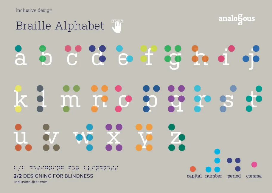
![Blind users need to be considered in more designs – these cards suggest some tips [click the image to see it full-size]](https://cdn.mos.cms.futurecdn.net/QcpbuyfyaKEStTtvVQpXrm.jpg)
![Knowing basic sign gestures for deaf and hard of hearing audiences will always be useful [click the image to see it full-size]](https://cdn.mos.cms.futurecdn.net/aT7uakfcgxACWXomBy8mom.jpg)
![Visually impaired users may use a screen magnifier to access your site [click the image to see it full-size]](https://cdn.mos.cms.futurecdn.net/5x9jaSf8V2E8NaktGGZoom.jpg)
Read more:
- Get started with web accessibility
- The designer's guide to digital accessibility
- The essential guide to colour correction

