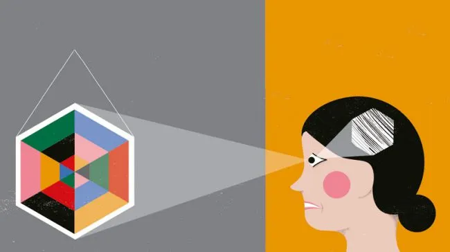
The notion of accessibility in digital designs may bring to mind ideas of screen readers and voice control, but it's about much more. Some impairments, for example, often go unnoticed. Take colour blindness: one in 12 suffer from the condition, so a design that uses only colour to convey information is useless to a large number of users.
Then there are those who aren't technically blind but do have some level of visual impairment. Designing with these users in mind not only helps them, but makes your work easier on everyone's eyes. The fact that most people can read grey text on a white background doesn't mean it's enjoyable to do so.
With websites, some users will have some kind of cognitive impairment. It might be permanent, such as a learning disability, or it may be a temporary impairment such as drunkenness (imagine designing for a taxi service, say) or even shock (think materials for a hospital).
Designing for these people means minimising clutter, using smart, simple copy and making user journeys easy to understand. These attributes are something that everyone appreciates.

Accessibility as an extension of UX design
Expert in accessibility Heydon Pickering advises that you think of accessibility as an extension of UX design. "Imagine how people with different disabilities experience the same content. It's part of the design process, not something you 'bolt on' later."
Think about how screen reader users will experience your page as you write your markup: the order is important. "If your navigation menu is positioned at the top of the page visually, but located at the bottom of the HTML document, then the experience for keyboard users will be frustratingly different to those who can point-and-click. They will have to tab-key through all the page content just to access the menu."
If you're a print designer and you haven't done much web work, it can be painful to realise that your attention to detail is lost when your designs can't be implemented on the web exactly as you made them.
"Don't be a slave to the tyranny of 'pixel perfection'," Pickering advises. "In print design, you can be exacting, but on the web it's pointless to attempt it. Design interactions, not approximations. Users are not gallery visitors, they are participants."
Keep designs simple
Above all, try to keep things as simple as possible. "The biggest enemy of accessibility is complexity," says Pickering. "Complexity makes interfaces inaccessible to anyone, but especially those who have content announced procedurally by assistive technologies."
Complexity also makes things harder for those with cognitive differences, such as autism, dyslexia or ADHD.
Jamie Knight, senior accessibility specialist at the BBC, breaks down the cognitive process required to do something into three parts: receiving information, processing information, and then taking actions. He then assesses how well a website enables someone to do each part.

'Receiving information' covers whether a person can take in the information that's there and spot things that they can use to achieve a task, such as buttons, menus and text areas.
'Processing information' covers whether a person can filter out the things they don't need to make a decision, such as adverts, links to other areas of the site and so on. The more irrelevant items there are, the harder it is to filter and decide.
'Actioning' refers to whether someone can form and complete a plan of action based on the decision they made in the previous step. Knight asks: "Can the user perceive the information and figure out what can be done? Can they filter the information in order to reach a decision? Can they then plan an action and complete it?"
Knight is autistic himself and in this post he explains how he uses a zoom tool to exclude adverts and other clutter from his screen to help him focus, and also a screen reader for the same reason.
Colour contrast
Colour contrast is one of the most important factors determining legibility of text. Accessibility was a priority for web design agency Domain7 when it redesigned the website for Imperial College London.
Design team lead Tracey Falk explains: "While sticking with black type on white is always the safest (and recommended for primary body copy), using an online tool that will test type colour against background colours for contrast is key. You'd be surprised at what fails these contrast tests."
Contrast also needs to be accounted for when using type overlayed on top of images. Miriam Thomas, UX designer and front-end development lead at Domain7, told us: "This continues to be a huge web trend and we're surprised by how often readability is overlooked in this design pattern."
"Often the solution is to neutralise and desaturate images with a dark or light overlay so text can be read. Imperial, however, had a huge library of bright imagery, so we chose to colour block backgrounds behind text on top of images to keep that vibrancy intact."
Inaccessible branding
But what if the brand colours don't pass contrast tests? Geri Coady, author of A Pocket Guide to Colour Accessibility, explains: "If brand colours have already been chosen and are unfortunately not accessible for whatever reason, try to find alternate ways to implement them," is her advice.
"A logo with insufficient contrast can be supplemented with descriptive alternate text, but for text elements like body copy and headlines, try introducing a darker, contrast-compliant shade of the same colour to add to your brand palette."
"If this creates pushback from your client, don't be afraid to bring up the potential risk of lawsuits and lost customers from an inaccessible website. Money talks." (Disney faced an accessibility lawsuit in 2011.)
Coady recommends Lea Verou's contrast checker for ensuring your palette is legible, and there's some more detail in her article on contrast checks. See also the Web Content Accessibility Guidelines.
All of the experts we spoke to agree that testing is key to making your work accessible and ironing out any problems. Test at regular intervals and include in your testing group people with cognitive differences such as Autism Spectrum or ADHD as well as those with visual and motor impairments.
The full version of this article first appeared inside Computer Arts issue 242, a typography special issue. Illustrations by Becca Allen.
At Generate London on 22 September, Léonie Watson will help you understand accessibility mechanics in the browser to avoid unexpected consequences. The conference will feature 15 more presentations covering web performance, animations, UX strategy, prototyping, adaptive interfaces, responsive CSS components, and loads more. Reserve your spot today!
Related articles: