There was once a time when a tech startup would spend months obsessing over building a website with the 'wow' factor. It would have all the bells and whistles (to show off its tech smarts), feature amazing visuals and animations (to impress customers and investors), and cram in all the information about the company people might ever want to know.
Those days are now gone. The startup world is now so intensely competitive that you now have only two choices: launch fast, or fail fast. And your website? More often than not, it needs to go up quickly and do the bare minimum your business goals require, whether that’s explaining the product, or just hosting a signup form for early adopters.
That doesn’t mean, however, that all of this can’t be achieved without style and grace, as these great examples show...
01. Magic Leap
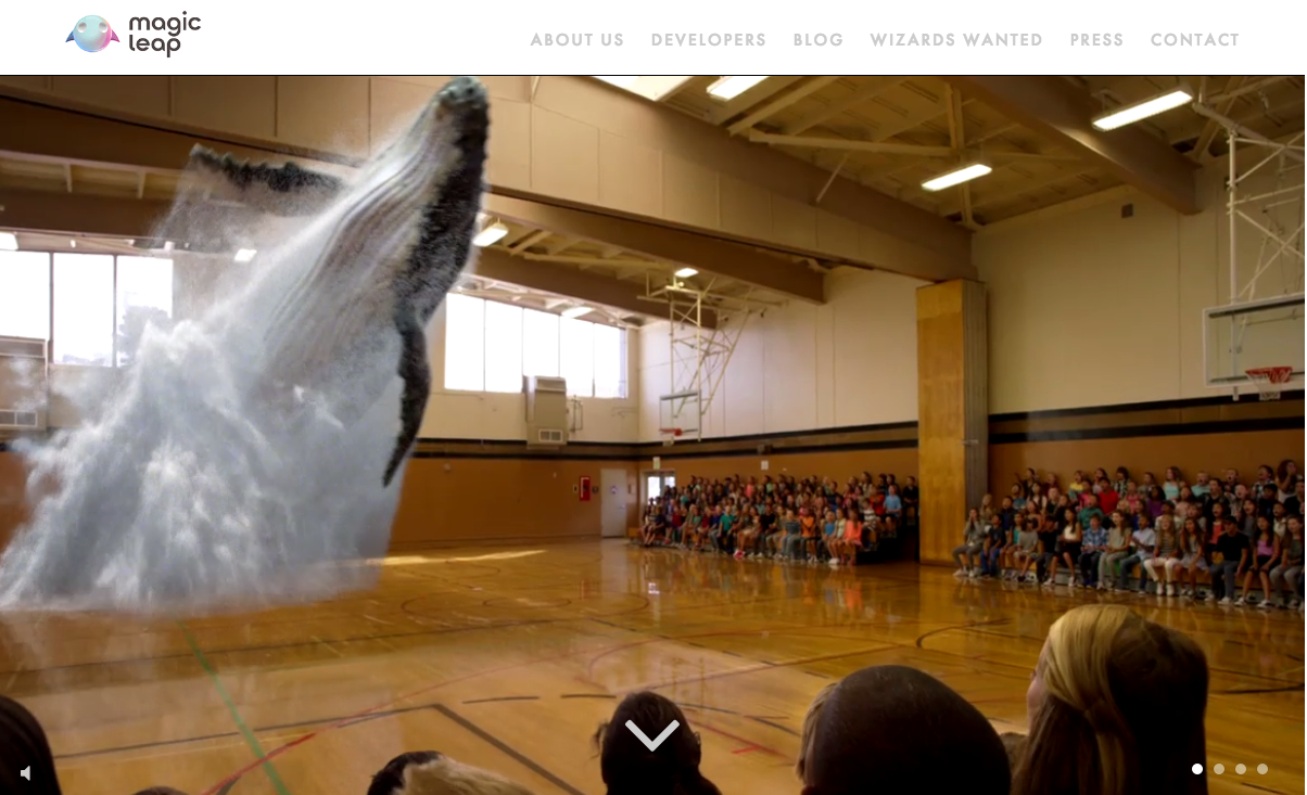
The AR space is teeming with startups. And some of the biggest buzz surrounds Magic Leap, which uses a head-worn display to project virtual images on the real world, in a way that’s breathtakingly realistic (less Pokemon Go, more Matrix).
For a start, the Magic Leap headset doesn’t use a screen but points directly at the retina. What’s more, light created in the virtual world bounces off real-life objects and create shadows within your field of view, which makes the illusion seem incredibly real.
Showcasing such technology on a website is tricky, because the only real way to see what the tech can do is actually use it. So Magic Leap’s homepage instead makes use of full-screen videos (like the one shown in the still above) to get over the basic point. Reminiscent of when 2D cinema started advertising 3D cinema, the effect is a little cheesy, but at least you’re left in no doubt what the end benefit is.
Start scrolling down the page and there are some beautiful full-screen images, presented with some very slick transitions, that serve the same purpose, along with text explaining key aspects of the technology. Then click through to the ‘About Us’ page and you get a feel for the real passion and enthusiasm for this project.
Daily design news, reviews, how-tos and more, as picked by the editors.
It’s a breath of fresh air compared to the generic mission statements of most tech startups, and thus far more likely to get you clicking on the ‘Developers’ tab to find out how to get involved in coding for the platform.
02. Elsewhere
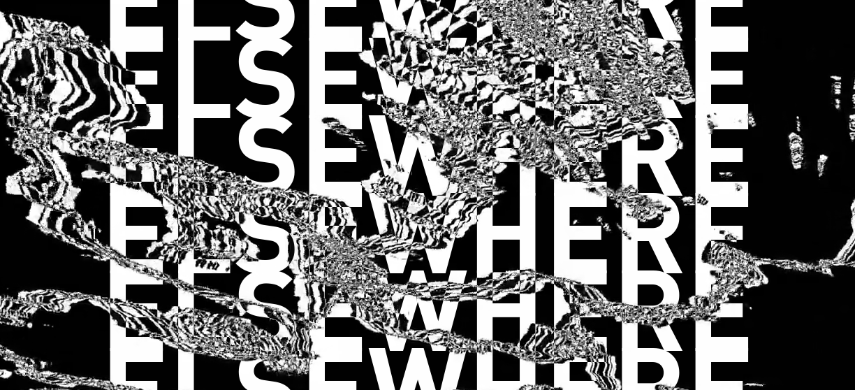
Many startups, consumed by the pace of building a new business from scratch, slap up a quick-one page website to advertise their wares. But that doesn’t mean it can’t be beautifully art-directed, and that’s certainly the case with this site.
Elsewhere is an intriguing entry into the VR space. It’s essentially a system that promises to turn any 2D video into a 3D VR experience, using an innovative kind of video-processing that converts motion into depth.
Its single-page scrolling website focuses on explaining the concept, simply and clearly, and offering social proof in the form of some carefully chosen testimonies.
With an arresting opening image, unexpectedly huge fonts, and a quirky sense of the bizarre, this website’s design drives you to read to the end, and decide for yourself whether this is just a silly gimmick or the next big thing.
03. B12
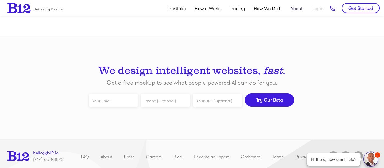
The Google homepage is the most visited website on the planet, so it’s surprising that more people don’t ape its stripped-down simplicity. One company that does is B12. Okay, that’s not actually a search box in the centre of their homepage page, but it still instantly draws you into trying their beta, in a way that a normal-looking web form probably wouldn’t.
What is B12? It’s a new kind of web design agency that builds websites for clients using a clever form of AI combined with the smarts of human designers. The appeal for the customer is you get, they claim, a high quality website at a much lower cost.
Their own website was, naturally, built using the same system. “B12 is the best way in the world to build and optimize a website,” B12’s Nitesh Banta told us. “While our product is catered toward SMB, our in-house design team, empowered by B12's product and our expert network, was able to quickly design our beautiful new presence.”
And it’s a great design, one that’s centred around one clear, call-to-action: the offer of a free mockup. If that’s not clear enough, there’s a chatbot at the bottom to guide you further. What more could you need?
04. Let’s Barter
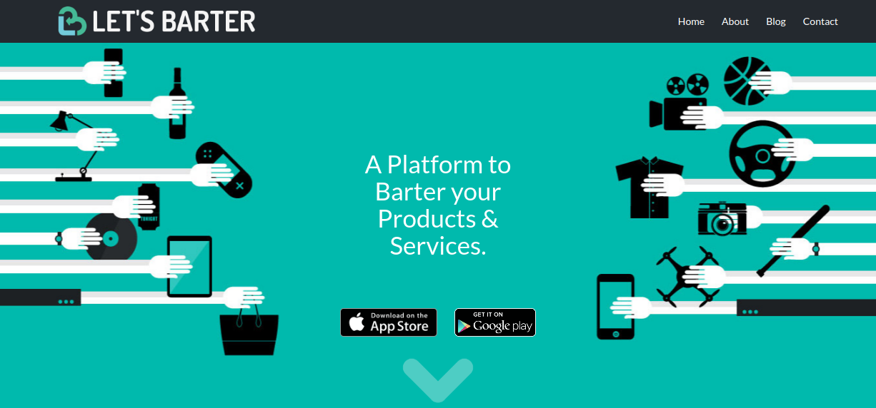
As the world moves towards a cashless economy, one startup is aiming to bring the time-honoured practice of bartering into the 21st century.
Let’s Barter, quite simplu, is an online platform for the exchange of products and services. And it’s a great example of the key to startup success: rather than spend an eternity making a perfect product that gets overtaken by events, just launch quickly, and keep improving it, little by little, as you go.
“We wanted to release one to two months after building the app,” says CTO Abhishek Biswal. “So we settled on a tech that allows us to prototype and build faster. We’ve put in a lot of work on performance, and are still doing so as we speak. We’re launching our features in a way that makes sense to our users: releasing only a few things which actually solve a problem.”
The team have taken a similar approach to Let’s Barter’s website, keeping things as simple as possible. A clean and uncluttered homepage conveys the concept clearly, using elegant illustrations and the minimum of words, and encourages people to click through and download via two clearly labelled buttons.
A nicely designed icon combines the ‘B’ bartering with a heart symbol, conveying the social, human nature of bartering. And anyone who wants to know more can head to the blog; so, despite the stripped-down nature of the site, all bases are covered.
05. Trip Rebel
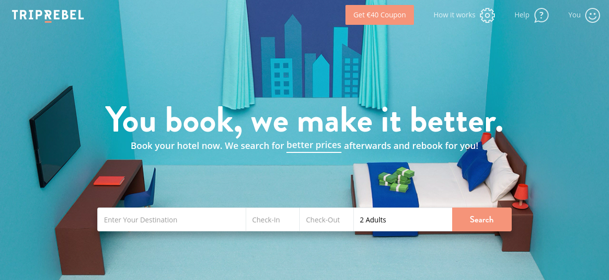
Trip Rebel is an international startup based in Hamburg that offers a unique proposition. Book a hotel today and then, until the time of your visit, the website will keep searching for a better deal. If it finds it, it will automatically cancel your booking and rebook it at the lower price.
Aside from a few subtle animations (check out the bed when you linger on the homepage), the website looks pretty simple, which was obviously the idea. But it hasn’t been a simple process to get the design nailed, explains designer Valentino Borghesi.
“To create a visual direction is quite simple and straightforward,” he says. “But what really takes time is to nail user experience and define all the details. It’s also about considering how the user experience is affected by the backend of the product; that's really something that takes a lot of time to align. So this version is the result of four to five months of continuous deployment and improvements.”
Borghesi’s priority was less about creating something flashy to impress other designers, and more about focusing on the business goals. “Design can make a great contribution to reach business goals,” he argues. “To achieve this and differentiate from competitors we decided that our website should have been uncluttered and distraction free. I always try to preach this mantra: ‘Don't make something unless it is both necessary and useful; but if it is both necessary and useful, don't hesitate to make it beautiful.’”
06. Flying Pinata
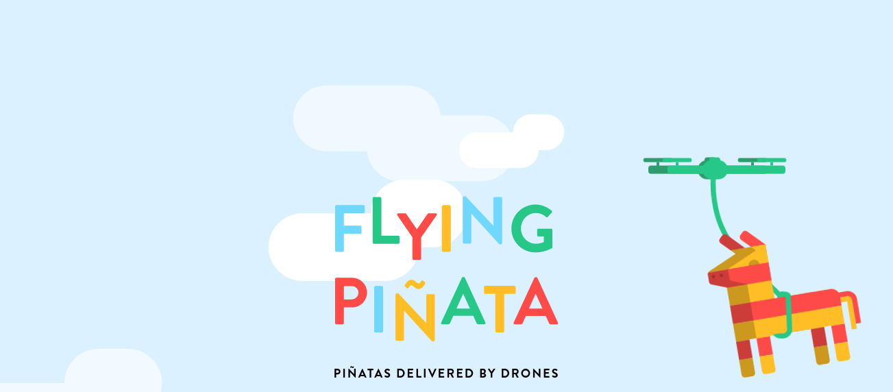
Flying Pinata might sound like one of those wacky names agencies give themselves, so that people can easily find them on Google. But in this case, it’s actually a company that provides flying pinantas, delivered by drones to your door. Yes, really.
This quirky startup’s homepage makes the point clear, by featuring an animation of a pinata being flown by a drone. Scroll down and there are more fun little animations, a brilliantly made video that must be seen for its entertainment value alone, and clear calls to action, to ‘Get the app’.
Norwegian digital design studio Bakken & Bæck has done a marvellous job executing this site, with its bright and cheery colour scheme that instantly brings to mind the feel of children’s parties, and neutralises any potential nervousness about drone technology.
07. Starry Station WiFi
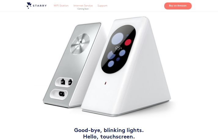
Starry Station is reinventing Wi-Fi, by offering a simpler, more reliable system with deeper controls for your myriad devices. And when it came to their website their priorities were similar: create a simple, responsive design, with clear product messaging.
This site was designed and built over a two-month period by a team of designers, copywriters, and developers. And the biggest technical challenges they had to overcome, they told us, were “designing with limited resources while simultaneously setting up a CSS system from scratch. We needed to create something that better fit our needs and allowed flexibility for quick iteration.
And, most importantly we needed to design and develop it on a tight timeline”.
The main lesson they learned during the site build was: “Websites are never done. As we learn more about ourselves, and who our audience is, we are constantly iterating and evolving our messaging and design.” The result: a one-page, explainer website that eschews flashy gimmickry and instead does what exactly what it needs, no more, no less.
08. Hyper Science
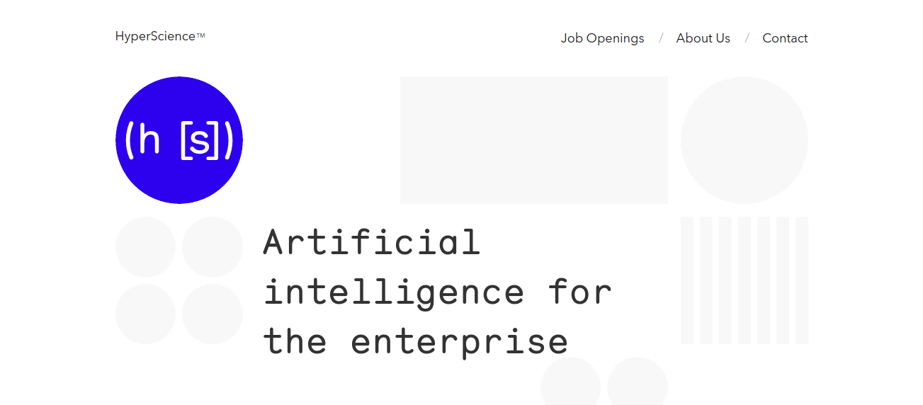
Sometimes a startup’s website just needs to announce its presence, but not give anything away about what it’s working on. All we know about HyperScience is that it’s developing “Artificial intelligence for the enterprise”, that its aim is to “automate cognitive labor” - and that they’re based in New York and Sofia. And that’s obviously all they want us to know.
So designer Sam Dallyn has done a great job in spinning such thin content into an attractive and alluring website. Artfully minimalist, this simple site combines ‘sciencey’ typography with masterful use of white space to convey a confident company that’s on the edge of something truly exciting (even if it that does ultimately lead to us all becoming unemployed...).

Thank you for reading 5 articles this month* Join now for unlimited access
Enjoy your first month for just £1 / $1 / €1
*Read 5 free articles per month without a subscription
Join now for unlimited access
Try first month for just £1 / $1 / €1

Tom May is an award-winning journalist and author specialising in design, photography and technology. His latest book, The 50th Greatest Designers, was released in June 2025. He's also author of the Amazon #1 bestseller Great TED Talks: Creativity, published by Pavilion Books, Tom was previously editor of Professional Photography magazine, associate editor at Creative Bloq, and deputy editor at net magazine.
